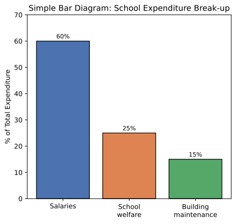
In a School 60% of money spent goes for salaries, 25% for School welfare and 15% for building maintenance. With the help of this information construct a bar diagram.
OR
Construct a pie diagram to represent the following items :
| Items | Expenditure (%) |
|---|---|
| Labour | 25 |
| Bricks | 15 |
| Cement | 20 |
| Steel | 15 |
| Timber | 10 |
| Supervisor | 15 |
You're viewing a preview — the full solution, concept, methods & PYQ mapping are locked.
Start your 14-day free trial to unlock the full solution →The school expenditure data can be shown as a simple bar diagram with bars of heights proportional to the percentages; the alternative item-wise expenditure data is converted into degrees of a circle to construct a pie diagram. [The OR alternative gives the full pie-diagram construction.]
MAIN PART — Constructing the Bar Diagram:
Given: Salaries = 60%, School welfare = 25%, Building maintenance = 15% (total = 100%).
Steps:
- Draw two perpendicular axes — the horizontal (X) axis for the categories (Salaries, School welfare, Building maintenance), and the vertical (Y) axis for 'Percentage of money spent', marked with a suitable scale (e.g., 1 cm = 10%).
- Draw three vertical bars of EQUAL WIDTH, one for each category, spaced at equal intervals along the X-axis.
- Make the height of each bar proportional to its percentage value: the 'Salaries' bar reaches up to 60 on the Y-axis scale, the 'School welfare' bar up to 25, and the 'Building maintenance' bar up to 15.
- Label each bar clearly and title the diagram (e.g., 'Percentage distribution of school expenditure').
This produces a simple bar diagram in which the Salaries bar is clearly the tallest (60), School welfare the next tallest (25), and Building maintenance the shortest (15) — giving an immediate visual comparison of how the school's money is spent.
OR ALTERNATIVE — Constructing the Pie Diagram:
To construct a pie diagram, each item's percentage share of the total must first be converted into the corresponding angle (in degrees) of the 360° circle, using: Degree = Percentage × 3.6 (since 360° ÷ 100% = 3.6° per 1%).
| Items | Expenditure (%) | Degrees (% × 3.6) |
|---|---|---|
| Labour | 25 | 90° |
| Bricks | 15 | 54° |
| Cement | 20 | 72° |
| Steel | 15 | 54° |
| Timber | 10 | 36° |
| Supervisor | 15 | 54° |
| Total | 100 | 360° |
Steps to draw:
- Draw a circle of any convenient radius, using a compass.
- Draw one radius line from the centre to the top of the circle (12 o'clock position) as the starting line. …
Unlock everything free for 14 days
- Full step-by-step solutions
- Concept-first explanations
- Methods, shortcuts & mistakes
- PYQ mapping + timed mock tests
Full access for 14 days. No credit card required.