Economics · Ch 3 — Organisation of Data
What is a Frequency Distribution?
What is a Frequency Distribution?
A frequency distribution is a full way of classifying the raw data of a quantitative variable. It shows how the different values of the variable are spread across several classes, together with each class's frequency. For the mathematics marks there are ten classes: 0–10, 10–20, …, 90–100.
Key terms:
- Class frequency — the number of observations falling in a class. In the class 30–40 there are 7 raw values (30, 37, 34, 30, 35, 39, 32), so its frequency is 7. (A value of exactly 40 is not counted here — it goes into 40–50 — for a reason explained under class limits.)
- Class limits — the two ends of a class: the smaller is the lower class limit, the larger the upper class limit. For 60–70 the lower limit is 60 and the upper limit is 70.
- Class interval (class width) — the gap between the two limits: . For 60–70 it is .
- Class mid-point (class mark) — the middle value of a class:
Once data are grouped, individual values are dropped and the class mark represents the whole class in later calculations. For the mark classes:
| Class | Frequency | Lower Class Limit | Upper Class Limit | Class Mark |
|---|---|---|---|---|
| 0–10 | 1 | 0 | 10 | 5 |
| 10–20 | 8 | 10 | 20 | 15 |
| 20–30 | 6 | 20 | 30 | 25 |
| 30–40 | 7 | 30 | 40 | 35 |
| 40–50 | 21 | 40 | 50 | 45 |
| 50–60 | 23 | 50 | 60 | 55 |
| 60–70 | 19 | 60 | 70 | 65 |
| 70–80 | 6 | 70 | 80 | 75 |
A frequency curve is the graphic form of a frequency distribution — class marks on the X-axis, frequencies on the Y-axis, the plotted points joined into a curve.
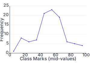
Drawn by us to help you understand the concept clearly, and verified to make sure it's accurate. For exams, practice from your NCERT textbook's own diagram.
Fig. 3.1 in the Organisation of Data chapter (p.29) is a frequency curve — a single line graph built from Table 3.3's ten-class distribution of the 100 students' mathematics marks. The horizontal axis (x-axis) plots the class marks (mid-values) of the ten classes: 5, 15, 25, 35, 45, 55, 65, 75, 85, 95. The vertical axis (y-axis) plots the corresponding frequencies: 1, 8, 6, 7, 21, 23, 19, 6, 5, 4.
Each class mark is plotted against its frequency as a point, and the points are joined by straight line segments into a single curve that rises sharply through the middle classes (peaking at 23, the class mark 55) and tapers off at both ends. This is the only graph the real page prints for this distribution — there is no separate histogram alongside it here; the histogram + frequency-polygon pairing is introduced separately, later in the chapter, for the discussion of unequal classes.
The key formula the figure rests on is the class mark:
…
Activity
…