Geography · Ch 16 — International Trade — India
Changing Pattern of the Composition of India’s Exports
Changing Pattern of the Composition of India’s Exports
The composition of India’s exports has changed significantly over time, reflecting shifts in the country’s industrial base, global demand, and policy priorities. The textbook focuses on the most recent pattern visible in the data up to 2021-22.
A key observation is that India’s export basket is no longer dominated by primary products like tea, jute, or cotton textiles, as it was in the early decades after independence. Instead, manufactured goods and high-value items now account for the bulk of export earnings.
The single largest contributor to India’s export earnings is gems and jewellery. This sector consistently holds a major share of the country’s total export value. India is a global hub for cutting and polishing diamonds and for manufacturing gold jewellery, and these products are shipped to markets around the world.
Other major commodities that featured prominently in India’s export list for the year 2021-22 include petroleum products, engineering goods, chemicals and related products, and textiles (including readymade garments). The textbook directs you to study Table 8.3 (which is part of the original NCERT data) to identify the exact list of major commodities for that year and to practise drawing a bar diagram to visualise their relative shares.
The textbook also notes that China and other East Asian countries are India’s major competitors in export markets. This competition is especially strong in sectors like textiles, engineering goods, and electronics, where these countries have established large-scale production and supply chains. …
Drawn by us to help you understand the concept clearly, and verified to make sure it's accurate. For exams, practice from your NCERT textbook's own diagram.
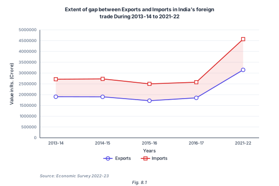
The figure is a standard line graph, not a map or diagram of physical places. Its purpose is to show the trade deficit — the gap between what India earns from exports and what it spends on imports — over a specific period.
The X-axis is labelled "Years" and carries five tick marks: 2013-14, 2014-15, 2015-16, 2016-17, and 2021-22. Notice the jump: the data skips the years 2017-18 through 2020-21. This is a deliberate choice by the source (Economic Survey 2022-23) to highlight the long-term trend rather than year-to-year noise. The Y-axis is labelled "Value in Rs. (Crore)" and runs from 0 to 5,000,000, with gridlines every 500,000.
Two lines are plotted, each with square markers. A legend at the bottom identifies them: one line for Exports, one for Imports.
What the lines show: Both lines stay roughly level between about 2,000,000 and 2,700,000 crore rupees from 2013-14 to 2016-17, with a slight dip. Then, from 2016-17 to 2021-22, both lines climb steeply — meaning both exports and imports grew sharply in that final period.
The key teaching point: The Imports line sits above the Exports line at every single year. This means India consistently imported more than it exported — a trade deficit. The vertical gap between the two lines is the size of that deficit. The gap is narrowest in the middle years (2015-16, 2016-17) and widest at 2021-22, showing that the excess of imports over exports grew dramatically by the end of the period.
The figure directly illustrates the growing trade deficit of India. Even though exports grew significantly by 2021-22, imports grew even faster, widening the gap. This is a central concern in the chapter's discussion of India's international trade pattern. …
| Commodities | 2015-16 | 2016-17 | 2020-21 | 2021-22 |
|---|---|---|---|---|
| Agriculture and allied products | 12.6 | 12.3 | 14.3 | 11.9 |
| Ore and Minerals | 1.6 | 1.9 | 3.2 | 2.0 |
| Manufactured goods | 72.9 | 73.6 | 71.2 | 67.8 |
| Commodities | 2021-22 |
|---|---|
| Agriculture and allied products | 3,75,742 |
| Ores and Minerals | 63,754 |
| Manufactured goods | 21,32,296 |