Q.Data represented through a histogram can help in finding graphically the
Concept understanding — Graphical Representation of Data
Graphical Representation of Data in Economics
You already use graphs without thinking about it. When you glance at a weather app and see a line climbing upward over the afternoon, you know it will get hotter. When a friend shows you a bar chart of their monthly savings, you instantly see which months they spent less. That instinct — turning numbers into a picture so patterns become obvious — is the entire point of graphical representation.
What It Really Means
In economics, data comes as tables of numbers: GDP over ten years, unemployment rates across states, price changes month by month. A table is precise but slow. Your brain has to read each number, compare it to the one above, hold it in memory, and build a mental picture. A graph does that work for you. It maps one variable (say, time) on the horizontal axis and another (say, GDP) on the vertical axis, then plots each pair as a point. Connect the points, and the shape of the line tells you the story — growth, decline, cycles, stability — in a single glance.
The formal definition is simple: a graph is a visual representation of the relationship between two (or more) variables, drawn on a coordinate plane.
Why Economists Cannot Work Without Graphs
Economics deals with relationships: how price affects demand, how income affects consumption, how investment affects national income. A graph makes that relationship visible. You can see whether it is positive (both variables move together) or negative (one rises as the other falls), whether it is steady or accelerating, whether there is a sudden break or a smooth trend.
A graph is not decoration. It is an analytical tool. When you draw a demand curve, you are not just illustrating a textbook idea — you are showing the precise mathematical relationship between price and quantity demanded, and you can read off the effect of any price change instantly.
The Core Types You Must Know
Time Series Graph
This is the most common in macroeconomics. Time goes on the x-axis (horizontal), and the variable you are tracking goes on the y-axis (vertical). Plot points for each time period and join them with straight lines.
Example: India's GDP from 2010 to 2020. The line rises year after year, but some years it rises steeply (high growth) and some years it flattens (slowdown). You see the 2016 demonetisation dip and the 2020 COVID crash as clear downward jags — something a table of numbers would hide until you studied it carefully.
Frequency Distribution (Histogram)
When you have data grouped into classes — say, monthly incomes of 1000 households in ranges ₹0–₹10,000, ₹10,000–₹20,000, etc. — you draw bars whose heights show how many households fall in each range. This tells you where most people are concentrated. If the tallest bar is at the low-income end, you know inequality is high.
Ogive (Cumulative Frequency Curve)
This is the histogram's cousin. Instead of showing how many fall in each class, it shows how many fall below a certain value. You plot cumulative frequencies and get a rising S-shaped curve. Economists use this to answer questions like: "What percentage of households earn less than ₹50,000 per month?" You read it straight off the ogive.
Scatter Diagram
You have two variables — say, advertising spend and sales revenue — for 50 different firms. Each firm becomes one dot on the graph, with its advertising spend on the x-axis and its sales on the y-axis. If the dots cluster along an upward-sloping line, advertising and sales are positively correlated. If they are scattered randomly, there is no relationship. This is the first step before you ever calculate a correlation coefficient or run a regression.
In exams, when asked to "represent the data graphically," always choose the type that matches your data. Time data → time series graph. Grouped data → histogram or ogive. Two variables → scatter diagram. A single category comparison → bar diagram.
How to Draw One Correctly (Exam-Ready)
- Choose the axes. The independent variable (the one that causes the change, or time) goes on the x-axis. The dependent variable (the one that changes as a result) goes on the y-axis.
- Scale the axes. The scale must be uniform — equal gaps represent equal changes. If you squeeze one part and stretch another, the graph lies.
- Label everything. The axes must have their variable names and units (₹ crores, years, percentage). The graph must have a title.
- Plot accurately. Each point is a precise intersection of the x and y values.
- Join the points. For a time series, join them with straight lines. For a scatter diagram, do not join them — leave the dots.
The most common exam mistake: drawing a freehand curve that does not actually pass through the plotted points. Each point represents real data. The line must hit every point exactly. If you are connecting points, use a ruler. If you are drawing a trend line through scattered dots, it should be a straight line (or smooth curve) that balances the dots above and below it — not a wiggly line that chases every dot.
What a Graph Tells You That Numbers Cannot
A table of GDP figures might show: 2015: ₹100 lakh crore, 2016: ₹108, 2017: ₹115, 2018: ₹120, 2019: ₹123, 2020: ₹110. The numbers are there, but you have to work to see the story. The graph shows it instantly: steady growth, then a sharp fall in 2020. More than that, the slope of the line between 2015 and 2016 is steeper than between 2018 and 2019 — meaning growth was faster earlier. That slope is the rate of change, and it is visible without any calculation.
In economics, this is everything. The difference between a 5% growth rate and a 7% growth rate is the difference between doubling your economy in 14 years versus 10 years. A graph makes that difference leap off the page.
The One Formula You Need
For a straight-line graph (which is the foundation of demand curves, supply curves, and consumption functions), the relationship is:
y=a+bx
Where:
- y is the dependent variable (on the vertical axis)
- x is the independent variable (on the horizontal axis)
- a is the intercept — the value of y when x=0
- b is the slope — the change in y for a one-unit change in x
In economics, this becomes specific. For a consumption function: C=Cˉ+bY, where Cˉ is autonomous consumption (consumption when income is zero) and b is the marginal propensity to consume. The graph of this line shows you exactly how consumption responds as income rises.
The Bottom Line
Graphical representation is the language in which economics speaks. Every model — demand and supply, the Keynesian cross, the Phillips curve, the Lorenz curve — is a graph first and an equation second. When you learn to read and draw graphs fluently, you are not just learning a skill for one chapter. You are learning to think like an economist.
A histogram's tallest rectangle marks the class with the highest frequency, and that modal rectangle is exactly what lets a particular measure of central tendency be pinned down graphically.
(ii) Mode.
A histogram lets you locate the mode graphically. You draw two diagonals inside the tallest (modal) rectangle — one from its top-left corner to the top-left of the next bar, and one from its top-right corner to the top-right of the previous bar — and drop a perpendicular from where they cross to the X-axis. That foot of the perpendicular is the mode.
A histogram helps find the mode graphically — option (ii). The mode lies inside the tallest (modal) rectangle and is located by drawing two cross-diagonals and dropping a perpendicular to the X-axis.
Concept first: histogram and the mode
A histogram is a set of adjacent rectangles whose areas are proportional to the class frequencies; for equal class intervals the heights are proportional to the frequencies. The modal class is the class with the highest frequency — i.e. the tallest rectangle.
Locating the mode graphically
- Identify the tallest rectangle (the modal class).
- From its top-left corner, draw a line to the top-left corner of the rectangle on its right.
- From its top-right corner, draw a line to the top-right corner of the rectangle on its left.
- These two diagonals intersect inside the modal rectangle.
- Drop a perpendicular from the point of intersection to the X-axis. The value at its foot is the mode.
| Option | Verdict |
|---|---|
| (i) mean | ✗ not read from a histogram |
| (ii) mode | ✓ Correct |
| (iii) median | ✗ located from an ogive, not a histogram |
| (iv) all the above | ✗ |
(ii) mode — a histogram locates the mode graphically via the cross-diagonals of the tallest (modal) rectangle and a perpendicular dropped to the X-axis.
- JKBOSE Class 11 (Commerce) 2019Set ANNUAL6 marksQ.What is Lorenz Curve ? Draw a Lorenz curve of the data given below :
Income (₹) 100 200 400 500 800 No. of persons 80 70 50 30 20 (OR)Why is the arithmetic mean the most commonly used measure of Central Tendency ?›Reveal solutionSolution
This question has an OR — Part (a) explains the Lorenz Curve and plots one from the given income/persons data; Part (b) (OR) explains why the arithmetic mean is the most commonly used average. Both are answered in full below.
Part (a): Lorenz Curve
What is a Lorenz Curve? The Lorenz Curve is a graphical method of measuring dispersion/inequality, developed by Dr Max Lorenz. It is a cumulative percentage curve in which the cumulative percentage of the number of items (e.g., persons) is plotted against the cumulative percentage of the corresponding values (e.g., income). It is widely used to show the degree of inequality in the distribution of income or wealth in an economy — the farther the curve lies from the diagonal 'line of equal distribution', the greater the inequality.
Data:
Income (₹) 100 200 400 500 800 No. of persons 80 70 50 30 20 Step 1 — Compute total income of each group (Income × No. of persons):
Income (₹) Persons Total Income (₹) 100 80 8,000 200 70 14,000 400 50 20,000 500 30 15,000 800 20 16,000 Total 250 73,000 Step 2 — Cumulative persons and cumulative income, converted to percentages:
Cumulative Persons Cum. % of Persons Cumulative Income (₹) Cum. % of Income 80 32.0 8,000 10.96 150 60.0 22,000 30.14 200 80.0 42,000 57.53 230 92.0 57,000 78.08 250 100.0 73,000 100.00 Step 3 — Plot the Lorenz Curve. Plot cumulative % of persons on the X-axis and cumulative % of income on the Y-axis, starting from the origin (0, 0): points (0,0), (32, 10.96), (60, 30.14), (80, 57.53), (92, 78.08), (100, 100). Join these points with a smooth curve.
Step 4 — Draw the line of equal distribution. A straight diagonal line from (0,0) to (100,100) represents perfectly equal distribution (where x% of persons always hold exactly x% of income).
Interpretation: The plotted Lorenz Curve lies below the diagonal line of equal distribution at every point (e.g., the bottom 60% of persons hold only about 30% of total income), which shows that income is unequally distributed in this data — the further the curve bows away from the diagonal, the greater the inequality.
OR — Why Arithmetic Mean is the Most Commonly Used Average
The arithmetic mean is the most popular and widely-used measure of central tendency because:
-
It is based on all observations — every value in the series contributes to it, making it a fully representative measure (unlike mode or median, which depend only on certain values/positions).
-
It is rigidly/mathematically defined — its formula (ΣX/N) gives one definite, unique value for a given data set, leaving no room for subjective judgement.
-
It is simple to understand and easy to calculate, even for someone without advanced statistical training.
-
It is capable of further algebraic treatment — many advanced statistical measures (standard deviation, correlation, etc.) are built using the mean, which is not possible with mode or median.
-
It has the least sampling fluctuation — of all the averages, the arithmetic mean tends to vary the least from one sample to another drawn from the same population, making it more stable and reliable for comparison and estimation.
✓Final answerPart (a): The Lorenz Curve is a cumulative-percentage graph (cum. % of persons vs cum. % of income) used to show inequality of distribution; plotting the given data gives points (0,0), (32, 10.96), (60, 30.14), (80, 57.53), (92, 78.08), (100,100), and since this curve lies below the diagonal line of equal distribution, the income is shown to be unequally distributed. OR: The arithmetic mean is the most commonly used average because it is based on all observations, is rigidly defined, is simple to calculate, allows further algebraic treatment, and has the least sampling fluctuation among the averages.
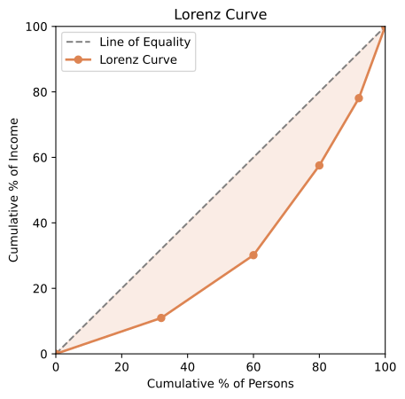
Lorenz curve of income distribution -
🎓Unlock everything free for 14 days
- ✓Full step-by-step solutions
- ✓Concept-first explanations
- ✓Methods, shortcuts & mistakes
- ✓PYQ mapping + timed mock tests
Full access for 14 days. No credit card required.