Economics · Ch 5 — Market Equilibrium
Market Equilibrium: Fixed Number of Firms
Market Equilibrium: Fixed Number of Firms
Market Equilibrium with a Fixed Number of Firms
In a perfectly competitive market, the number of firms is assumed to be fixed in the short run. This means no new firms can enter the industry, and no existing firms can leave. The market supply curve, therefore, is simply the horizontal sum of the individual supply curves of these fixed firms — exactly as derived in Chapter 4. The market demand curve, from Chapter 2, is the horizontal sum of all individual consumers' demand curves.
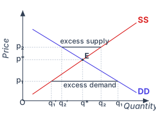
Equilibrium occurs at the price where the quantity consumers want to buy exactly equals the quantity firms want to sell. Graphically, this is the point where the market demand curve (DD) and the market supply curve (SS) intersect.
Drawn by us to help you understand the concept clearly, and verified to make sure it's accurate. For exams, practice from your textbook's own diagram.
The figure is a single two-dimensional graph. Price is measured on the vertical axis, and Quantity is measured on the horizontal axis. Two curves are drawn: a downward-sloping market demand curve labelled DD (indigo) and an upward-sloping market supply curve labelled SS (red). These two curves intersect at a single point labelled E. From point E, dashed lines drop vertically to the quantity axis and horizontally to the price axis, marking the equilibrium quantity q* and the equilibrium price p*.
Two additional horizontal lines are drawn to illustrate disequilibrium. A higher price p₂ is shown above p*. At this price, the demand curve DD lies to the left of the supply curve SS. The quantity demanded at p₂ is labelled q₂′ (on the demand curve), and the quantity supplied is labelled q₂ (on the supply curve). The horizontal gap between q₂′ and q₂ on the quantity axis represents excess supply. A lower price p₁ is shown below p*. Here, the supply curve SS lies to the left of the demand curve DD. The quantity supplied at p₁ is labelled q₁′ (on the supply curve), and the quantity demanded is labelled q₁ (on the demand curve). The horizontal gap between q₁′ and q₁ represents excess demand.
What the figure teaches …
Figure 5.1 (described in words): The vertical axis is labelled "Price" and the horizontal axis "Quantity". The demand curve DD slopes downward from left to right. The supply curve SS slopes upward from left to right. They intersect at a single point. The price corresponding to this intersection is called the equilibrium price, denoted . The quantity at this point is the equilibrium quantity, denoted .
What Happens Away from Equilibrium?
If the prevailing market price is above , say at in the figure, the quantity supplied () exceeds the quantity demanded (). This creates a situation of excess supply (a surplus). Firms cannot sell all they want to at this price. To clear their unsold stock, some firms will lower their price. As the price falls, two things happen simultaneously: consumers increase their quantity demanded, and firms reduce their quantity supplied. This process continues until the price reaches , where the surplus disappears.
If the prevailing market price is below , say at , the quantity demanded () exceeds the quantity supplied (). This creates excess demand (a shortage). Some consumers cannot buy the good at all, or cannot buy as much as they want. They will bid the price up. As the price rises, quantity demanded falls and quantity supplied rises. The market moves toward , where the shortage is eliminated.
The equilibrium price is the only price at which the plans of buyers and sellers are mutually consistent. At any other price, market forces (price adjustment) push the price toward .
Worked Example: The Wheat Market
The textbook provides a concrete numerical example to illustrate these concepts.
The Market for Wheat
Consider a market with many identical farms producing wheat. The market demand and supply curves are given by:
Where and are in kilograms, and is the price in rupees per kg. For prices below ₹10, supply is zero; for prices above ₹200, demand is zero.
Finding Equilibrium
At equilibrium, quantity demanded equals quantity supplied. Set :
Rearranging:
So the equilibrium price is ₹40 per kg.
To find the equilibrium quantity , substitute into either equation:
The equilibrium quantity is 160 kg.
Checking for Excess Demand and Excess Supply
-
At a price below equilibrium, say :
- Excess demand = kg. Algebraically, excess demand . For any , .
-
At a price above equilibrium, say :
- Excess supply = kg. Algebraically, excess supply . For any , .
A common mistake is to confuse excess demand with the quantity demanded. Excess demand is the difference between quantity demanded and quantity supplied at a given price, not the quantity demanded itself.
Wage Determination in the Labour Market
The same demand–supply framework can be applied to the market for labour, with one important role-reversal. In the goods market households demand and firms supply; in the labour market it is the opposite — households are the suppliers of labour and firms are the source of demand. Here "labour" means the hours of work provided, not the number of workers. The equilibrium wage rate is set where the demand and supply curves of labour intersect.
The demand for labour. Assume labour is the only variable input and the firm is a price-taker in both the goods and labour markets, so it takes the wage rate as given. A profit-maximising firm hires labour up to the point where the extra cost of the last unit of labour equals the extra benefit it brings. The extra cost is the wage rate ; the extra benefit is the marginal revenue product of labour () — the marginal product of labour () multiplied by the marginal revenue earned on that output. Hence the firm employs labour until
For a perfectly competitive firm marginal revenue equals the price of the commodity, so the marginal revenue product of labour equals the value of the marginal product of labour, . As long as exceeds the wage, hiring one more unit of labour raises profit; if is below the wage, cutting a unit raises profit. Because of the law of diminishing marginal product, keeping as the wage rises requires a higher , which means employing less labour — so each firm's labour-demand curve, and hence the market demand curve for labour, slopes downward.
The supply of labour. A household's labour-supply decision is essentially a choice between income and leisure. When the wage rises, two opposing forces act: the higher opportunity cost of leisure makes leisure costlier and encourages more hours of work, while the higher purchasing power encourages the household to enjoy more leisure and work fewer hours. At low wage rates the first effect dominates, so the individual supplies more labour as the wage rises; at high wage rates the second dominates, so the individual supplies less — giving a backward-bending individual labour supply curve. Aggregating across individuals, however, the market supply curve of labour is upward sloping, because a higher wage draws many more individuals into work even if some existing workers choose fewer hours.
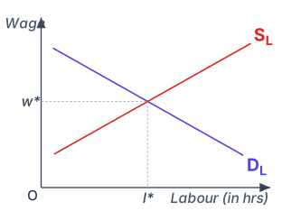
Equilibrium. With a downward-sloping market demand curve for labour () and an upward-sloping market supply curve (), the equilibrium wage and equilibrium quantity of labour are determined where the two curves intersect — where the labour households wish to supply equals the labour firms wish to hire.
Drawn by us to help you understand the concept clearly, and verified to make sure it's accurate. For exams, practice from your textbook's own diagram.
The equilibrium wage rate is set where the demand for labour by firms exactly balances the supply of labour by households: at the wage w*, firms wish to hire exactly the l* hours of work that households wish to supply. At any higher wage the surplus of labour would push the wage down, and at any lower wage the shortage would bid it up - the same market-clearing logic as …
Shifts in Demand and Supply
The analysis so far assumed that all other factors (tastes, income, technology, input prices, etc.) remain constant. When these factors change, the demand curve or the supply curve shifts, leading to a new equilibrium.
Shift in Demand
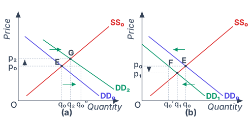
Figure 5.2 (described in words): Two panels are shown. In both, the initial equilibrium is at point E, where demand curve and supply curve intersect, giving price and quantity .
Drawn by us to help you understand the concept clearly, and verified to make sure it's accurate. For exams, practice from your textbook's own diagram.
Figure 5.2 is split into two panels, (a) and (b), placed side by side. Both panels share the same axes: price on the vertical axis and quantity on the horizontal axis. In each panel, a single upward-sloping market supply curve is drawn and labelled SS₀. This supply curve does not move — it stays fixed throughout the figure. The only thing that changes between the two panels is the position of the demand curve.
In both panels, the initial equilibrium is marked at point E, where the original demand curve DD₀ intersects SS₀. At E, the equilibrium price is p₀ and the equilibrium quantity is q₀.
Panel (a) shows a rightward shift of demand. The demand curve moves from DD₀ to DD₂ (drawn in green, with arrows pointing to the right). At the original price p₀, the new demand curve DD₂ now lies to the right of the old one, meaning consumers want to buy more than before at that same price. The quantity demanded at p₀ on DD₂ is labelled q₀″, while the quantity supplied remains at q₀. This creates an excess demand equal to the horizontal distance from q₀ to q₀″. Because of this shortage, price is pushed up. The new equilibrium is at point G, where DD₂ crosses SS₀. At G, the new equilibrium price is p₂ (higher than p₀) and the new equilibrium quantity is q₂ (greater than q₀). So a rightward demand shift raises both price and quantity.
Panel (b) shows a leftward shift of demand. The demand curve moves from DD₀ to DD₁. At the original price p₀, the new demand curve DD₁ lies to the left, so the quantity demanded at p₀ is now q₀′ — less than the quantity supplied q₀. This creates an excess supply equal to the distance from q₀′ to q₀. Firms respond by cutting price. The new equilibrium is at point F, where DD₁ meets SS₀. At F, the equilibrium price is p₁ (lower than p₀) and the equilibrium quantity is q₁ (less than q₀). A leftward demand shift reduces both price and quantity. …
-
Panel (a) – Rightward shift of demand: The demand curve shifts to . At the original price , there is now excess demand (the quantity demanded at exceeds the quantity supplied at ). Price rises. The new equilibrium is at point G, with a higher price and a higher quantity . Both price and quantity increase.
-
Panel (b) – Leftward shift of demand: The demand curve shifts to . At , there is excess supply. Price falls. The new equilibrium is at point F, with a lower price and a lower quantity . Both price and quantity decrease.
When only demand shifts (supply unchanged), price and quantity always move in the same direction.
Examples of Demand Shifts:
-
Increase in consumers' income (normal good): For a normal good like clothes, higher income means consumers want to buy more at every price. The demand curve shifts rightward. The supply curve is unaffected (income does not directly affect firms' production decisions). The result: higher equilibrium price and higher equilibrium quantity.
-
Increase in the number of consumers: More buyers in the market means greater demand at each price. Again, the demand curve shifts rightward, supply unchanged. Equilibrium price and quantity both rise.
Shift in Supply
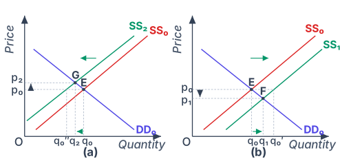
Figure 5.3 (described in words): Again, two panels. Initial equilibrium at E with demand and supply , price , quantity .
Drawn by us to help you understand the concept clearly, and verified to make sure it's accurate. For exams, practice from your textbook's own diagram.
Figure 5.3 is split into two panels, (a) and (b), and both panels share the same initial setup. In each panel, you see a standard demand-and-supply diagram with price on the vertical axis and quantity on the horizontal axis. The initial market demand curve is labelled DD₀ and the initial market supply curve is labelled SS₀. These two curves intersect at point E, which marks the original equilibrium. At E, the equilibrium price is p₀ and the equilibrium quantity is q₀. This is the starting point before any shift occurs.
Now look at panel (a). Here, the supply curve shifts leftward — from SS₀ to a new curve labelled SS₂. The demand curve DD₀ does not move; it stays fixed. The leftward shift means that at every price, firms are willing to supply less than before. At the original price p₀, this creates a shortage (excess demand) because the quantity demanded at p₀ is now greater than the quantity supplied. The market responds by pushing the price upward. The new equilibrium is at point G, where the new supply curve SS₂ crosses the unchanged demand curve DD₀. At G, the new equilibrium price is p₂ (higher than p₀) and the new equilibrium quantity is q₂ (lower than q₀). So the arrow of change points up and to the left: price rises, quantity falls.
Panel (b) shows the opposite case. Here, the supply curve shifts rightward — from SS₀ to SS₁. Again, demand stays at DD₀. A rightward shift means firms are willing to supply more at each price. At the original price p₀, there is now a surplus (excess supply). Firms cut prices to sell their extra output, and the market moves to a new equilibrium at point F, where SS₁ meets DD₀. At F, the new equilibrium price is p₁ (lower than p₀) and the new equilibrium quantity is q₁ (higher than q₀). The arrow of change here points down and to the right: price falls, quantity rises. …
-
Panel (a) – Leftward shift of supply: The supply curve shifts to . At , there is excess demand. Price rises. The new equilibrium is at point G, with a higher price and a lower quantity . Price rises, quantity falls.
-
Panel (b) – Rightward shift of supply: The supply curve shifts to . At , there is excess supply. Price falls. The new equilibrium is at point F, with a lower price and a higher quantity . Price falls, quantity rises.
When only supply shifts (demand unchanged), price and quantity move in opposite directions.
Examples of Supply Shifts:
-
Increase in input price: If the price of a key input (e.g., fertiliser for wheat) rises, firms' marginal costs increase. At every price, they are willing to supply less. The supply curve shifts leftward. Demand is unaffected. The result: higher equilibrium price, lower equilibrium quantity.
-
Increase in the number of firms: More firms in the market means more output supplied at each price. The supply curve shifts rightward. Demand unchanged. The result: lower equilibrium price, higher equilibrium quantity.
Simultaneous Shifts of Demand and Supply …
Drawn by us to help you understand the concept clearly, and verified to make sure it's accurate. For exams, practice from your textbook's own diagram.
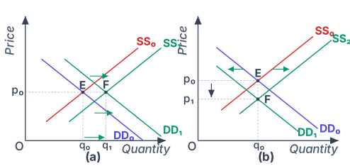
Figure 5.4 is a two-panel diagram that shows what happens to market equilibrium when both the demand curve and the supply curve shift at the same time. Each panel starts from the same initial equilibrium, labelled E, where the original demand curve DD₀ and the original supply curve SS₀ intersect. That intersection gives an initial equilibrium price p₀ and quantity q₀.
Panel (a) shows both curves shifting to the right. The demand curve moves from DD₀ to DD₁, and the supply curve moves from SS₀ to SS₁. Both shifts are drawn with green arrows pointing rightward. The new equilibrium is at point F, where DD₁ and SS₁ intersect. Crucially, this new equilibrium lies exactly at the same price level as the old one — p₀ — but at a higher quantity, q₁. The movement from E to F is purely horizontal. What this teaches is that when demand and supply increase by exactly the right proportions, the price can stay unchanged while the market clears at a larger output. In the real world, this might happen when, say, a new technology lowers production costs (shifting supply right) at the same time that consumer incomes rise (shifting demand right), and the two forces balance out on price.
Panel (b) shows a different combination: supply shifts rightward (from SS₀ to SS₂) while demand shifts leftward (from DD₀ to DD₁). Again, green arrows indicate the direction of each shift. The new equilibrium is at point F, where SS₂ and DD₁ intersect. This time, the equilibrium moves vertically downward from E to F: the quantity stays the same at q₀, but the price falls from p₀ to p₁. This illustrates that when supply increases and demand decreases simultaneously, the opposing forces on quantity can cancel out, leaving the quantity unchanged while the price drops. A real-world example would be a bumper harvest (supply increases) occurring at the same time as a fall in consumer preference for that crop (demand decreases) — the amount sold might not change, but the price will be lower. …