Mathematics and Statistics · Ch 14 — Correlation
Scatter Diagram
2
Scatter Diagram
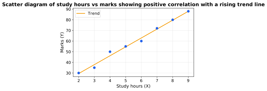
The simplest way to see correlation is to plot the paired observations as points on a graph, with one variable on the horizontal () axis and the other on the vertical () axis. The resulting cloud of points is called a scatter diagram (or dot diagram). Its shape reveals the direction, degree and form of the relationship at a glance — before any formula is used.
Reading a scatter diagram:
- If the points rise from lower-left to upper-right, the correlation is positive.
- If the points fall from upper-left to lower-right, the correlation is negative.
- The more tightly the points hug an imaginary straight line, the stronger (higher) the correlation; a widely scattered cloud means weak correlation.
- If the points all lie exactly on a rising line, correlation is perfect positive; on a falling line, perfect negative.
- A shapeless, patternless swarm (or a horizontal/vertical band) indicates no correlation.
Note
Merit and limitation …
Definition 1Scatter diagram
A graph of the paired observations plotted as points, used to judge the direction and degree of c …