Economics · Ch 10 — Presentation of Data
Frequency Polygon
Frequency Polygon
A frequency polygon is a plane figure bounded by straight lines — an alternative to the histogram, and in fact derived from it. The simplest way to draw it is to join the midpoints of the tops of the consecutive rectangles of the histogram with straight lines.
Doing only that leaves the two ends hanging above the base line, which prevents the area under the figure from being measured. So the two end points are brought down to the base line at the midpoints of the two adjoining classes that have zero frequency, one just before the first class and one just after the last; broken lines or dots may make these final joins. The total area then enclosed equals the total frequency (sample size), just as the histogram's area does. …
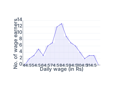
Drawn by us to help you understand the concept clearly, and verified to make sure it's accurate. For exams, practice from your textbook's own diagram.
A frequency polygon for the same 85-wage-earner data, drawn over the histogram. It is formed by joining the mid-points of the tops of the rectangles with straight lines, then bringing both ends down to the base at the mid-values of the empty classes just outside the range, so the figure closes onto the axis. The rise to a peak near the 80–84 class and fall away on either side show the sha …