Economics · Ch 6 — Correlation
Scatter Diagram
Scatter Diagram
A scatter diagram is a simple visual technique for examining the form of a relationship without computing any number. The paired values of the two variables are plotted as points on graph paper; the way the cloud of points lies then reveals the nature of the relationship.
Two features of the plot matter: how closely the points cluster and their overall direction.
- If all the points lie exactly on a line, the correlation is perfect (said to be in unity).
- If the points are widely dispersed, the correlation is low.
- The correlation is called linear when the points lie on or near a straight line.
The textbook's figures 6.1 to 6.7 illustrate the range of possibilities:
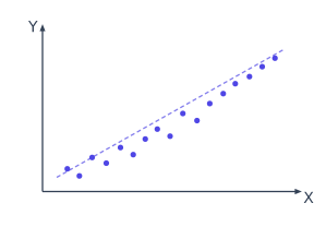
- Fig. 6.1 (Positive correlation): points scattered around an upward-rising line — when X rises, Y rises.
Drawn by us to help you understand the concept clearly, and verified to make sure it's accurate. For exams, practice from your NCERT textbook's own diagram.
The figure is a simple scatter plot with a single panel. The horizontal axis is labelled and the vertical axis is labelled . A set of points is plotted, and these points cluster around an upward-sloping straight line that runs from the bottom-left corner of the plot toward the top-right corner. The line itself is not necessarily drawn through every point, but the points clearly follow its general direction.
The physical idea is straightforward: as the value of increases, the value of also tends to increase. This is the defining pattern of positive correlation — the two variables move in the same direction. The scatter is not perfectly tight; the points show some spread around the imaginary line, which tells you the relationship is not exact. But the upward tilt is unmistakable.
The textbook uses this figure to introduce the concept of correlation visually before moving to the numerical measure. The key formula that follows from this idea is Karl Pearson’s coefficient of correlation:
Here, and are the individual observations of the two variables, and and are their respective arithmetic means. The numerator measures how the two variables co-vary — when a point is above the mean in , is it also above the mean in ? The denominator normalises this co-variation by the total spread of each variable, so that always lies between and . For the pattern in Fig. 6.1, would be positive (likely somewhere between and , depending on how tightly the points cluster). …
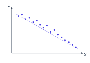
- Fig. 6.2 (Negative correlation): points scattered around a downward-sloping line — when X rises, Y falls.
Drawn by us to help you understand the concept clearly, and verified to make sure it's accurate. For exams, practice from your NCERT textbook's own diagram.
The figure is a simple scatter plot with a downward-sloping pattern. The horizontal axis is labelled and the vertical axis is labelled . Each point on the plot represents a pair of values from a dataset. The points do not lie on a straight line, but they clearly cluster along a line that falls from the top-left corner of the plot toward the bottom-right corner.
The physical idea is straightforward: as the value of increases, the value of tends to decrease. This is the visual signature of a negative relationship between two variables. The textbook uses this figure to introduce the concept of negative correlation — a situation where two variables move in opposite directions. For example, if is the price of a commodity and is its quantity demanded (other things being equal), you would expect a scatter plot that looks like this.
The key formula developed alongside this figure is the Karl Pearson coefficient of correlation, , which quantifies the strength and direction of the linear relationship shown in the plot. The formula is:
Here, and are the individual data points for the two variables. and are their respective arithmetic means. The numerator is the sum of the products of the deviations of each variable from its mean — this is called the covariance. The denominator is the product of the standard deviations of and , which normalises the covariance so that always lies between and .
For a plot like Fig. 6.2, where the points slope downward, the value of will be negative. The more tightly the points cluster around a straight line, the closer will be to . If the points were scattered randomly with no downward trend, would be close to . The figure therefore serves as the visual anchor for understanding what a negative value of actually looks like in data. …
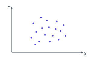
- Fig. 6.3 (No correlation): no rising or falling line about which the points cluster.
Drawn by us to help you understand the concept clearly, and verified to make sure it's accurate. For exams, practice from your NCERT textbook's own diagram.
What Fig. 6.3 Shows
The figure presents a simple scatter plot with no visible pattern. On the horizontal axis (x-axis) is one variable, say , and on the vertical axis (y-axis) is another variable, say . The points are scattered across the plot area in a way that resembles a random cloud — they do not cluster along any line, curve, or trend. There is no upward slope, no downward slope, and no systematic shape like a curve or a cluster. The points appear to be distributed roughly evenly across the entire range of both axes.
This is the visual definition of zero correlation: the two variables move independently of each other. Knowing the value of gives you no information about what might be. For example, if is the shoe size of students and is their marks in a test, you would expect a plot like this — there is no logical connection between the two.
The Physical Idea
The core concept is that correlation measures the strength and direction of a linear relationship between two variables. When the scatter plot shows no pattern at all, the correlation coefficient is zero (or very close to zero). This does not mean the variables are unrelated in every possible way — they could have a non-linear relationship, like a U-shaped curve, which would also give a correlation coefficient near zero. But for the linear relationship that Karl Pearson's formula measures, Fig. 6.3 represents the case of complete independence.
A correlation coefficient of zero does not mean the variables are unrelated. It only means there is no linear relationship. Two variables could be perfectly related in a non-linear way (e.g., ) and still have .
The Key Formula
The textbook develops Karl Pearson's coefficient of correlation using this figure as the baseline case. The formula is:
Where:
- and are the individual values of the two variables
- and are their respective means
- The numerator is the covariance of and — it measures how they vary together
- The denominator is the product of the standard deviations of and — it normalises the covariance to a scale from to …
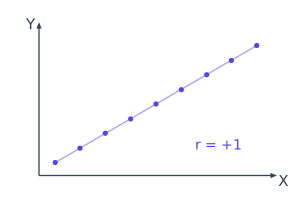
- Fig. 6.4 and Fig. 6.5 (Perfect positive and perfect negative correlation): the points lie exactly on an upward or downward line.
Drawn by us to help you understand the concept clearly, and verified to make sure it's accurate. For exams, practice from your NCERT textbook's own diagram.
The figure is a simple scatter plot with a straight line drawn through the points. The horizontal axis is labelled and the vertical axis is labelled . Every point in the plot lies exactly on a single straight line that slopes upward from the bottom-left corner to the top-right corner. There is no scatter — the points are perfectly aligned. The line itself is not a curve; it is a straight line with a positive slope.
The physical idea is the strictest possible form of a relationship between two variables: when one variable increases, the other increases in a fixed proportion with no exceptions. If you know the value of , you can predict the value of with absolute certainty because every observation falls on that line. This is what "perfect positive correlation" means — the correlation coefficient equals exactly .
Perfect positive correlation () means all data points lie exactly on an upward-sloping straight line. There is no deviation whatsoever.
The textbook uses this figure to introduce the concept of the correlation coefficient as a measure of the linear relationship between two variables. The key formula that the figure illustrates is the Pearson product-moment correlation coefficient:
Here, and are the individual data values for the -th observation, is the mean of all values, and is the mean of all values. The numerator measures how the two variables co-vary — when a point is above its mean on , is it also above its mean on ? The denominator is the product of the standard deviations of and , which scales the result so that always lies between and . …
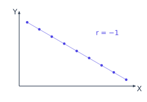
Drawn by us to help you understand the concept clearly, and verified to make sure it's accurate. For exams, practice from your NCERT textbook's own diagram.
What Fig. 6.5 Shows
The figure presents a scatter diagram with a single downward-sloping straight line passing through all the plotted points. On the horizontal axis (the -axis) we have one variable, say ; on the vertical axis (the -axis) we have the other variable, . Every point in the plot lies exactly on the line — there is no scatter, no deviation, no gap between any point and the line.
The line itself runs from the top-left corner of the plotting area to the bottom-right corner. As increases, decreases in a perfectly regular, proportional way. The caption tells you this is perfect negative correlation.
The Physical Idea
The figure teaches one core idea: when two variables are perfectly negatively correlated, knowing the value of one tells you the exact value of the other, and the relationship is inverse. If goes up by one unit, goes down by a fixed amount every time. There is no randomness, no other factor interfering — the points form a perfect straight line with a negative slope.
This is the extreme opposite of perfect positive correlation (where all points lie on an upward-sloping line). In real data you almost never see perfect correlation of either sign; the figure exists to show you the boundary case, the theoretical maximum strength of a negative linear relationship.
Perfect negative correlation means the Pearson correlation coefficient equals exactly . This is the lowest possible value of ; no correlation can be more negative than this.
The Key Formula Developed with This Figure
The textbook uses this figure to illustrate the Karl Pearson's correlation coefficient formula and to show what happens when the relationship is perfectly linear and inverse. The formula is:
where:
- and are the individual observations of the two variables
- and are their respective arithmetic means
- The numerator is the sum of the products of deviations from the means (the covariance)
- The denominator is the product of the standard deviations of and
When all points lie exactly on a downward-sloping straight line, the numerator equals the negative of the denominator in magnitude, so the fraction simplifies to .
A simpler computational form that the textbook often uses alongside this figure is:
Here is the number of pairs of observations. For the data plotted in Fig. 6.5, this formula also yields exactly .
What the Figure Does Not Show …
- Fig. 6.6 and Fig. 6.7 (Non-linear relations): points follow a clear curve, positive or negative, rather than a straight line.
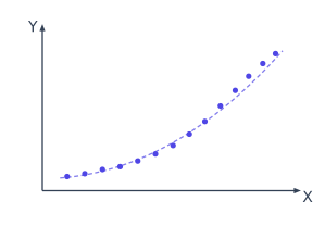
Drawn by us to help you understand the concept clearly, and verified to make sure it's accurate. For exams, practice from your NCERT textbook's own diagram.
The figure shows a simple scatter plot with two axes. The horizontal axis is labelled and the vertical axis is labelled . The plotted points do not lie on a straight line, but they follow a clear upward curve — as increases, also increases, but not at a constant rate. The curve rises slowly at first and then more steeply, or vice versa, depending on the specific shape drawn. The key visual fact is that the points cluster around a smooth, rising curve, not around a straight line.
This diagram teaches a critical distinction: correlation measures the strength and direction of a relationship, but it does not require that relationship to be linear. A positive non-linear relation means that when one variable goes up, the other tends to go up as well, but the amount of change in for each unit change in is not fixed. For example, the relationship between the age of a tree and its height is positive but non-linear — a sapling grows quickly at first, then more slowly as it matures.
A common mistake is to think that a low or zero value of Pearson's correlation coefficient means there is no relationship at all. This figure shows the opposite: a strong, clear positive relationship can exist even when is small, because only measures linear association. Always plot the data first.
The textbook uses this figure to introduce the idea that the standard Pearson correlation coefficient is not the only measure of association. The formula for Pearson's is:
…
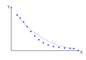
Drawn by us to help you understand the concept clearly, and verified to make sure it's accurate. For exams, practice from your NCERT textbook's own diagram.
The figure shows a scatter plot with two variables. On the horizontal axis we have the independent variable, usually labelled , and on the vertical axis the dependent variable, labelled . The points are not scattered randomly; they trace a clear curved path that falls from left to right. As increases, first decreases steeply, then the decrease slows, and eventually the curve flattens out. The points cluster tightly around this curve, so the relationship is strong, but it is not a straight line — it is a curve that slopes downward overall.
The key idea the figure teaches is that correlation does not have to be linear. A negative relationship means that as one variable goes up, the other tends to go down. But the rate at which it goes down can change. Here the relationship is negative (downward trend) and non-linear (the points follow a curve, not a line). The Pearson correlation coefficient measures only the strength of a linear relationship. If you compute for this data, you will get a value less than ? No — is always between and . But because the relationship is curved, will be closer to than the actual strength of the association suggests. The figure warns you: a low does not mean no relationship; it means no linear relationship.
A common mistake is to think that a Pearson near zero means the variables are unrelated. This figure shows the opposite: a strong, systematic negative relationship that is simply not straight. Always plot the data first.
The textbook uses this figure to introduce the idea that the Pearson correlation coefficient is only appropriate for linear patterns. The formula for is:
where and are the individual data points, and are their respective means, and the sums run over all observations. The numerator measures how and vary together (covariance), and the denominator normalises by their individual spreads. For a curved pattern like the one in the figure, the deviations from the means do not align in a consistent linear way, so the numerator is smaller than it would be for a straight-line fit of the same strength. The result is a misleadingly low . …
…