Informatics Practices · Ch 4 — Plotting Data using Matplotlib
Plotting using Matplotlib
Plotting using Matplotlib
The Purpose of Matplotlib
Matplotlib is a Python library used to create static, animated, and interactive 2D plots or figures. It is the standard tool for data visualisation in Python. To install it, you run the following command from your command prompt:
pip install matplotlib
Once installed, you need to import its pyplot module before you can start plotting. The standard way to do this is:
import matplotlib.pyplot as plt
Here, plt is an alias (a short alternative name) for matplotlib.pyplot. You can choose any alias you like, but plt is the convention used by almost all Python programmers.
Understanding the Components of a Plot
The pyplot module contains a collection of functions that let you build and modify a plot step by step. The central function is plot(), which creates a figure. A figure is the overall window or canvas where everything is drawn. Inside a figure, you will find several components:
- A plotting area (the actual chart)
- Axis labels (descriptions for the x-axis and y-axis)
- Ticks (the small marks along the axes that show scale)
- A title (a heading for the chart)
- A legend (a key that explains what different lines or markers represent)
Each function in pyplot makes a specific change to the figure. For example, one function creates the figure, another creates the plotting area, another plots lines, and others add labels or a title.
The Importance of Clear Presentation
When you present data through charts, it is essential that the information is easily understood. Therefore, you should always:
- Give the chart a clear title
- Label both the x-axis and y-axis
- Provide a legend if you have more than one set of data plotted
Basic Plotting: x versus y
To plot one set of values against another, you write:
plt.plot(x, y)
Here, x is the list of values for the horizontal axis, and y is the list of values for the vertical axis. After you have created the plot, you must call plt.show() to display the figure on your screen.
A Worked Example: Temperature Over Three Days
Consider a city where the maximum temperature is recorded for three consecutive days. The following program demonstrates how to plot these temperature values:
import matplotlib.pyplot as plt

# List storing dates in string format
date = ["25/12", "26/12", "27/12"]

# List storing temperature values
temp = [8.5, 10.5, 6.8]

# Create a figure plotting temperature versus date
plt.plot(date, temp)

# Show the figure
plt.show()
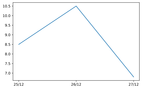
In this program, plot() is given two parameters. The first parameter (date) provides the values for the x-axis, and the second parameter (temp) provides the values for the y-axis. The x and y ticks are displayed automatically based on the data you provide.
By default, the plot() function draws a line chart, as shown in the output of this program.
Saving a Plot
You can save the figure you have created in two ways:
- Manually: Click the save button on the output window that appears when you run
plt.show(). - Programmatically: Use the
savefig()function. Pass the desired filename (including the extension) as a parameter. For example:plt.savefig('x.png')
This saves the plot as an image file in your current working directory.
Different Types of Plots
The plot() function is just one of many plotting methods available in pyplot. The choice of plot depends on the type of data you have. The table below lists the main functions for creating different kinds of charts: …
Drawn by us to help you understand the concept clearly, and verified to make sure it's accurate. For exams, practice from your NCERT textbook's own diagram.
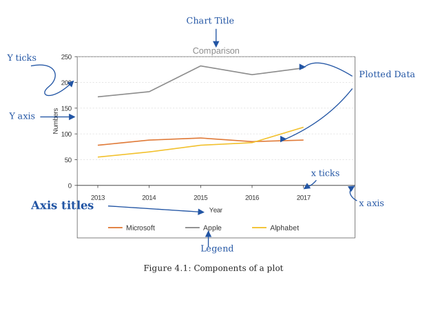
Figure 4.1 is a labelled schematic — a diagram, not a real plot — that shows the anatomy of a single matplotlib figure. It is the standard reference for what each part of a plotted chart is called.
At the outermost level, the entire window that appears on screen is labelled the figure. This is the container that holds everything else. Inside the figure, there is a rectangular region called the plotting area (or axes area) — this is where the actual data lines, bars, or markers are drawn. The plotting area is bounded by two perpendicular lines: the horizontal line at the bottom is the x-axis, and the vertical line on the left is the y-axis. Each axis has small marks along it called tick marks (or simply ticks), and next to each tick is a numeric or categorical label — these are the tick labels. The axes themselves are named with descriptive text: the x-axis label (e.g., "Date") and the y-axis label (e.g., "Temperature (°C)") are placed alongside their respective axes.
Above the plotting area, centred, is the title of the chart — a short heading that tells the viewer what the plot is about. If the plot contains more than one line or set of data, a legend box appears somewhere inside the plotting area (often in an empty corner). The legend uses small coloured markers or line samples to identify each dataset, with a corresponding label.
The diagram also shows that the figure can contain other elements like gridlines (though not always drawn), and that the entire figure — including the title, axes, ticks, legend, and plotting area — is one cohesive object that can be saved or displayed as a single image. …
Plotting Temperature against Height -- plot the maximum temperature recorded over three consecutive days as a line chart. This is the chapter's first plot: a bare plt.plot(date, temp) with no c …
Drawn by us to help you understand the concept clearly, and verified to make sure it's accurate. For exams, practice from your NCERT textbook's own diagram.
The chapter's first plot: everything here comes from a single plt.plot() call on two Python lists — the dates and their temperatures — followed by plt.show(). The figure teaches two lessons at once. First, how little code matplotlib needs to turn raw numbers into a picture: the rise on 26/12 and the sharp drop on 27/12 are instantly visible. Second, what a chart loses without customisation — no title, no axis labels, no grid, no legend — so a viewer can …
| Function | Description |
|---|---|
| plot(*args[, scalex, scaley, data]) | Plot x versus y as lines and/or markers. |
| bar(x, height[, width, bottom, align, data]) | Make a bar plot. |
| boxplot(x[, notch, sym, vert, whis, ...]) | Make a box and whisker plot. |
| hist(x[, bins, range, density, weights, ...]) | Plot a histogram. |
| pie(x[, explode, labels, colors, autopct, ...]) | Plot a pie chart. |