Economics · Ch 4 — Determination of Income and Employment
Macroeconomic Equilibrium with Price Level Fixed
Macroeconomic Equilibrium with Price Level Fixed
The Consumption Function in Graph Form
The consumption function is given by the equation:
Here, is the autonomous consumption — the level of consumption that would occur even if income were zero. The symbol is the marginal propensity to consume (MPC), which tells us how much consumption changes when income changes by one unit.
To draw this on a graph, we use the standard intercept form of a straight line: .
Drawn by us to help you understand the concept clearly, and verified to make sure it's accurate. For exams, practice from your textbook's own diagram.
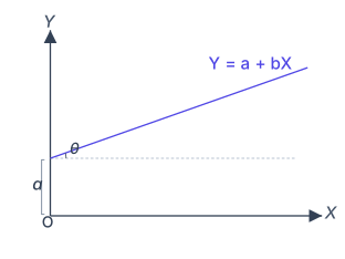
Fig. 4.1 is a generic illustration of the intercept form of a linear equation — the algebraic form the chapter uses to draw the consumption function, the investment function and the aggregate demand line.
The horizontal axis is labelled and the vertical axis is labelled ; the two variables are related by the straight line
where and are constants. The line rises from left to right and meets the vertical () axis at a point above the origin. That point is the intercept — the value of when — and in the figure it is marked by a small brace on the axis. The constant is the slope of the line: the figure shows the angle that the line makes with the horizontal, and .
is the vertical intercept (the value of at ) and is the slope. …
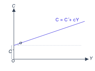
In our consumption function, the vertical axis measures consumption () and the horizontal axis measures income (). The intercept on the vertical axis is — this is the value of when . The slope of the line is , which equals where is the angle the line makes with the horizontal axis.
Drawn by us to help you understand the concept clearly, and verified to make sure it's accurate. For exams, practice from your textbook's own diagram.
Fig. 4.2 in the NCERT textbook is a simple two-dimensional graph that shows how consumption spending () depends on the level of income () when the consumption function has a positive intercept. The vertical axis is labelled Consumption () and the horizontal axis is labelled Income (). The figure contains a single straight line that slopes upward from left to right, but it does not pass through the origin — it meets the vertical axis at a point above zero.
That point on the vertical axis is labelled (read as "C-bar" or "autonomous consumption"). It represents the amount of consumption that occurs even when income is zero. The line itself is the consumption function and is drawn with a constant slope. The slope of this line is the marginal propensity to consume (MPC), denoted by or in the textbook. The line continues upward and to the right, showing that as income increases, consumption also increases — but by a smaller amount than the increase in income, because the slope is less than 1.
The physical idea the figure teaches is that consumption has two parts: a fixed part that does not depend on income (autonomous consumption, ) and a variable part that does depend on income (induced consumption, which is ). The total consumption at any income level is the sum of these two. The graph makes this additive relationship visually clear — the intercept is , and for any income level , the height of the line above the horizontal axis is .
The key formula the textbook develops with this figure is the linear consumption function:
where:
- = total consumption expenditure
- = autonomous consumption (the vertical intercept; consumption when )
- = marginal propensity to consume (MPC), the slope of the line; it is a positive fraction less than 1
- = level of income (or output)
The intercept is what makes this consumption function different from a proportional one. If , the line would pass through the origin and consumption would be strictly proportional to income. The positive intercept captures the idea that households must consume some minimum amount even with zero income — they dissave by borrowing or using past savings. …
The consumption function is a straight line because the relationship between consumption and income is assumed to be linear in this basic model. The slope is constant, meaning every additional rupee of income leads to the same increase in consumption.
The Investment Function in Graph Form
In a two-sector model (households and firms), there are two sources of final demand: consumption and investment. The investment function is written as:
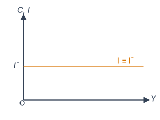
This means investment is autonomous — it does not depend on the level of income. On a graph with income on the horizontal axis and investment on the vertical axis, this appears as a horizontal straight line at a height equal to above the horizontal axis. No matter what the level of income is, investment remains the same.
Drawn by us to help you understand the concept clearly, and verified to make sure it's accurate. For exams, practice from your textbook's own diagram.
Fig. 4.3 in the NCERT textbook is a simple two-dimensional graph that illustrates the investment function under the assumption that investment is entirely autonomous — that is, it does not depend on the current level of income or output.
The vertical axis is labelled Investment (I). The horizontal axis is labelled Income (Y). Because investment is autonomous, the relationship between I and Y is a horizontal straight line. This line is drawn at a height equal to the fixed amount of autonomous investment, which the textbook denotes as . The line is labelled .
The physical idea is straightforward: in the simplest Keynesian model, firms are assumed to make investment decisions based on long-term expectations (the "animal spirits" of entrepreneurs) and the rate of interest, not on today's production level. So no matter what the current national income is — whether the economy is in a recession or a boom — planned investment spending remains constant at .
The term "autonomous" means self-governing. Autonomous investment is independent of income; it is not induced by changes in income. This contrasts with induced investment, which does respond to income changes (and is not considered in this basic model).
The key formula that this figure develops is the investment function itself:
where:
- = planned investment expenditure (a flow variable, measured in rupees per year)
- = autonomous investment, a positive constant (the intercept of the investment line on the vertical axis)
Because the line is horizontal, its slope is zero: . This tells us that a change in income produces no change in planned investment.
This figure is the foundation for the aggregate demand curve in the two-sector model (households and firms). Since (the consumption function) and , aggregate demand becomes , where is total autonomous expenditure. The horizontal investment line is what makes the vertical intercept of the AD curve equal to . …
Aggregate Demand: The Vertical Sum
The Aggregate Demand (AD) function shows the total planned expenditure in the economy at each level of income. Since there are only two components in this model, AD is simply consumption plus investment:
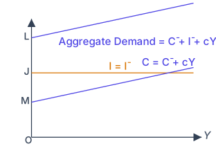
Graphically, we obtain the AD curve by vertically adding the consumption function and the investment function. On the diagram, if the vertical distance from the origin to the consumption line at any income level is , and the vertical distance from the consumption line to the investment line is , then the total height from the origin to the AD line is .
Drawn by us to help you understand the concept clearly, and verified to make sure it's accurate. For exams, practice from your textbook's own diagram.
Figure 4.4 in the NCERT textbook is a simple two-dimensional graph that shows how the economy’s total planned spending — aggregate demand — is built up from its two main components: consumption expenditure and investment expenditure. The entire point of the figure is to make the idea of vertical addition visually concrete.
The vertical axis is labelled Aggregate Demand (AD) (or sometimes just Expenditure), and the horizontal axis is labelled Output/Income (Y). Both axes start from zero. The 45° line from the origin is also drawn — it represents all points where aggregate demand equals output, and it serves as a reference line for equilibrium.
On this graph, two separate lines are drawn. The first is the consumption function, a straight line that slopes upward but with a slope less than 1. Its intercept on the vertical axis is positive — that intercept is autonomous consumption (), the amount people spend even when income is zero. The slope of this line is the marginal propensity to consume (MPC), denoted or in the textbook. So the consumption line is the graph of .
The second line is the investment function. In this simple model (the two-sector model with no government and no foreign trade), investment is treated as autonomous — it does not depend on current income. So the investment line is a horizontal straight line at height above the horizontal axis. It runs parallel to the income axis at a constant vertical distance.
Now comes the key visual move: the figure shows that the aggregate demand curve is obtained by vertically adding these two lines. At every level of income , you take the height of the consumption line and add the height of the investment line. Since investment is constant, the AD curve is simply the consumption line shifted upward by the amount . So the AD line has the same slope as the consumption line (MPC), but its intercept is larger: .
Here:
- = autonomous consumption (consumption when )
- = autonomous investment (investment, independent of )
- = marginal propensity to consume ()
- = national income / output
The figure therefore teaches a fundamental principle: aggregate demand is not a new, separate curve — it is the sum of the component spending curves. The vertical distance between the AD line and the consumption line at any income level is exactly , the constant investment. And the vertical distance between the consumption line and the horizontal axis at any income level is .
The 45° line is not part of the addition process — it is there to help you later find the equilibrium point where AD = Y. The figure 4.4 itself stops at showing how AD is constructed; the equilibrium is developed in the next figure. …
The AD line is parallel to the consumption function — they have the same slope . This is because investment is a constant, so adding it shifts the entire consumption line upward by the same amount at every income level.
The Aggregate Demand function shows ex ante demand — the planned or desired spending by households and firms before actual production takes place. This is the demand that will be compared with supply to determine equilibrium.
The Supply Side: The 45° Line
In microeconomics, the supply curve is drawn with price on the vertical axis and quantity on the horizontal axis. But here, in the first stage of macroeconomic theory, we are taking the price level as fixed. This means the overall price level does not change as output changes.
With the price level fixed, the aggregate supply (or GDP) is assumed to move smoothly up or down because there are unused resources of all types available. Whatever level of GDP is produced, that much will be supplied — and the price level plays no role in determining how much is supplied.
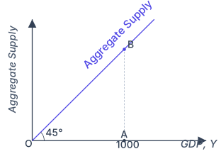
This kind of supply situation is shown by a 45° line drawn from the origin. The key feature of a 45° line is that every point on it has the same horizontal and vertical coordinates. For example, if GDP is ₹1,000 at point A on the horizontal axis, the vertical coordinate at that same point on the 45° line is also ₹1,000. So the supply corresponding to point A is found at point B — the intersection of the 45° line and the vertical line drawn upward from A.
Drawn by us to help you understand the concept clearly, and verified to make sure it's accurate. For exams, practice from your textbook's own diagram.
Fig. 4.5 shows the aggregate supply schedule of the fixed-price model as a single line. The vertical axis is labelled Aggregate Supply and the horizontal axis is labelled GDP, ; a straight line is drawn from the origin at to the horizontal axis and is itself labelled Aggregate Supply.
Why a line? In the first stage of the analysis the price level is taken as fixed and resources are assumed to be unused, so firms supply whatever quantity is demanded. Every point on a line has the same horizontal and vertical coordinate, so along this line aggregate supply is always exactly equal to GDP: whatever level of output is called for, that much is produced.
The figure illustrates this with one worked point. Suppose GDP is ₹1,000, marked as point A on the horizontal axis. The amount supplied is then also ₹1,000, shown at point B, which lies directly above A where the vertical line through A meets the line. A dashed vertical line from A up to B makes this correspondence explicit. …
The 45° line is a convenient way to show that aggregate supply equals GDP. At any point on this line, the value on the vertical axis (which represents what is supplied) is exactly equal to the value on the horizontal axis (which represents income or output).
Finding Equilibrium …
Drawn by us to help you understand the concept clearly, and verified to make sure it's accurate. For exams, practice from your textbook's own diagram.
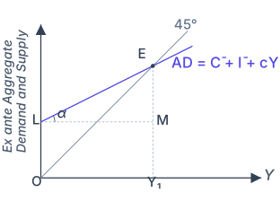
Fig. 4.6 brings the demand side and the supply side together in a single diagram to locate the equilibrium level of income. The vertical axis is labelled Ex ante Aggregate Demand and Supply and the horizontal axis is income .
Two lines are drawn. The first is the aggregate supply line from the origin , along which planned supply equals income (). The second is the aggregate demand line, which starts from a positive vertical intercept at point L — the total autonomous expenditure — and rises with a slope equal to the marginal propensity to consume, shown as the angle at L. Because , the AD line is flatter than the line, so the two lines cross exactly once.
That crossing is the equilibrium point E: the level of output at which ex ante aggregate demand equals ex ante aggregate supply. A dashed vertical line dropped from E to the horizontal axis marks the equilibrium income , and a dashed horizontal line from E to the vertical axis at M marks the corresponding level of aggregate demand (and supply) at equilibrium.
At equilibrium ex ante aggregate demand equals output:
…