Economics · Ch 9 — Production and Costs
Shapes of Total Product, Marginal Product and Average Product Curves
Shapes of Total Product, Marginal Product and Average Product Curves
The Law of Variable Proportions and the Shape of the TP Curve
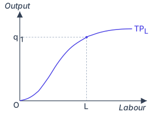
When you increase the amount of one input (say, labour) while holding all other inputs (like capital, land, technology) fixed, total output generally rises. This is the starting point. The textbook shows this through Table 3.2 (which you should imagine as a schedule: as labour units increase, total product increases). The relationship is plotted in Figure 3.1.
In that figure, the horizontal axis measures units of labour (), and the vertical axis measures total output (). The curve itself is called the Total Product curve for labour (TPL). It slopes upward from left to right — a positively sloped curve. For a given amount of labour , the firm can produce at most units of output. The key point: the curve is not a straight line; its slope changes as labour increases. That changing slope is what gives us the Marginal Product.
Drawn by us to help you understand the concept clearly, and verified to make sure it's accurate. For exams, practice from your textbook's own diagram.
The figure is a simple two-axis graph. The horizontal axis is labelled Labour (units of the variable input), and the vertical axis is labelled Output. A single curve, labelled TP (or TPL in the caption), rises from the origin (0,0) and moves to the right.
The curve has a distinct S-shape. It begins with a gentle upward slope — output increases slowly as the first few units of labour are added. Then the curve becomes steeper and bends upward (convex shape), meaning output now rises at an increasing rate. Finally, the curve flattens off (concave shape), showing that additional labour adds smaller and smaller amounts to total output.
A dashed line is drawn from a point on the vertical axis labelled q1 (a specific output level) horizontally to the curve, then vertically down to the horizontal axis at a point labelled L (the corresponding labour input). This dashed construction shows that with L units of labour, the firm can produce at most q1 units of output — it is a visual way to read off the input-output combination from the curve.
What the S-shape teaches
The changing slope of the TP curve reflects the law of variable proportions. The initial slow rise corresponds to increasing returns to the variable input (MP rising). The steep middle section shows constant returns (MP at its maximum). The final flattening shows diminishing returns (MP falling). The curve never slopes downward because total product does not decrease — it just grows more slowly. …
The Marginal Product Curve: Inverse ‘U’-Shape
The law of variable proportions tells us what happens to the Marginal Product (MP) as we add more labour. Initially, MP rises — each additional worker adds more to total output than the previous one. This happens because of better specialisation and more efficient use of fixed inputs. But after a certain level of employment, MP starts to fall — diminishing returns set in because the fixed inputs become overcrowded or overused.
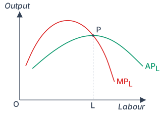
So the MP curve, when drawn against labour on the horizontal axis and MP on the vertical axis, looks like an inverse ‘U’ — it rises, reaches a peak, and then falls. This is shown in Figure 3.2.
Drawn by us to help you understand the concept clearly, and verified to make sure it's accurate. For exams, practice from your textbook's own diagram.
The figure plots two curves on a standard graph: the horizontal axis measures units of labour (L), and the vertical axis measures output. The two curves are the marginal product of labour (MP, shown in red) and the average product of labour (AP, shown in green). Both curves are inverse-U shaped — they rise, reach a peak, and then fall.
The MP curve peaks earlier and at a higher level than the AP curve. The AP curve rises more slowly than MP and reaches its maximum at a larger quantity of labour. The two curves start from the same point on the left (for the first unit of labour, MP and AP are equal). The critical feature is that the MP curve cuts the AP curve from above exactly at the point where AP is at its maximum. This intersection point is labelled P on the diagram. A dashed vertical line drops from point P down to the horizontal axis, marking the labour level L at which AP is maximised. …
Do not confuse "inverse U" with a bell curve. An inverse U rises to a maximum and then falls symmetrically or asymmetrically — it does not have a flat top. The MP curve is not necessarily symmetric.
The Average Product Curve: Also Inverse ‘U’-Shaped
The Average Product (AP) of labour is total product divided by the number of labour units: . How does this curve behave?
For the very first unit of labour, MP and AP are identical — because the average of just one number is that number itself. As we add more labour, MP rises. AP, being the average of all marginal products up to that point, also rises — but it rises less steeply than MP. Why? Because the average is pulled up by the high marginal values, but it never jumps as sharply as the marginal value itself.
Then comes the turning point: MP starts falling. But here is the crucial logic — as long as MP remains greater than AP, AP continues to rise. Think of it like your exam scores: if your next test score (marginal) is higher than your current average, the average goes up. Only when MP falls below AP does AP start to fall. So AP also traces an inverse ‘U’ shape, but its peak occurs after MP has already peaked.
The Relationship Between MP and AP: The Crossing Point
The textbook makes a precise claim: the MP curve cuts the AP curve from above at the point where AP is at its maximum. Let us see why.
- To the left of the maximum point of AP, AP is rising. For AP to rise, MP must be greater than AP.
- To the right of the maximum point, AP is falling. For AP to fall, MP must be less than AP.
- Therefore, exactly at the maximum of AP, MP must equal AP. And since MP was above AP before and below AP after, the MP curve crosses the AP curve from above at that point.
In Figure 3.2, the AP of factor 1 (labour) is maximum at . To the left of , AP rises and MP > AP. To the right of , AP falls and MP < AP. …