Economics · Ch 8 — Theory of Consumer Behaviour
Ordinal Utility Analysis
Ordinal Utility Analysis
2.1.2 Ordinal Utility Analysis
The Problem with Cardinal Utility
The cardinal utility approach, though simple, has a fundamental flaw: it assumes utility can be measured in numbers like height or weight. In real life, no consumer ever says "this mango gives me 10 utils and that banana gives me 7 utils." We simply do not carry around a mental utility meter.
What we actually do is rank our options. A consumer can say "I prefer this bundle over that one" or "these two bundles give me the same satisfaction." She cannot say by how much. This observation is the foundation of ordinal utility analysis — we only need to know the order of preferences, not their numerical magnitude.
Representing Preferences Diagrammatically
Since we cannot measure utility in numbers, we represent preferences using a different tool. Every available bundle of two goods can be plotted as a point in a two-dimensional diagram — bananas on one axis, mangoes on the other. Now consider all those bundles that give the consumer exactly the same level of satisfaction. If we join these points, we get a curve.
The consumer is said to be indifferent among all bundles on this curve — she would be equally happy with any of them. Hence the name: indifference curve.
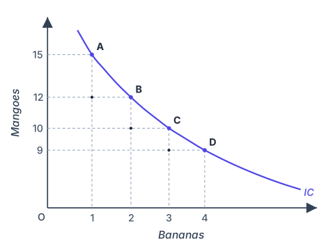
In Figure 2.3 of the textbook, points A, B, C and D all lie on the same indifference curve. Each point represents a different combination of bananas and mangoes, yet the consumer's total utility is identical at every point.
Drawn by us to help you understand the concept clearly, and verified to make sure it's accurate. For exams, practice from your textbook's own diagram.
Figure 2.3 shows a single, downward-sloping curve drawn on a two-dimensional graph. The horizontal axis is labelled “Bananas” and runs from 1 to 4. The vertical axis is labelled “Mangoes” and runs up to 15. Four points — A, B, C, and D — lie exactly on this curve.
Point A is at (1 banana, 15 mangoes). Point B is at (2, 12). Point C is at (3, 10). Point D is at (4, 9). From each of these four points, dashed lines drop vertically to the banana axis and horizontally to the mango axis, so you can read off the exact quantities in each bundle. The curve itself is smooth, convex to the origin (bowed inward), and slopes downward from left to right.
What this figure teaches is the core idea of an indifference curve: every bundle on this curve gives the consumer the same level of satisfaction. The consumer is indifferent between having 1 banana and 15 mangoes, 2 bananas and 12 mangoes, 3 bananas and 10 mangoes, or 4 bananas and 9 mangoes. The downward slope shows the trade-off: to get more bananas, the consumer must give up some mangoes, keeping total utility constant.
The figure also illustrates the Law of Diminishing Marginal Rate of Substitution. Look at the movement from A to B: the consumer sacrifices 3 mangoes for 1 extra banana. From B to C, she sacrifices 2 mangoes for 1 banana. From C to D, she sacrifices only 1 mango for 1 banana. The amount of mangoes she is willing to give up for each additional banana keeps falling. This diminishing MRS is what makes the indifference curve convex to the origin — a shape that is typical for most goods. …
Why the Indifference Curve Slopes Downward
If the consumer wants one more banana while staying on the same indifference curve (keeping total utility constant), she must give up some mangoes. She cannot have more of both goods and remain equally satisfied — that would put her on a higher indifference curve. So as the quantity of bananas increases along the curve, the quantity of mangoes must decrease. The curve therefore slopes downward from left to right.
Marginal Rate of Substitution (MRS)
The rate at which the consumer is willing to give up mangoes to get one more banana, while keeping total utility unchanged, is called the Marginal Rate of Substitution (MRS). Formally:
where is the change in the quantity of mangoes (the good on the vertical axis) and is the change in the quantity of bananas (the good on the horizontal axis). The vertical bars mean we take only the magnitude — if , then .
In words: MRS tells us how many mangoes the consumer will sacrifice for one additional banana, her total utility remaining exactly the same.
The Law of Diminishing Marginal Rate of Substitution
Look at Table 2.2 from the textbook:
| Combination | Quantity of Bananas () | Quantity of Mangoes () | MRS |
|---|---|---|---|
| A | 1 | 15 | — |
| B | 2 | 12 | 3:1 |
| C | 3 | 10 | 2:1 |
| D | 4 | 9 | 1:1 |
Moving from A to B, the consumer gives up 3 mangoes for 1 banana. From B to C, she gives up only 2 mangoes for 1 banana. From C to D, she gives up just 1 mango for 1 banana. The MRS is falling — from 3 to 2 to 1.
Why does this happen? As the consumer gets more bananas, the marginal utility (MU) from each additional banana falls — the first banana is very satisfying, the fourth much less so. At the same time, as she has fewer mangoes, the marginal utility of mangoes rises — each remaining mango becomes more precious. So she is willing to sacrifice smaller and smaller amounts of mangoes for each extra banana. This tendency is called the Law of Diminishing Marginal Rate of Substitution.
Do not confuse MRS with the slope of the budget line (which we will study later). MRS is purely about the consumer's preferences — it tells us what the consumer is willing to do. The budget line tells us what the consumer can do given prices and income.
Shape of an Indifference Curve
The Law of Diminishing MRS gives the indifference curve its characteristic shape: it is convex to the origin. This convex shape is the most common form of an indifference curve. As we move down the curve, the curve becomes flatter — the consumer gives up fewer mangoes for each additional banana.
The Special Case of Perfect Substitutes
Some goods are perfect substitutes — the consumer is completely indifferent between them. The textbook gives the example of a five-rupee coin and a five-rupee note. For the consumer, it makes no difference which form the money takes; only the total value matters.
Table 2.3 shows this situation:
| Combination | Quantity of Five-Rupee Notes () | Quantity of Five-Rupee Coins () | MRS |
|---|---|---|---|
| A | 1 | 8 | — |
| B | 2 | 7 | 1:1 |
| C | 3 | 6 | 1:1 |
| D | 4 | 5 | 1:1 |
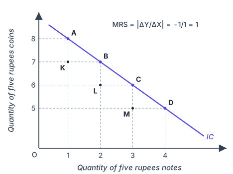
Here, the MRS does not diminish — it stays constant at 1:1. The consumer always sacrifices exactly one five-rupee coin for one five-rupee note, regardless of how many notes she already has. The indifference curve for perfect substitutes is therefore a straight line (as shown in Figure 2.4 of the textbook).
Drawn by us to help you understand the concept clearly, and verified to make sure it's accurate. For exams, practice from your textbook's own diagram.
Figure 2.4 shows a single, straight downward-sloping line drawn on a two-dimensional graph. The horizontal axis is labelled “Quantity of five‑rupee notes” and runs from 1 to 4. The vertical axis is labelled “Quantity of five‑rupee coins” and runs from 5 to 8. Four bundles are marked on the line: A at (1,8), B at (2,7), C at (3,6), and D at (4,5). Each bundle contains a different mix of notes and coins, but the total value is the same — 1 note + 8 coins = 9 units of five‑rupee value, 2 notes + 7 coins = 9 units, and so on. The line itself is the indifference curve: it joins all bundles that give the consumer equal satisfaction. Three further points are marked at the corners of the dashed steps just below the line - K at (1,7), L at (2,6) and M at (3,5) - each showing the bundle reached by giving up exactly one coin before the extra note restores the consumer to the line.
An annotation near the curve reads MRS = |ΔY/ΔX| = –1/1 = 1. This tells you that moving from one bundle to the next (say from A to B) involves giving up exactly 1 coin (ΔY = –1) to get 1 more note (ΔX = +1). The marginal rate of substitution is constant at 1 throughout — it does not diminish. That is the key teaching point of the figure. …
Indifference Map
A single indifference curve shows only those bundles that give one particular level of satisfaction. But the consumer has many possible satisfaction levels. The entire set of indifference curves representing all possible levels of satisfaction is called an indifference map.
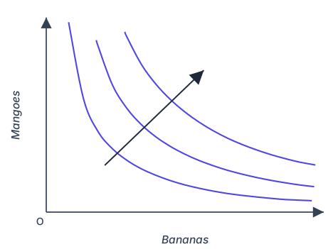
Because of monotonic preferences (explained below), bundles on higher indifference curves are always preferred to bundles on lower indifference curves. The arrow in Figure 2.5 of the textbook points upward, indicating that satisfaction increases as we move to curves farther from the origin.
Drawn by us to help you understand the concept clearly, and verified to make sure it's accurate. For exams, practice from your textbook's own diagram.
An indifference map is a collection of indifference curves drawn together in one diagram. Figure 2.5 shows exactly this: three distinct curves, each convex to the origin, plotted on the same axes. The vertical axis is labelled “Mangoes” and the horizontal axis “Bananas.” Each curve represents a set of bundles (combinations of mangoes and bananas) that give the consumer the same level of satisfaction. The curves are nested — they do not touch or cross — and they lie at increasing distances from the origin.
The key teaching point is the arrow. A diagonal arrow starts near the origin and points outward, crossing all three curves. This arrow is not a budget line or a price line; it simply indicates the direction of increasing preference. As you move outward from the origin — from a lower curve to a higher one — the consumer gets more of at least one good and no less of the other. Because preferences are monotonic, bundles on a higher indifference curve are strictly preferred to those on a lower one. The arrow makes this directional preference visually clear: higher curves mean greater satisfaction. …
Drawn by us to help you understand the concept clearly, and verified to make sure it's accurate. For exams, practice from your textbook's own diagram.
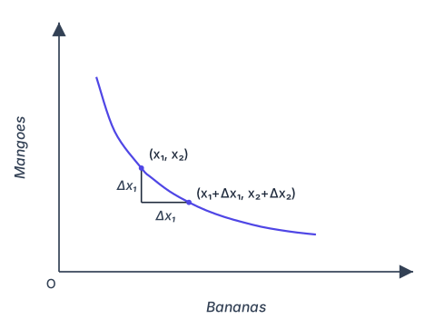
Figure 2.6 is a simple diagram with just one indifference curve. It is drawn as a smooth, downward-sloping curve that is convex to the origin — that is, it bends inward toward the point where the axes meet. The vertical axis is labelled “Mangoes” and the horizontal axis is labelled “Bananas.”
Two specific bundles are marked on this curve. The first bundle is labelled — that is, bananas and mangoes. The second bundle is labelled . Because the curve slopes downward, moving from the first bundle to the second involves a horizontal movement to the right (an increase in bananas, ) and a vertical movement downward (a decrease in mangoes, ).
To make this movement clear, the diagram includes a solid right-angled step connecting the two bundles. The step drops vertically from down to the level of the second bundle, then runs horizontally across to . Matching the textbook's own printed figure, both segments of the step carry the label — on the horizontal leg (the rise in bananas) and on the vertical leg (the fall in mangoes) alike.
In the NCERT textbook's own Figure 2.6, both legs of the step are printed with the same label — including the vertical leg. As the figure's own condition “if then ” makes clear, the vertical change is properly the change in mangoes, ; the repeated on the vertical leg is a small printing slip in the book. We reproduce the figure exactly as your textbook prints it, so what you see here matches your book.
The step is not part of the indifference curve itself — it is a visual aid to show the change in each good separately.
The step is drawn as a right angle because it separates the change in bananas (horizontal) from the change in mangoes (vertical). The indifference curve itself is smooth and curved, not stepped. …
Features of Indifference Curves
1. Downward Sloping from Left to Right
This follows directly from the logic of substitution. To have more of one good while staying equally satisfied, the consumer must have less of the other. If the consumer could have more bananas without giving up any mangoes and still be on the same indifference curve, that would contradict the idea that more is better.
Monotonic Preferences
Before we discuss the next feature, we need a key assumption about consumer behaviour:
Monotonic preferences: Between any two bundles and , if has more of at least one good and no less of the other compared to , then the consumer prefers to .
In plain language: more is always better, as long as you are not getting less of anything else. This assumption rules out situations where a consumer might dislike a good (like pollution or labour).
2. Higher Indifference Curves Give Greater Utility
Consider Table 2.4 from the textbook:
| Combination | Quantity of Bananas | Quantity of Mangoes |
|---|---|---|
| A | 1 | 10 |
| B | 2 | 10 |
| C | 3 | 10 |
Here, the quantity of mangoes is fixed at 10, while bananas increase from 1 to 2 to 3. Since the consumer has more bananas and the same mangoes, monotonic preferences tell us that B is preferred to A, and C is preferred to B. Therefore, B lies on a higher indifference curve than A, and C on a higher curve than B.
More generally, any bundle with more mangoes, or more bananas, or more of both, will lie on a higher indifference curve and give greater satisfaction — as long as the marginal utility of each good is positive. …
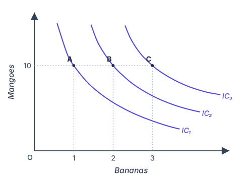
Drawn by us to help you understand the concept clearly, and verified to make sure it's accurate. For exams, practice from your textbook's own diagram.
Figure 2.7 is a simple but powerful diagram. It shows three indifference curves, labelled IC₁, IC₂, and IC₃, drawn on the usual axes: the vertical axis measures mangoes, the horizontal axis measures bananas. Each curve is convex to the origin, as a typical indifference curve should be. The key feature is a horizontal dashed line drawn at the level of 10 mangoes. This line cuts through all three curves.
On that dashed line, three bundles are marked: A, B, and C. All three have exactly 10 mangoes. What differs is the number of bananas: bundle A has 1 banana, bundle B has 2 bananas, and bundle C has 3 bananas. Because A lies on IC₁, B on IC₂, and C on IC₃, the diagram shows that as you move from left to right along the horizontal line — increasing only bananas — you jump to a higher indifference curve each time.
What does this teach? The caption says it directly: higher indifference curves give greater utility. The figure makes this concrete. Since the consumer always prefers more of a good (as long as marginal utility is positive), a bundle with more bananas and the same mangoes must be preferred. That preferred bundle cannot lie on the same indifference curve — it must be on a higher one. So IC₂ is above IC₁, and IC₃ is above IC₂. The horizontal dashed line simply isolates the effect of increasing bananas alone, making the point visually unmistakable: more of one good, holding the other constant, lifts you to a more preferred curve. …
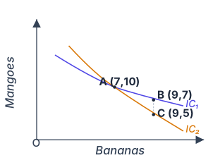
Drawn by us to help you understand the concept clearly, and verified to make sure it's accurate. For exams, practice from your textbook's own diagram.
Figure 2.8 is a deliberately wrong diagram — it is drawn to show why two indifference curves can never cross. The axes are labelled Mangoes (vertical) and Bananas (horizontal). Two curves, IC₁ and IC₂, are drawn so that they intersect at a single point labelled A, with coordinates (7 bananas, 10 mangoes).
A vertical dashed line is drawn at Bananas = 9. This line meets IC₁ at point B (9 bananas, 7 mangoes) and meets IC₂ at point C (9 bananas, 5 mangoes). No other points, arrows, or labels appear in the figure.
The contradiction is this: because A and B lie on the same indifference curve IC₁, the consumer must be indifferent between bundle A and bundle B. Similarly, because A and C lie on the same indifference curve IC₂, the consumer must be indifferent between A and C. If the consumer is indifferent between A and B, and also indifferent between A and C, then by transitivity she must be indifferent between B and C. …