Economics · Ch 11 — Market Equilibrium
Market Equilibrium: Free Entry and Exit
Market Equilibrium: Free Entry and Exit
Free Entry and Exit: The Core Idea
In the previous section, we assumed the number of firms in the market was fixed. That assumption is now dropped. Here, firms can enter the market whenever they wish, and exit whenever they wish, with no barriers or costs. For simplicity, we also assume that all firms in the market are identical — they have the same cost structure and produce the same product.
What does free entry and exit imply for equilibrium? The key result is this: in equilibrium, no firm earns supernormal profit, and no firm incurs a loss by staying in production. Every firm earns exactly normal profit. This means the market price must settle at the minimum point of each firm's average cost curve.
With free entry and exit, the equilibrium price is always equal to the minimum average cost of the firms: .
Why Price Equals Minimum Average Cost
To see why this must be true, consider what happens if the price is above minimum average cost. At such a price, each firm earns supernormal profit. That profit acts as a magnet — new firms see the opportunity and enter the market. As new firms enter, the market supply curve shifts to the right. Demand, however, remains unchanged. The result is a fall in the market price. This process continues until the price falls enough that supernormal profits are completely wiped out. At that point, with all firms earning only normal profit, no further firms have an incentive to enter.
Now consider the opposite case: suppose the price is below minimum average cost. Firms are earning less than normal profit — they are incurring losses. Some firms will exit the market. As firms exit, the market supply curve shifts to the left. With demand unchanged, the price rises. This continues until the price rises enough that the remaining firms earn normal profit. At that point, no more firms want to leave.
Thus, at any price above minimum average cost, entry occurs; at any price below minimum average cost, exit occurs. Only at the price exactly equal to minimum average cost does neither entry nor exit happen. Each firm earns normal profit, so no new firm is attracted, and no existing firm is forced to leave. This price therefore prevails in the market.

Drawn by us to help you understand the concept clearly, and verified to make sure it's accurate. For exams, practice from your NCERT textbook's own diagram.
Our own line-art recreation of the NCERT 'Free for all' margin cartoon (Market Equilibrium chapter, p.81). It shows a shared entrance whose signboards read 'Entry' and 'Exit', with a line of identical firms — depicted as businessmen with briefcases — walking through it, capturing the section's assumption that firms enter and exit the market freely and without barriers. Scene, labels and caption are taken from the textbook a …
Equilibrium Quantity and Number of Firms
Once the equilibrium price is fixed at , the equilibrium quantity is determined entirely by market demand at that price. The demand curve tells us how much consumers want to buy at , and that quantity is what the market supplies.
Each identical firm, at price , produces a certain output, say . The total market output must be the sum of the outputs of all firms. Therefore, the equilibrium number of firms is:
Graphically, the equilibrium is shown in Figure 5.5. The market demand curve intersects the horizontal price line at point . At this intersection, the price is and the total quantity is . Each firm supplies at that price, so the number of firms is .
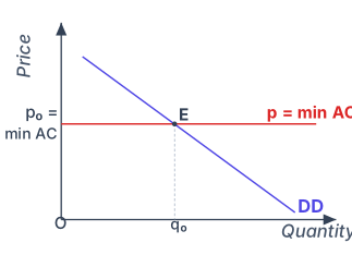
Drawn by us to help you understand the concept clearly, and verified to make sure it's accurate. For exams, practice from your NCERT textbook's own diagram.
Figure 5.5 is a single-panel graph with two axes: the vertical axis is labelled Price, the horizontal axis is labelled Quantity. A downward-sloping straight line labelled DD (indigo) represents the market demand curve. A horizontal red line is drawn across the graph at the height p₀, which is labelled as p = min AC — the minimum average cost of the identical firms in the market. This horizontal line is the market supply curve under free entry and exit: because any firm can enter or exit instantly, the market will supply any quantity at this fixed price, so the supply curve is perfectly elastic at p₀.
The demand curve DD and the horizontal price line intersect at a single point labelled E (the equilibrium point). From point E, a dashed vertical line drops straight down to the quantity axis, meeting it at the label q₀ — the equilibrium quantity. There is no second panel; the figure is a single, clean diagram. …
Worked Example: The Wheat Market
Let us see how this works with a concrete numerical example.
The demand curve for wheat is:
The supply curve of a single firm is:
With free entry and exit, the equilibrium price must equal the minimum average cost of the firms. From the firm's supply curve, we see that the firm will not produce at all for prices below 20. This is because at prices below 20, the firm would incur a loss — the price is below its minimum average cost. Therefore, the minimum average cost is 20, and the equilibrium price is:
At this price, market demand determines the equilibrium quantity:
Each firm, at , supplies:
Therefore, the equilibrium number of firms is:
So, with free entry and exit, the equilibrium price is ₹20, the equilibrium quantity is 180 kg, and there are 6 firms in the market.
A common mistake is to think that the equilibrium quantity is determined by the intersection of demand and supply curves as in the fixed-firms case. With free entry and exit, the price is fixed at , and the quantity is read only from the demand curve at that price. The supply curve of the industry is horizontal at .
Shifts in Demand: What Changes and What Does Not
Now consider what happens when the demand curve shifts, given that firms can freely enter and exit.
Because free entry and exit force the equilibrium price to always equal the minimum average cost of the firms, the price is fixed. No matter how demand shifts — rightward or leftward — the new equilibrium price will be the same as the old one: . …
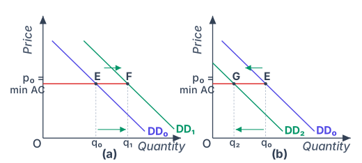
Drawn by us to help you understand the concept clearly, and verified to make sure it's accurate. For exams, practice from your NCERT textbook's own diagram.
Figure 5.6 has two panels, (a) and (b), each showing the same horizontal price line drawn at , which equals the minimum average cost (min AC) of the firms. This price line is flat because, with free entry and exit, the equilibrium price is fixed at min AC regardless of how much is demanded.
In both panels, the initial demand curve is labelled . It slopes downward and intersects the line at point E. At E, the equilibrium quantity is and the price is . This is the starting equilibrium.
Panel (a) shows a rightward shift of demand. A new demand curve, , is drawn to the right of (an arrow indicates the shift direction). meets the line at a new point F, which lies to the right of E. The new equilibrium quantity is , which is larger than , but the price remains exactly . The movement from E to F is along the horizontal price line — quantity increases, price does not change.
Panel (b) shows a leftward shift of demand. A new demand curve, , is drawn to the left of (again with an arrow). meets the line at point G, to the left of E. The new equilibrium quantity is , smaller than , and the price stays at . The movement from E to G is also along the same horizontal price line — quantity decreases, price unchanged. …