Informatics Practices · Ch 4 — Plotting Data using Matplotlib
Customisation of Plots
Customisation of Plots
Pyplot provides a wide range of functions to make charts more informative and readable. A basic plot shows data, but customisation — adding labels, a title, grid lines, or a legend — turns a raw graph into a clear visual story. The textbook introduces these customisation tools through a single, complete example.
The core customisation functions are summarised in Table 4.2 of the NCERT text. Each function serves a specific purpose:
grid([b, which, axis])— Configures the grid lines on the plot. The simplest use isgrid(True)to turn them on.legend(*args, **kwargs)— Places a legend on the axes, essential when multiple data series are plotted.savefig(*args, **kwargs)— Saves the current figure to a file (e.g., as a PNG or PDF).show(*args, **kw)— Displays all open figures on the screen.title(label[, fontdict, loc, pad])— Sets a title for the axes. You can control its font, location (e.g., 'center', 'left'), and padding.xlabel(xlabel[, fontdict, labelpad])— Sets the label for the x-axis.xticks([ticks, labels])— Gets or sets the tick locations and labels on the x-axis.ylabel(ylabel[, fontdict, labelpad])— Sets the label for the y-axis.yticks([ticks, labels])— Gets or sets the tick locations and labels on the y-axis.
The textbook demonstrates these in Program 4-2, which plots a line chart of date versus temperature. The code is straightforward:
import matplotlib.pyplot as plt

date = ["25/12", "26/12", "27/12"]
temp = [8.5, 10.5, 6.8]

plt.plot(date, temp)
plt.xlabel("Date")          # add the label on x-axis
plt.ylabel("Temperature")   # add the label on y-axis
plt.title("Date wise Temperature")  # add the title to the chart
plt.grid(True)              # add gridlines to the background
plt.yticks(temp)
plt.show()
Notice the order: after plt.plot(), each customisation function is called separately. plt.xlabel("Date") writes "Date" along the horizontal axis. plt.ylabel("Temperature") writes "Temperature" along the vertical axis. plt.title("Date wise Temperature") places a heading above the chart. plt.grid(True) draws light grid lines behind the data, making it easier to read values. Finally, plt.yticks(temp) forces the y-axis tick marks to appear exactly at the temperature values in the list temp — in this case, 8.5, 10.5, and 6.8. …
| Function | Description |
|---|---|
| grid([b, which, axis]) | Configure the grid lines. |
| legend(*args, **kwargs) | Place a legend on the axes. |
| savefig(*args, **kwargs) | Save the current figure. |
| show(*args, **kw) | Display all figures. |
| title(label[, fontdict, loc, pad]) | Set a title for the axes. |
| xlabel(xlabel[, fontdict, labelpad]) | Set the label for the x-axis. |
| xticks([ticks, labels]) | Get or set the current tick locations and labels of the x-axis. |
Plotting a line chart of date versus temperature by adding a label on the X and Y axis, and adding a title and grids to the chart. This repeats Program 4-1's chart but adds xlabel, ylabel, title and grid so the same …
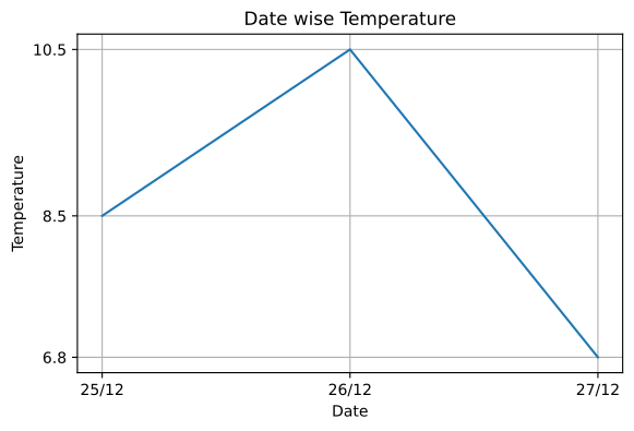
Drawn by us to help you understand the concept clearly, and verified to make sure it's accurate. For exams, practice from your NCERT textbook's own diagram.
This figure shows the payoff of customisation: identical data to Figure 4.2, but now self-explanatory. plt.title() names the chart, plt.xlabel() and plt.ylabel() identify the axes, a grid helps read values, and plt.yticks(temp) places tick marks only at the actual recorded temperatures 6.8, 8.5 and 10.5 rather than matplotlib's automatic steps. The comparison teaches that the labelling functions do not change th …