Economics · Ch 14 — Presentation of Data
Arithmetic Line Graph
Arithmetic Line Graph
An arithmetic line graph, also called a time-series graph, plots time (hour, day, week, month, year, etc.) along the x-axis and the value of the variable along the y-axis, then joins the plotted points with straight lines.
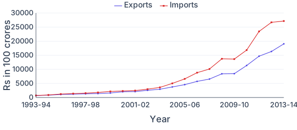
The resulting line reveals the trend and periodicity in a long-run series, so it is well suited to data followed over many years. For example, plotting India's exports and imports year by year makes it easy to see that imports stayed above exports throughout the period shown, that both rose rapidly after 2001-02, and that the gap between them widened after that year. This is exactly t …
Drawn by us to help you understand the concept clearly, and verified to make sure it's accurate. For exams, practice from your textbook's own diagram.
An arithmetic line graph of time-series data. The x-axis is the year (1993-94 to 2013-14) and the y-axis is value in Rs (100 crore). Two lines are plotted — Exports (lower) and Imports (upper, marked). Imports stay above exports throughout, so India runs a trade deficit; both rise gently until about 2001-02 then climb steeply, with imports reaching ~27154 and exports …
| Year | Exports | Imports |
|---|---|---|
| 1993-94 | 698 | 731 |
| 1994-95 | 827 | 900 |
| 1995-96 | 1064 | 1227 |
| 1996-97 | 1188 | 1389 |
| 1997-98 | 1301 | 1542 |
| 1998-99 | 1398 | 1783 |
| 1999-2000 | 1591 | 2155 |
| 2000-01 | 2036 | 2309 |
| 2001-02 | 2090 | 2452 |
| 2002-03 | 2549 | 2964 |
| 2003-04 | 2934 | 3591 |
| 2004-05 | 3753 | 5011 |
| 2005-06 | 4564 | 6604 |
| 2006-07 | 5718 | 8815 |
| 2007-08 | 6559 | 10123 |
| 2008-09 | 8408 | 13744 |
| 2009-10 | 8455 | 13637 |
| 2010-11 | 11370 | 16835 |