Economics · Ch 8 — Use of Statistical Tools
Example of Simplified Project Report
Example of Simplified Project Report
This is how the toothpaste survey's findings are pulled together into a simplified project report. Each item is a small table drawn from the questionnaire answers, followed by the observation it supports.
Sample and location. Total sample size: 100 households. By location, Urban 67% and Rural 33% — so the majority of users were urban.
(i) Age distribution
| Age (years) | No. of persons |
|---|---|
| Below 10 | 74 |
| 10–20 | 56 |
| 20–30 | 91 |
| 30–40 | 146 |
| 40–50 | 93 |
| Above 50 | 40 |
| Total | 500 |
Observation: most people surveyed fall in the 20–50 age group. (Shown as a bar diagram, Fig. 8.1.)
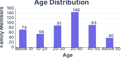
Drawn by us to help you understand the concept clearly, and verified to make sure it's accurate. For exams, practice from your textbook's own diagram.
Fig. 8.1 in the Use of Statistical Tools chapter is a simple bar diagram that illustrates the concept of frequency distribution of a discrete variable. The figure shows a single panel with a set of vertical bars, each representing a distinct value of a variable (say, the number of children per family) and the height of each bar corresponding to how many families have that exact number of children.
The horizontal axis (x-axis) is labelled with the variable values — for example, 0, 1, 2, 3, 4, 5 — each evenly spaced. The vertical axis (y-axis) is labelled with the frequency, i.e., the count of families. The bars are of equal width, separated by small gaps, and their heights rise and fall according to the data. There is no curve or second panel; it is a straightforward, one-variable bar chart.
The physical idea the figure teaches is that a bar diagram gives an immediate visual sense of the distribution of a discrete variable — which values are most common, which are rare, and how the frequencies spread across the possible outcomes. The eye compares bar heights directly, so the mode (the value with the tallest bar) is instantly visible.
The textbook uses this figure to introduce the concept of frequency and to set up the formula for the arithmetic mean of a discrete frequency distribution. If the variable takes values with corresponding frequencies , then the mean is given by:
Here, means "sum over all values of frequency times the value" — you multiply each bar's height () by the value it sits above (), then add those products. The denominator is the total number of observations (the sum of all bar heights). The bar diagram makes this formula intuitive: the mean is the "balance point" of the bars, where the total "weight" (frequency) on each side is equal. …
(ii) Family size
| Family size | No. of families |
|---|---|
| 1–2 | 20 |
| 3–4 | 40 |
| 5–6 | 30 |
| Above 6 | 10 |
| Total | 100 |
Observation: most families have 3–6 members. (Shown as a bar diagram, Fig. 8.2.)
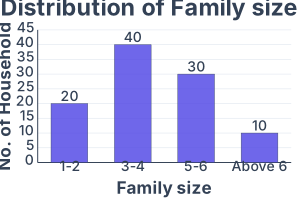
Drawn by us to help you understand the concept clearly, and verified to make sure it's accurate. For exams, practice from your textbook's own diagram.
Fig. 8.2 in the Use of Statistical Tools chapter is a simple bar diagram that illustrates the concept of frequency distribution for a discrete variable. The figure shows a set of vertical bars, each representing a distinct value of a variable (say, the number of children per family), with the height of each bar proportional to how many times that value occurs in the data.
The horizontal axis (x-axis) is labelled with the variable values — for example, 0, 1, 2, 3, 4 — each placed at the centre of its bar. The vertical axis (y-axis) shows the frequency, i.e., the count of observations for each value. The bars are drawn with equal width and are separated by small gaps, making it a discrete (or ungrouped) bar diagram, not a histogram. The tallest bar corresponds to the most frequent value, and the shortest to the least frequent.
The physical idea is straightforward: a bar diagram gives an immediate visual sense of the distribution of a variable — where most observations cluster, how spread out the values are, and whether the pattern is symmetric or skewed. It is the simplest graphical tool for presenting ungrouped frequency data.
The textbook uses this figure to introduce the frequency distribution table and then to show how the same data can be represented graphically. The key formula that accompanies this figure is the definition of relative frequency:
Here, the frequency of a value is the count of times it appears in the data, and the total number of observations is the sum of all frequencies (often denoted by ). For example, if the bar for value 2 has height 8 and the total number of families is 40, then the relative frequency of 2 is or 20%. The bar diagram can be easily converted into a relative frequency bar diagram by scaling the vertical axis to proportions or percentages instead of raw counts. …
(iii) Monthly family income. The income data are summarised and the mean and standard deviation found by the step-deviation method, taking assumed mean and class width , with :
| Income class | Midpoint | ||||
|---|---|---|---|---|---|
| 0–10000 | 5000 | 20 | −3 | −60 | 180 |
| 10000–20000 | 15000 | 40 | −1 | −40 | 40 |
| 20000–30000 | 25000 | 30 | 1 | 30 | 30 |
| 30000–40000 | 35000 | 10 | 3 | 30 | 90 |
| Total | 100 | −40 | 340 |
So the mean income was Rs. 18,000 and the standard deviation Rs. 9,000. Observation: most families earn between Rs. 10,000 and Rs. 30,000 a month. (Shown as a histogram, Fig. 8.3.)
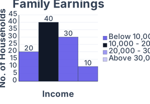
Drawn by us to help you understand the concept clearly, and verified to make sure it's accurate. For exams, practice from your textbook's own diagram.
The figure is a histogram — a bar chart of a continuous frequency distribution. The horizontal axis (the -axis) is labelled marks and is divided into class intervals: , , , , , , , , , and . The vertical axis (the -axis) is labelled number of students (the frequency). Each class interval is represented by a rectangular bar whose width equals the class size (10 marks) and whose height equals the frequency of that class. The bars are drawn touching each other — no gaps — because the data is continuous.
The physical idea the histogram teaches is simple: the area of each bar, not just its height, represents the frequency. For equal-width classes, height alone is proportional to frequency, so the visual impression is correct. But the deeper lesson is that when class widths are unequal, you must adjust the height so that area (not height) reflects frequency. The histogram is the standard graphical tool for displaying the shape, centre, and spread of a continuous distribution.
In a histogram, the height of each bar is the frequency density, so the area of the bar equals the frequency. …
(iv) Monthly family budget on toothpaste. The same step-deviation method is applied to expenditure, with assumed mean and class width , where :
| Expenditure class | Midpoint | ||||
|---|---|---|---|---|---|
| 0–40 | 20 | 5 | −2 | −10 | 20 |
| 40–80 | 60 | 20 | −1 | −20 | 20 |
| 80–120 | 100 | 40 | 0 | 0 | 0 |
| 120–160 | 140 | 30 | 1 | 30 | 30 |
| 160–200 | 180 | 5 | 2 | 10 | 20 |
| Total | 100 | 10 | 90 |
The report gives the mean expenditure as Rs. 104 per household per month and the standard deviation as Rs. 35.60.
(v) Major occupational status
| Occupation | No. of families |
|---|---|
| Service | 30 |
| Professional | 5 |
| Manufacture | 10 |
| Trader | 40 |
| Any other | 15 |
Observation: most families were service class or traders. (Shown as a pie diagram, Fig. 8.4.)
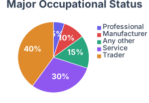
Drawn by us to help you understand the concept clearly, and verified to make sure it's accurate. For exams, practice from your textbook's own diagram.
The figure is a pie diagram (also called a pie chart) — a circular statistical graphic divided into slices to show proportional data. In this case, the pie represents the breakdown of total expenditure for a hypothetical household or economy, with each slice corresponding to a specific category of spending.
The circle itself is the whole (100% of the expenditure). There are no axes — a pie diagram has no x-axis or y-axis. Instead, the angle of each sector (slice) is proportional to the share of that category in the total. The figure labels each slice with the category name (e.g., Food, Clothing, Rent, Education, Miscellaneous) and, crucially, with the percentage that category contributes to the total. The slices are arranged clockwise, usually starting from the largest share at the 12 o'clock position.
The physical idea is simple but powerful: a pie diagram lets you see at a glance how a total is divided among its parts. The visual impact comes from comparing the areas (or equivalently, the central angles) of the slices — a bigger slice means a bigger share. This makes it ideal for presenting budget data, market shares, or any composition where the parts add up to a whole.
The key formula the textbook develops with this figure is the conversion of a category's value into the central angle of its slice:
Here, the Value of the category is the actual numerical amount spent on that item (say, ₹2000 on food), and the Total of all values is the sum of spending across all categories (say, ₹10,000). The fraction gives the proportion of the total that category represents. Multiplying by converts that proportion into degrees — the angle at the centre of the circle that the slice will occupy. For example, if food accounts for 20% of total expenditure, its central angle is . …
(vi) Preferred use of toothpaste (brands used)
| Brand | No. of households | Brand | No. of households |
|---|---|---|---|
| Aquafresh | 5 | Anchor | 4 |
| Cibaca | 9 | Babool | 3 |
| Close-up | 12 | Promise | 3 |
| Colgate | 18 | Meswak | 5 |
| Pepsodent | 20 | OralB | 7 |
| Pearl | 4 | Sensodyne | 7 |
| Any other | 3 |
Observation: Pepsodent, Colgate and Close-up were the most preferred brands.
(vii) Basis of selection
| Feature | Family members |
|---|---|
| Advertisement | 15 |
| Persuaded by the dentist | 5 |
| Price | 35 |
| Quality | 45 |
| Taste | 20 |
| Ingredients | 10 |
| Standardised marking | 50 |
| Tried new product | 10 |
| Company's brand name | 35 |
Observation: people chose mainly on standardised markings, quality, price and brand name.
(viii) Taste and preferences (satisfaction by brand)
| Brand | Satisfied | Unsatisfied |
|---|---|---|
| Aquafresh | 2 | 3 |
| Cibaca | 5 | 4 |
| Close-up | 10 | 2 |
| Colgate | 16 | 2 |
| Meswak | 3 | 2 |
| Pepsodent | 18 | 2 |
| Anchor | 2 | 2 |
| Babool | 2 | 1 |
| Promise | 2 | 1 |
| OralB | 4 | 3 |
| Sensodyne | 5 | 2 |
| Pearl | 2 | 2 |
Observation: among the most-used toothpastes, the level of dissatisfaction was relatively low.
(ix) Ingredients preference
| Ingredient | No. of people |
|---|---|
| Plain | 40 |
| Gel | 70 |
| Antiseptic | 80 |
| Flavoured | 50 |
| Caries protective | 30 |
| Fluoride | 10 |
Observation: most people preferred gel and antiseptic-based toothpastes.
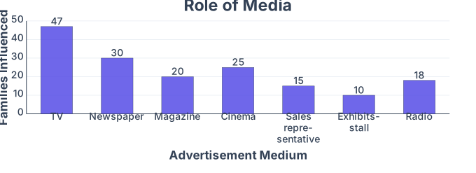
(x) Media influence
| Advertisement medium | Families influenced |
|---|---|
| Television | 47 |
| Newspaper | 30 |
| Magazine | 20 |
| Cinema | 25 |
| Sales representative | 15 |
| Exhibits / stall | 10 |
| Radio | 18 |
Observation: most people learnt about the product through television or newspapers. (Shown as a bar diagram, Fig. 8.5.)
Drawn by us to help you understand the concept clearly, and verified to make sure it's accurate. For exams, practice from your textbook's own diagram.
Fig. 8.5 in the Use of Statistical Tools chapter is a simple bar diagram that illustrates the concept of relative frequency — the proportion of observations that fall into each class interval of a frequency distribution. The figure shows a single panel with a horizontal axis and a vertical axis, and a set of adjacent rectangular bars of equal width.
The horizontal axis is labelled with the class intervals (for example, marks scored by students, grouped into ranges like 0–10, 10–20, 20–30, and so on). Each bar sits above its corresponding class interval. The vertical axis is labelled Relative Frequency, and it runs from 0 up to 1 (or sometimes 0% to 100%). The height of each bar represents the relative frequency of that class — that is, the fraction of the total number of observations that lie in that interval. Because the bars are drawn with equal width, the area of each bar is proportional to the relative frequency, and the total area of all bars together equals 1 (or 100%).
The physical idea the figure teaches is this: a bar diagram of relative frequencies gives a visual picture of the proportion of data in each category, not the raw count. This makes it easy to compare distributions that have different total numbers of observations. For example, if one class has 20 students out of 100, its relative frequency is 0.20; if another class has 30 out of 100, its relative frequency is 0.30 — the bar for the second class is one and a half times taller.
The key formula the textbook develops with this figure is the definition of relative frequency:
Here, frequency means the number of observations falling in that class interval, and total number of observations is the sum of all frequencies (often denoted by ). So if a class has frequency and the total number of observations is , the relative frequency is . The figure makes this abstract formula concrete: the height of each bar is exactly that fraction. …
…