Economics · Ch 8 — Theory of Consumer Behaviour
Demand Curve and the Law of Demand
Demand Curve and the Law of Demand
The Demand Function
When we hold constant the prices of other goods, the consumer's income, and her tastes and preferences, the quantity of a good she chooses optimally depends only on its own price. This relationship — between the consumer's optimal choice of quantity and the price of the good — is called the demand function.
The demand function is written as:
where denotes the quantity demanded of the good and denotes its price. The function tells us, for each possible price, exactly how much of the good the consumer will buy.
Functions
A function is a rule that assigns a unique value of (the dependent variable) to each value of (the independent variable). The demand function is one such function — it assigns a unique quantity demanded to each price.
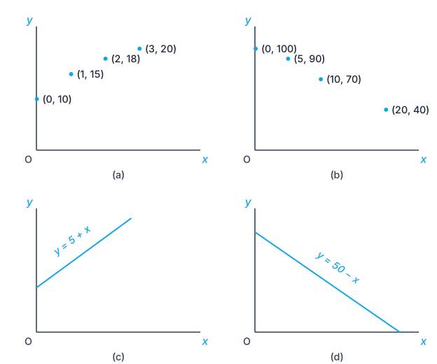
Example 1. Suppose takes the values 0, 1, 2, 3 and the corresponding values of are 10, 15, 18, 20. Then , , , . Here rises as rises — an increasing function.
Example 2. Suppose takes the values 0, 5, 10, 20 and the corresponding values of are 100, 90, 70, 40. Then , , , . Here falls as rises — a decreasing function.
The Demand Curve
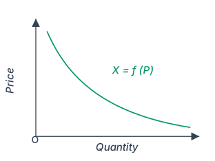
The graphical representation of the demand function is called the demand curve. It shows the relation between the quantity of the good chosen by the consumer and the price of the good.
In economics, the convention for drawing the demand curve is the opposite of the usual mathematical convention. The independent variable (price) is measured along the vertical axis, and the dependent variable (quantity) is measured along the horizontal axis. The demand curve gives the quantity demanded by the consumer at each price.
Drawn by us to help you understand the concept clearly, and verified to make sure it's accurate. For exams, practice from your textbook's own diagram.
Figure 2.13 is a simple two-axis graph. The vertical axis is labelled Price (the independent variable, denoted ), and the horizontal axis is labelled Quantity (the dependent variable, denoted ). A single, smooth curve slopes downward from left to right, convex to the origin — meaning it bends outward slightly rather than being a straight line. The curve is labelled , which is the algebraic form of the demand function. There are no data points, gridlines, or additional curves; the entire figure is just this one downward-sloping line.
The key teaching point is the negative relationship between price and quantity demanded. As you move upward along the vertical axis (higher price), the curve shows a lower corresponding quantity on the horizontal axis. Conversely, moving downward (lower price) gives a higher quantity. This is the graphical expression of the Law of Demand: ceteris paribus (other things unchanged), a consumer buys less of a good when its price rises and more when its price falls.
Notice the deliberate reversal of axes: in standard mathematics, the independent variable goes on the horizontal axis, but here price (independent) is on the vertical axis and quantity (dependent) on the horizontal. The textbook explicitly notes this convention is common in economics. The curve itself is convex to the origin — not a straight line — because the relationship between price and quantity is typically non-linear in consumer theory (due to diminishing marginal utility or substitution effects), though the figure does not specify a particular functional form.
The demand curve does not show a causal mechanism — it simply maps the consumer's optimal quantity at each price, holding income, tastes, and other prices constant. It is a relation, not a story about why the consumer changes behaviour. …
In most mathematics graphs, the independent variable goes on the horizontal axis. In economics, for the demand curve, price (the independent variable) goes on the vertical axis and quantity (the dependent variable) goes on the horizontal axis. This is a standard convention you must follow in exams.
The Law of Demand
The relation between the consumer's demand for a good and the price of the good is negative in general. This means:
- When the price of a good falls, the amount the consumer would optimally choose increases.
- When the price of a good rises, the amount the consumer would optimally choose decreases.
This negative relationship is called the Law of Demand. It is the reason the demand curve slopes downward from left to right.
The Law of Demand states that, other things remaining the same (ceteris paribus), the quantity demanded of a good varies inversely with its price. The demand curve is therefore downward sloping.
Increasing and Decreasing Functions
A function is an increasing function if the value of does not decrease when the value of increases. For example, is an increasing function — as rises, rises. The graph of an increasing function is upward sloping. …
Drawn by us to help you understand the concept clearly, and verified to make sure it's accurate. For exams, practice from your textbook's own diagram.
The 'Graphical Representation of a Function' box plots the two example functions from the text. Panels (a) and (b) mark the individual (x, y) pairs as points, while panels (c) and (d) graph y = 5 + x (an increasing function, upward sloping) and y = 50 − x (a decreasing function, downward sloping). Note: the textbook's own panel (b) prints the points (5, 90) and (10, 70) even though its accompanying text define …