Economics · Ch 5 — Measures of Central Tendency
Computation of Mode
Computation of Mode
Discrete series
Here the mode is simply the value carrying the highest frequency, read off directly by inspection. For example, in the data set 1, 2, 3, 4, 4, 5 the mode is 4, since 4 appears most often (twice). In a frequency table, whichever value has the maximum frequency is the mode; when exactly one value has the largest frequency the data is unimodal.
Drawn by us to help you understand the concept clearly, and verified to make sure it's accurate. For exams, practice from your textbook's own diagram.
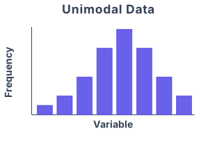
Fig. 5.4 in the NCERT Class 11 Economics chapter on Measures of Central Tendency is a simple frequency distribution graph — a single smooth, bell-shaped curve. It is drawn with the horizontal axis representing the values of the variable (say, income or marks) and the vertical axis representing the frequency (how many times each value occurs). The curve rises smoothly from the left, reaches a single peak in the middle, and then falls symmetrically on the right. There is only one hump — that is what "unimodal" means.
The physical idea the figure teaches is that in many real-world data sets, most observations cluster around one central value, and the frequency tapers off as you move away from that centre in either direction. The single peak marks the mode — the value that occurs most often. The figure is deliberately drawn as a smooth, symmetric curve so that the mode is visually obvious: it is the highest point on the curve, directly above the value on the horizontal axis that appears most frequently.
The textbook uses this figure to introduce the concept of the mode for grouped (continuous) data. When data are grouped into class intervals, the mode is not simply the midpoint of the class with the highest frequency — that would be too crude. Instead, the figure helps motivate the interpolation formula for the mode, which adjusts the estimate within the modal class by considering the frequencies of the neighbouring classes.
Here, is the lower limit of the modal class (the class interval with the highest frequency). is the frequency of the modal class itself. is the frequency of the class just before the modal class, and is the frequency of the class just after it. is the width (size) of the class interval. The fraction is a correction factor that shifts the mode away from the midpoint of the modal class toward the neighbouring class that has the higher frequency. If the two neighbouring frequencies are equal, the fraction becomes and the mode falls exactly at the midpoint of the modal class — which matches the symmetric shape of the curve in Fig. 5.4. …
Drawn by us to help you understand the concept clearly, and verified to make sure it's accurate. For exams, practice from your textbook's own diagram.
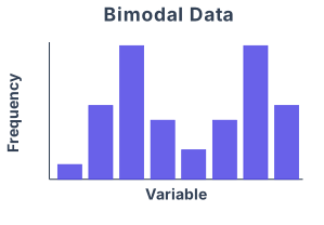
Fig. 5.5 in the chapter is a simple frequency-distribution graph that illustrates a dataset with two distinct peaks — hence the name "Bimodal Data". The horizontal axis (x-axis) represents the values of the variable (say, marks in a test or income in rupees), and the vertical axis (y-axis) shows the frequency — how many observations fall into each class interval.
The curve drawn in the figure is a smooth, bell-shaped frequency polygon that rises from the left, reaches a first peak, dips slightly, rises again to a second peak of roughly the same height, and then falls off to the right. There are no labels for specific numerical values on the axes; the figure is purely schematic. The key visual feature is that the curve has two humps (two modes) rather than the single hump of a unimodal distribution.
What this figure teaches is that a dataset can have more than one "typical" value. In a bimodal distribution, the data cluster around two different central values. For example, if you record the heights of a mixed group of adult men and women, you might get one peak around 165 cm (women) and another around 178 cm (men). The two modes are the values at which the frequency is highest — the two peaks of the curve.
The textbook uses this figure to introduce the concept of mode for grouped data. When data are grouped into class intervals, the modal class is the class with the highest frequency. But in a bimodal distribution, there are two such classes. The formula for computing the exact mode (a single value) from a grouped frequency distribution is given as:
where:
- = lower limit of the modal class (the class with the highest frequency)
- = frequency of the modal class
- = frequency of the class preceding the modal class
- = frequency of the class succeeding the modal class
- = class width (size of the class interval) …
Continuous series
With class intervals, first identify the modal class — the class with the largest frequency — then apply:
where = lower limit of the modal class, = difference between the modal class frequency and that of the preceding class (ignoring sign), = difference between the modal class frequency and that of the succeeding class (ignoring sign), and = class interval. The series must be exclusive with equal class intervals; if only mid-points are given, the intervals must first be reconstructed. A less-than cumulative table must be converted into an ordinary frequency table before the modal class can be found.
Example. From a less-than cumulative distribution, the ordinary frequencies work out so that the modal class is 25–30 with frequency 30, its neighbours having frequencies 18 (below) and 20 (above). Thus , , , :
So the modal worker family's monthly income is Rs 27,273 (Rs 27.273 thousand).
Drawn by us to help you understand the concept clearly, and verified to make sure it's accurate. For exams, practice from your textbook's own diagram.
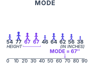
The figure is a simple bar chart or histogram that illustrates the concept of the mode as the most frequently occurring value in a data set. On the horizontal axis (x-axis) you have the different values or class intervals of the variable being measured — for example, marks scored by students or sizes of shoes sold. The vertical axis (y-axis) shows the frequency, that is, how many times each value appears in the data.
The bars rise to different heights. One bar stands taller than all the others — that bar corresponds to the value that occurs most often. The figure labels this tallest bar as the mode. The surrounding bars are shorter, showing that those values occur less frequently. The entire plot makes the idea visual: the mode is simply the peak of the frequency distribution, the value around which the data clusters most densely.
The figure does not show a smooth curve or a bell shape — it is a discrete bar chart. The mode is identified by the tallest bar, not by any mathematical calculation on a continuous curve.
The key formula the textbook develops alongside this figure is the mode for grouped (continuous) data, where the exact modal value lies within a class interval. The formula is:
Here:
- is the mode.
- is the lower limit of the modal class (the class interval with the highest frequency).
- is the frequency of the modal class.
- is the frequency of the class preceding the modal class.
- is the frequency of the class succeeding the modal class.
- is the width (size) of the class interval. …
Activities
- A shoe company, making shoes for adults only, wants to know the most popular size of shoes. Which average will be most appropriate for it? …