Economics · Ch 9 — Organisation of Data
Frequency Distribution with Unequal Classes
Frequency Distribution with Unequal Classes
Equal class intervals are not always best. In the mathematics-marks distribution most observations pile into just three classes — 40–50, 50–60 and 60–70, with frequencies 21, 23 and 19. That is out of 100 students, i.e. 63 per cent in the 40–70 middle range, while the remaining 37 per cent are thinly spread across 0–10, 10–20, 20–30, 30–40, 70–80, 80–90 and 90–100. In these sparse classes the observations lie far from their class marks, so the class mark represents them poorly.
The cure is to make classes so that each class mark sits close to where its observations actually cluster — which calls for unequal intervals. Splitting each crowded class into two halves of width 5 does this:
| Class | Observations | Frequency | Class Mark |
|---|---|---|---|
| 0–10 | 0 | 1 | 5 |
| 10–20 | 10, 14, 17, 12, 14, 12, 14, 14 | 8 | 15 |
| 20–30 | 25, 25, 20, 22, 25, 28 | 6 | 25 |
| 30–40 | 30, 37, 34, 39, 32, 30, 35 | 7 | 35 |
| 40–45 | 42, 44, 40, 44, 41, 40, 43, 40, 41 | 9 | 42.5 |
| 45–50 | 47, 49, 49, 45, 45, 47, 49, 46, 48, 48, 49, 49 | 12 | 47.5 |
| 50–55 | 51, 53, 51, 50, 51, 50, 54 | 7 | 52.5 |
| 55–60 | 59, 56, 55, 57, 55, 56, 59, 56, 59, 57, 59, 55, 56, 55, 56, 55 | 16 | 57.5 |
| 60–65 | 60, 64, 62, 64, 64, 60, 62, 61, 60, 62 | 10 | 62.5 |
| 65–70 | 66, 69, 66, 69, 66, 65, 65, 66, 65 | 9 | 67.5 |
The crowded classes now have width 5 while the sparse ones keep width 10. Their new class marks (42.5, 47.5, 52.5, 57.5, 62.5, 67.5) lie much nearer their observations than the old marks (45, 55, 65) did, so the unequal-interval table represents this data more faithfully. …
Drawn by us to help you understand the concept clearly, and verified to make sure it's accurate. For exams, practice from your textbook's own diagram.
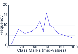
The figure is a frequency curve for the unequal-class distribution of Table 3.7 — the same 100 marks as Table 3.6, but with the crowded 40–50, 50–60 and 60–70 classes each split into two narrower classes of width 5. The horizontal axis plots the class marks of Table 3.7's thirteen classes (5, 15, 25, 35, 42.5, 47.5, 52.5, 57.5, 62.5, 67.5, 75, 85, 95); the vertical axis plots the corresponding frequencies (1, 8, 6, 7, 9, 12, 7, 16, 10, 9, 6, 5, 4).
The points are joined by straight line segments, giving the curve a visibly sharper, more angular shape than Fig. 3.1 — in particular a single tall, narrow peak at the class mark 57.5 (frequency 16), rather than the broader, rounder rise Fig. 3.1 shows around its own peak. This sharper shape is exactly the point of the companion Activity (compare Fig. 3.2 with Fig. 3.1): splitting the crowded classes into narrower widths lets the curve trace the true concentration of the data more closely, at the cost of a less smooth-looking line.
The key idea the figure teaches is the same one the unequal-classes section makes in words: a class mark is only a faithful stand-in for its class when the class is narrow enough that observations don't lie far from it. The relative frequency of a class remains:
…