Q.Match the following graphical variation with their description
Column A:
(i)
You're viewing a preview — the full solution, concept, methods & PYQ mapping are locked.
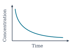
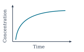
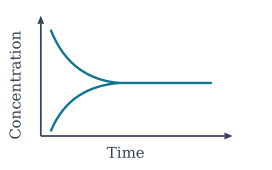
Start your 14-day free trial to unlock the full solution →The shape of a concentration–time graph tells you whether the species is a reactant (decreasing) or a product (increasing), and the flat region signals equilibrium.
(i) → (c), (ii) → (a), (iii) → (b).
The core idea
When a reversible reaction proceeds, the concentrations of reactants and products change until they reach a dynamic equilibrium. A graph of concentration vs. time reveals two things at a glance: the direction of change (up or down) tells you whether the species is a product or a reactant, and the flattening of the curve tells you that equilibrium has been reached.
At equilibrium, the forward and reverse rates become equal, so the net change in concentration of every species is zero. That is why the curve becomes horizontal — parallel to the time axis — and stays there.
Matching each graph
1. Graph (i): starts high, decreases, levels off
A species that begins at a high concentration and then falls must be a reactant — it is being consumed as the reaction moves forward. The curve flattens when the reaction reaches equilibrium, meaning the reactant is no longer being used up on net. This matches description (c).
Don't confuse "reactant concentration decreasing" with "reaction at equilibrium." The decreasing part is the approach to equilibrium; the flat part is equilibrium. The whole curve shows both.
2. Graph (ii): starts near zero, increases, levels off
A species that starts near zero and rises must be a product — it is being formed as the reaction proceeds. The flat region again signals equilibrium, where the product concentration stops changing. This matches description (a).
3. Graph (iii): falls from a higher value, then becomes constant …
Unlock everything free for 14 days
- Full step-by-step solutions
- Concept-first explanations
- Methods, shortcuts & mistakes
- PYQ mapping + timed mock tests
Full access for 14 days. No credit card required.