Applied Mathematics · Ch 10 — Descriptive Statistics
Bar Graph
Bar Graph
A bar graph is a visual tool that uses rectangular bars of equal width to represent and compare different categories of data. The length or height of each bar is proportional to the frequency or value it stands for, making patterns and differences easy to spot at a glance. Unlike a histogram, the bars in a bar graph do not touch each other because the categories are distinct and separate. This simple yet powerful display helps you quickly see which category is the largest, small …
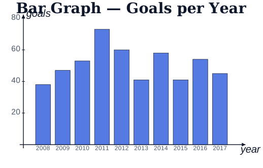
Drawn by us to help you understand the concept clearly, and verified to make sure it's accurate. For exams, practice from your NCERT textbook's own diagram.
A bar graph uses the height of each bar to compare a quantity across categories (here, …