Informatics Practices · Ch 4 — Plotting Data using Matplotlib
Plotting a Line chart
Plotting a Line chart
A line chart (or line plot) is a graph that shows the frequency of data along a number line. It is used to display a continuous dataset — meaning data that flows without gaps, like measurements over time. The main purpose of a line chart is to visualise growth or decline in data over a time interval. You have already seen simple line charts in Programs 4-1 and 4-2. Now we learn to plot a line chart for data stored in a DataFrame.
The textbook uses a real-world example: Smile NGO participated in a three-week cultural mela. They stored day-wise sales (in rupees) for each week in a CSV file named "MelaSales.csv". The data has three columns — Week 1, Week 2, and Week 3 — with seven rows (one for each day of the week). The sales figures are:
| Week 1 | Week 2 | Week 3 |
|---|---|---|
| 5000 | 4000 | 4000 |
| 5900 | 3000 | 5800 |
| 6500 | 5000 | 3500 |
| 3500 | 5500 | 2500 |
| 4000 | 3000 | 3000 |
| 5300 | 4300 | 5300 |
| 7900 | 5900 | 6000 |
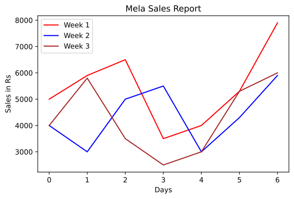
The goal is to depict the sales for all three weeks using a single line chart with these specifications: chart title "Mela Sales Report", x-axis label "Days", y-axis label "Sales in Rs", and line colours red for week 1, blue for week 2, and brown for week 3.
Here is the code that achieves this:
import pandas as pd
import matplotlib.pyplot as plt

df = pd.read_csv("MelaSales.csv")
df.plot(kind='line', color=['red','blue','brown'])
plt.title('Mela Sales Report')
plt.xlabel('Days')
plt.ylabel('Sales in Rs')
plt.show()
Notice that df.plot(kind='line', ...) is called directly on the DataFrame. The color parameter accepts a list of colours — one for each column in the DataFrame. The order of colours matches the order of columns: first colour for the first column (Week 1), second for Week 2, third for Week 3.
When you run this code, Matplotlib automatically places the row index (0, 1, 2, ..., 6) on the x-axis. This is because a line plot expects numeric values on the x-axis, and by default it uses the DataFrame's index. The legend is displayed by default, associating each colour with its corresponding week column. The output is Figure 4.5 in the textbook.
The x-axis tick labels are the index numbers (0 to 6), not the actual day names. The DataFrame's index is used because the CSV file does not contain a separate "Day" column — only the three week columns.
Customising the Line Plot
You can replace the default numeric x-axis ticks with custom labels using plt.xticks(ticks, label). Here, ticks is a list of positions (locations) on the x-axis where you want ticks placed, and label is a list of items to display at those positions.
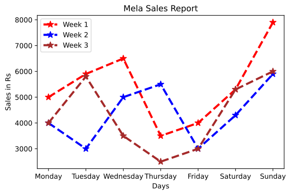
The textbook extends the same mela sales example with additional customisations: marker style, marker size, line style, and line width. The specifications are:
- Marker =
"*"(asterisk) - Marker size = 10
- Linestyle =
"--"(dashed) - Linewidth = 3
The code for this customised plot is:
import pandas as pd
import matplotlib.pyplot as plt

df = pd.read_csv("MelaSales.csv")
df.plot(kind='line', color=['red','blue','brown'],
        marker="*", markersize=10, linewidth=3, linestyle="--")
plt.title('Mela Sales Report')
plt.xlabel('Days')
plt.ylabel('Sales in Rs')

ticks = df.index.tolist()
plt.xticks(ticks, df.Day)
plt.show()
A few important details:
- The
marker,markersize,linewidth, andlinestyleparameters are passed insidedf.plot(). They apply to all lines in the plot. df.index.tolist()converts the index (0, 1, 2, ..., 6) into a Python list. This list is used as theticksargument. …
Plot the three-week Mela sales data (Table 4.6) as a line chart with the title 'Mela Sales Report', axis labels for Days and Sales in Rs, and a distinct colour per week -- the first example of calling .plot() …
| Week 1 | Week 2 | Week 3 |
|---|---|---|
| 5000 | 4000 | 4000 |
| 5900 | 3000 | 5800 |
| 6500 | 5000 | 3500 |
| 3500 | 5500 | 2500 |
| 4000 | 3000 | 3000 |
Drawn by us to help you understand the concept clearly, and verified to make sure it's accurate. For exams, practice from your NCERT textbook's own diagram.
This figure introduces a second way of plotting: instead of calling plt.plot() on lists, the data is read from MelaSales.csv into a DataFrame and drawn with the DataFrame's own plot() method, which automatically creates one line per numeric column and a legend naming each week. It also exposes a default worth noticing — the x-axis ticks are the DataFrame's row index 0 to 6, not the day names — setting up the customisation in the next figure. …
Drawn by us to help you understand the concept clearly, and verified to make sure it's accurate. For exams, practice from your NCERT textbook's own diagram.
The refined Mela Sales plot teaches that DataFrame plots accept the same styling controls as plain matplotlib ones: the '--' linestyle and linewidth 3 make the weekly lines dashed and bold, and star markers flag every day's value. The key fix is plt.xticks(ticks, df.Day), which replaces the numeric index 0 to 6 on the x-axis with the actual day names Monday to Sunday, so the chart now reads naturally — and …
Customising Line Plot
The real book's own 'Customising Line Plot' content is Program 4-5 above — the same MelaSales.csv chart styled with marker='*', markersize=10, linewidth=3, linestyle='--', and plt.xticks(ticks, df.Day). (No separate plt.plot(fmt_string, ...) shorthand or unrelate …
Using the same MelaSales.csv, plot the line chart with a star marker, marker size 10, dashed linestyle and linewidth 3, and replace the numeric x-axis ticks with the day names …