Informatics Practices · Ch 4 — Plotting Data using Matplotlib
Plotting Scatter Chart
Plotting Scatter Chart
A scatter chart is a two-dimensional method for visualising data. It uses dots to represent the values obtained for two different variables — one variable is plotted along the x-axis and the other along the y-axis. The purpose of a scatter plot is to show the relationship between two variables. Because they reveal how two variables are correlated, scatter plots are sometimes called correlation plots.
Beyond just two variables, the size, shape, or colour of each dot can be used to represent a third (or even a fourth) variable. This makes scatter charts a flexible tool for exploring multiple dimensions of data at once.
Example: Sales vs Discount
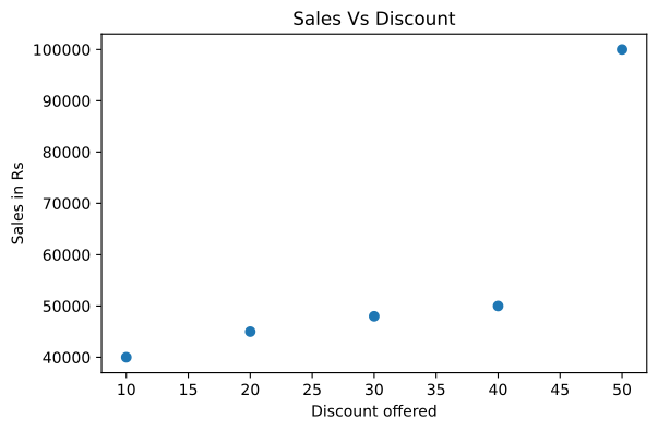
The textbook presents a scenario involving a seller named Prayatna, who sells designer bags and wallets. During a sales season, he offered discounts ranging from 10% to 50% over a period of 5 weeks. He recorded his sales for each type of discount in an array. The goal is to draw a scatter plot showing the relationship between the discount offered and the sales made.
The code for this basic scatter plot is:
import numpy as np
import matplotlib.pyplot as plt

discount = np.array([10, 20, 30, 40, 50])
saleInRs = np.array([40000, 45000, 48000, 50000, 100000])

plt.scatter(x=discount, y=saleInRs)
plt.title('Sales Vs Discount')
plt.xlabel('Discount offered')
plt.ylabel('Sales in Rs')
plt.show()
The output of this program is shown in Figure 4.14 of the textbook. The plot clearly shows how sales change as the discount percentage increases.
The textbook asks: "What would happen if we use df.plot(kind='scatter') instead of plt.scatter() in Program 4-13?" This is a prompt for you to think and reflect on the difference between using a DataFrame's built-in plotting method versus the pyplot function directly.
Customising the Scatter Chart
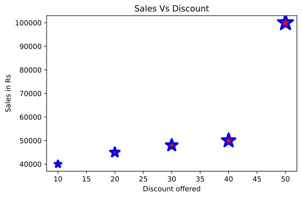
The size of the bubble (the dot) can be used to reflect a value. In Program 4-14 (referred to in the text as Program 4-13 in the original), the size of the bubble is set to 10 times the discount amount. The colour and markers can also be changed.
The code for this customised version is:
import numpy as np
import matplotlib.pyplot as plt

discount = np.array([10, 20, 30, 40, 50])
saleInRs = np.array([40000, 45000, 48000, 50000, 100000])
size = discount * 10

plt.scatter(x=discount, y=saleInRs, s=size, color='red', linewidth=3, marker='*', edgecolor='blue')
plt.title('Sales Vs Discount')
plt.xlabel('Discount offered')
plt.ylabel('Sales in Rs')
plt.show()
``` …
Draw a scatter plot showing the relationship between the discount a shop offered (10% to 50%) and the resulting sales, using plt.scatter() directly rather than the DataFrame's o …
Drawn by us to help you understand the concept clearly, and verified to make sure it's accurate. For exams, practice from your NCERT textbook's own diagram.
The chapter's first scatter plot, drawn with plt.scatter(): each of Prayatna's five discount/sales pairs becomes an isolated dot rather than a point on a connected line. That is the point of the chart type — a scatter plot shows the relationship between two variables without implying continuity between observations. Read left to right, the dots reveal the pattern in the data: sales rise only gently as the discount grows from 10 to 40, then leap from 50,0 …
Drawn by us to help you understand the concept clearly, and verified to make sure it's accurate. For exams, practice from your NCERT textbook's own diagram.
The customised scatter plot layers three encodings onto the same five points. marker='' turns each dot into a star, colour arguments paint the stars red with a blue edge of linewidth 3, and — the real lesson — the s parameter is fed size=discount10, so each marker's size is computed from the data itself. The stars therefore grow steadily from left to right, encoding the discount a second time as bubble size. The figure shows that point s …
Customising Scatter chart
The real book's own 'Customising Scatter chart' content is Program 4-13 (discount vs. sales), sizing bubbles with size=discount*10 and styling with color='red', marker='*', edgecolor='blue', linewidth=3. (No cmap/plt.colorbar() colo …
Customise the discount-vs-sales scatter plot so each point's bubble size is 10 times the discount value, with red star markers and a blue edge -- using bubble size to encode …