Economics · Ch 4 — Presentation of Data
Frequency Curve
Frequency Curve
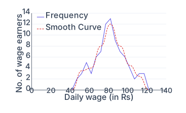
A frequency curve is a graphic representation of a frequency distribution obtained by drawing a smooth, free-hand curve through the points of a frequency polygon. It is a refinement of the frequency polygon: instead of joining the plotted points with a series of short straight lines (as in a polygon), the points are connected by one continuous, smoothly bending curve.
The curve need not pass exactly through every point of the frequency polygon; rather, it is drawn so as to pass as closely as possible to all of them, smoothing out the sharp corners of the polygon while preserving the overall shape of the distribution. To construct it, the class marks (mid-values of the class intervals) are taken along the -axis and the corresponding frequencies along the -axis, the points are plotted, and a smooth curve is then fitted to them. …
Drawn by us to help you understand the concept clearly, and verified to make sure it's accurate. For exams, practice from your textbook's own diagram.
A frequency curve for the daily-wage data. The x-axis is the wage (Rs) and the y-axis the number of earners. Two lines are shown: the jagged frequency polygon (solid) and a smooth freehand curve (dashed) drawn to pass as closely as possible through the polygon's points. Both rise from near zero around Rs 40, peak near Rs 80, and fall back to zero by about Rs 125. Smoothing removes the sharp c …