Informatics Practices · Ch 4 — Plotting Data using Matplotlib
Plotting Pie Chart
Plotting Pie Chart
Pie Chart: A Part-of-the-Whole Visualisation
A pie chart is a circular graph divided into sectors, where each sector represents a proportion of the total. The entire circle stands for the complete dataset, and each slice shows how much of that whole a particular category contributes. This makes pie charts ideal for displaying numerical data proportionally — for example, showing how forest cover is distributed across different states.
In Matplotlib, you create a pie chart from a DataFrame using df.plot(kind='pie'). There is an important rule: you must either specify a column using the y parameter or set subplots=True. If you pass no column reference and set subplots=True, a separate pie chart is drawn for every numerical column in the DataFrame.
How Labels Work in a Pie Chart
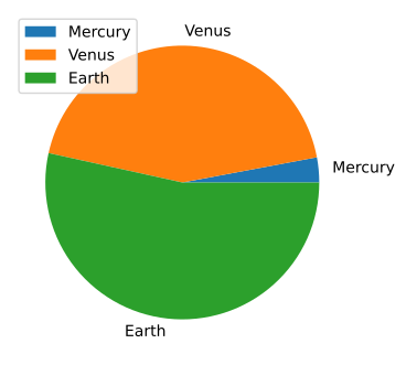
When you plot a pie chart from a DataFrame, the default labels come from the DataFrame's index. In the textbook's first example (Program 4.16), a DataFrame holds planet names as the index and their mass and radius as columns. Passing 'mass' to the plot() function produces a pie chart where each slice is labelled with the planet's name — because those names are the index values.
A Worked Example: Forest Cover Data
Consider a dataset of seven north-eastern Indian states. The DataFrame has two columns: GeoArea (total geographical area in sq km) and ForestCover (forested area in sq km). The state names serve as the index.
| State | GeoArea | ForestCover |
|---|---|---|
| Arunachal Pradesh | 83743 | 67353 |
| Assam | 78438 | 27692 |
| Manipur | 22327 | 17280 |
| Meghalaya | 22429 | 17321 |
| Mizoram | 21081 | 19240 |
| Nagaland | 16579 | 13464 |
| Tripura | 10486 | 8073 |
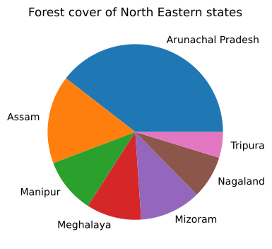
To plot a pie chart showing only the forest cover, you write:
df.plot(kind='pie', y='ForestCover', title='Forest cover of North Eastern states', legend=False)
plt.show()
Notice the parameter legend=False. This removes the legend from the output. Without it, Matplotlib would display a legend alongside the pie chart, which is often redundant because the slice labels already identify each category. The resulting chart (Figure 4.21) shows seven slices, each labelled with a state name and sized proportionally to that state's forest cover.
Always ask yourself: does the pie chart need a legend? If the slices are already labelled clearly, setting legend=False keeps the chart clean and avoids clutter.
Customising the Pie Chart
The textbook introduces two powerful customisation options: explode and autopct.
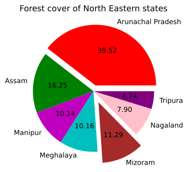
Explode lets you pull one or more slices away from the centre of the pie, drawing attention to them. You provide a list of values, one per slice, where each value is the fraction of the radius by which that slice should be separated. A value of 0 means the slice stays in place; 0.1 means it is shifted outward by 10% of the pie's radius.
Autopct displays the percentage value of each slice directly on the chart. You pass a format string — for example, "%.2f" shows percentages with two decimal places.
Here is the customised version from Program 4.18:
exp = [0.1, 0, 0, 0, 0.2, 0, 0]   # explode first slice by 0.1, fifth by 0.2
c = ['r', 'g', 'm', 'c', 'brown', 'pink', 'purple']

df.plot(kind='pie', y='ForestCover', title='Forest cover of North Eastern states',
        legend=False, explode=exp, autopct="%.2f", colors=c)
plt.show()
The colors parameter lets you assign a specific colour to each slice. In this example, Arunachal Pradesh gets red, Assam gets green, Manipur gets magenta, Meghalaya gets cyan, Mizoram gets brown, Nagaland gets pink, and Tripura gets purple. The first slice (Arunachal Pradesh) is exploded outward by 0.1 times the radius, and the fifth slice (Mizoram) is exploded by 0.2 times the radius — making it stand out even more. Each slice now also displays its exact percentage contribution to the total forest cover. …
Plot a pie chart of three planets' mass using a small DataFrame indexed by planet name -- the chapter's first pie chart, showing that the DataFrame's index becomes the default wedge labels …
Drawn by us to help you understand the concept clearly, and verified to make sure it's accurate. For exams, practice from your textbook's own diagram.
The first pie chart in the chapter, made with df.plot(kind='pie', y='mass'). Two defaults are the teaching points. A pie plots exactly one column of values, named through the y parameter — here the planets' masses, so Earth (5.97) takes the largest sector and Mercury (0.330) only a thin sliver. And matplotlib labels the slices with the DataFrame's index values, which is why the planet names appear around the rim and in the legend without being asked …
Plot a pie chart of forest cover across seven north-eastern states (Table 4.10), with legend=False since the wedge labels already name each state (Figure 4.21) -- a larger, real-data pie chart followi …
| State | GeoArea | ForestCover |
|---|---|---|
| Arunachal Pradesh | 83743 | 67353 |
| Assam | 78438 | 27692 |
| Manipur | 22327 | 17280 |
| Meghalaya | 22429 | 17321 |
| Mizoram | 21081 | 19240 |
Drawn by us to help you understand the concept clearly, and verified to make sure it's accurate. For exams, practice from your textbook's own diagram.
This pie chart applies the technique to real data — the forest cover of seven north-eastern states — and shows one presentational choice: with legend=False, each sector is labelled directly around the rim with its state name instead of through a colour-keyed legend box. Sector size does the analysis: Arunachal Pradesh visibly dominates the circle, Assam takes the next largest share, and the five remaining states split the rest. Since no percentages are printed on the s …
Drawn by us to help you understand the concept clearly, and verified to make sure it's accurate. For exams, practice from your textbook's own diagram.
The fully customised pie chart gathers three arguments in one figure. The colour list c=['r','g','m','c','brown','pink','purple'] assigns each state its own wedge colour; autopct="%.2f" stamps the exact percentage inside every slice, so Arunachal Pradesh's dominance becomes a number (39.52) rather than an impression; and the explode list pulls chosen wedges out of the circle — the first slightly and the fifth (Mizoram) further — so both stand separated for emphasis. Together …
Customisation of pie chart
A pie chart shows proportions, but the default look is often too plain. The textbook shows you how to customise it by adding a shadow, exploding a slice, and rotating the chart for better readability. You use the shadow parameter set to True to give the chart depth, and the explode parameter with a list of offset values to pull out a specific slice. The startangle parameter rotates the entire pie so the first slice starts at a given angle, and autopct formats the percentage labels displayed on each slice.
import matplotlib.pyplot as plt

subjects = ['Maths', 'Science', 'English', 'Hindi', 'SST']
marks = [85, 78, 92, 70, 88]
explode = [0, 0, 0.1, 0, 0] …
Customise the forest-cover pie chart by exploding two wedges outward, recolouring every wedge, and adding autopct to print each slice's percentage -- combining explode and aut …