Informatics Practices · Ch 4 — Plotting Data using Matplotlib
Plotting Quartiles and Box plot
Plotting Quartiles and Box plot
Quartiles and Box Plots
When you have a large dataset — like the scores of thousands of students in a national exam — it's hard to see patterns just by looking at raw numbers. Quartiles help you divide that data into four equal parts, each containing exactly one-fourth of the observations. This makes it easy to answer questions like "Who are the top 25% of students?" or "How does the middle half of the class compare to the extremes?"
A quartile is a type of quantile that splits a sorted dataset into four groups. The first quartile (Q1) is the median of the lower half of the data, the second quartile (Q2) is the overall median, and the third quartile (Q3) is the median of the upper half. The difference between Q3 and Q1 is called the interquartile range (IQR), which measures the spread of the middle 50% of the data.
A box plot (also called a box-and-whisker plot) is a visual summary of a dataset using these quartiles. It shows five key statistics: the minimum value, Q1, the median (Q2), Q3, and the maximum value. The "box" spans from Q1 to Q3, with a line inside marking the median. Two lines called whiskers extend from the box to the smallest and largest values that are not considered outliers. Any point that lies far from the rest of the data — typically beyond 1.5 times the IQR from the box — is plotted as a separate dot and called an outlier.
In the textbook's example, Mahi scored 120 out of 200 and got a 100 percentile — meaning every other candidate scored less. A box plot would show how the rest of the scores are distributed around that top score.
Plotting a Box Plot in Matplotlib
The textbook walks through two complete programs to show how box plots are created from CSV files using pandas and matplotlib.
Program 4-14 uses a file called Marks.csv that contains the marks of 14 students in five subjects: English, Maths, Hindi, Science, and Social Studies. The code reads the CSV into a DataFrame and then calls df.plot(kind='box'). This single line generates a box plot for each subject side by side, allowing a comparative analysis of performance across subjects. The plot is then given a title, x-axis label ("Subjects"), and y-axis label ("Marks").
The resulting figure (Figure 4.17 in the textbook) shows five boxes — one per subject. The distance between the box and the whiskers tells you about variation. A short distance means the data is tightly clustered (small variation), while a long distance means the data is spread out (large variation). For example, if English has a very short whisker and Maths has a long one, it suggests students' English scores are more consistent than their Maths scores.
Program 4-15 uses a different dataset: compareresort.csv containing average ratings (on a scale of 1–5) for three hotels over five years (2014–2018). The code is nearly identical — read CSV, create DataFrame, call df.plot(kind='box') — but this time the box plot compares the three resorts. The output (Figure 4.18) lets you see which resort has the most consistent ratings and which has the highest median rating.
To decide which resort to award, look at both the median (the line inside the box) and the spread. A high median with a small box and short whiskers means consistently high ratings. A low median or a very wide box suggests inconsistency or poor performance.
Customising the Box Plot
You can change the appearance of a box plot easily. The textbook shows two customisations:
- Horizontal orientation: Add
vert=Falseto theplot()call. This flips the boxes to run horizontally, which can be useful when you have long category names. - Colour: Add
color='red'(or any valid colour name) to change the colour of the whiskers, boxes, and median line. …
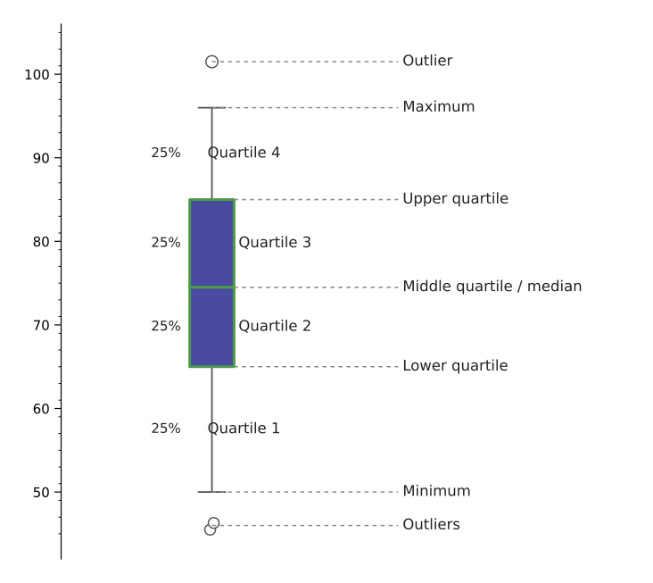
Drawn by us to help you understand the concept clearly, and verified to make sure it's accurate. For exams, practice from your textbook's own diagram.
Figure 4.16 is a schematic diagram — it does not show real data, but rather the anatomy of a box-and-whisker plot. The drawing consists of a vertical number line (the y-axis) labelled "Marks" or simply "Values", and a single box plot drawn alongside it.
The central element is a rectangular box. Its bottom edge is labelled Quartile 1 (Q1) and its top edge is labelled Quartile 3 (Q3). Inside the box, a horizontal line marks the Median (also called Quartile 2 or Q2). The box therefore spans the middle 50% of the data — from the 25th percentile to the 75th percentile.
From the top of the box, a vertical line (the upper whisker) extends upward to a point labelled Maximum. From the bottom of the box, a similar line (the lower whisker) extends downward to a point labelled Minimum. These whiskers show the full range of the data, excluding any outliers.
Beyond the upper whisker, a single dot is placed and labelled Outlier. This is a data point that lies far from the rest of the values — typically more than 1.5 times the interquartile range (Q3 − Q1) away from the box.
The figure also includes a small legend or annotation that lists the five-number summary: Minimum, Q1, Median, Q3, Maximum. This is the statistical summary the box plot visualises. …
Plot a boxplot of five subjects' marks (Table 4.8) to compare class performance subject by subject -- the chapter's first boxplot, introducing quartiles, whiskers and outliers visually (Figure 4.17), read straig …
| Name | English | Maths | Hindi | Science | Social_Studies |
|---|---|---|---|---|---|
| Rishika Batra | 95 | 95 | 90 | 94 | 95 |
| Waseem Ali | 95 | 76 | 79 | 77 | 89 |
| Kulpreet Singh | 78 | 81 | 75 | 76 | 88 |
| Annie Mathews | 88 | 63 | 67 | 77 | 80 |
| Shiksha | 95 | 55 | 51 | 59 | 80 |
| Naveen Gupta | 82 | 55 | 63 | 56 | 74 |
| Taleem Ahmed | 73 | 49 | 54 | 60 | 77 |
| Pragati Nigam | 80 | 50 | 51 | 54 | 76 |
| Usman Abbas | 92 | 43 | 51 | 48 | 69 |
| Gurpreet Kaur | 60 | 43 | 55 | 52 | 71 |
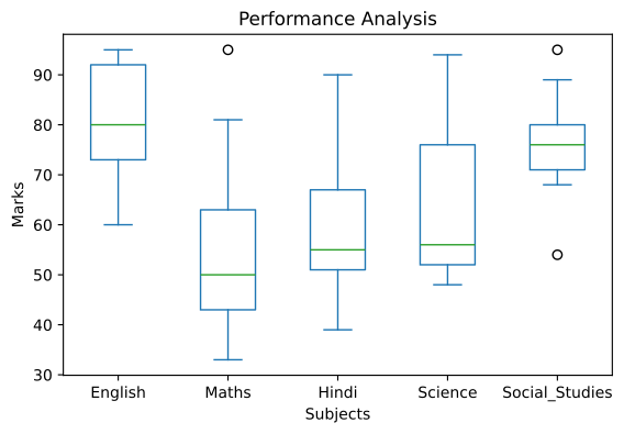
Drawn by us to help you understand the concept clearly, and verified to make sure it's accurate. For exams, practice from your textbook's own diagram.
This boxplot condenses a whole marks table into five statistical summaries, one box per subject. The figure teaches the anatomy of a boxplot: each blue box spans the middle half of the marks (quartile 1 to quartile 3), the green line inside is the median, the whiskers stretch to the extremes, and lone circles — like the one near 95 above Maths — flag outliers that sit apart from the rest. At a glance it supports comparisons no single average could: English scores run consistently high, Maths is both …
Plot a boxplot comparing three hotels' five-year average customer ratings (Table 4.9) so the best-performing resort can be identified from the spread of scores (Figure 4.18) -- the same boxplot technique appl …
| Year | Sunny Bunny Resort | Happy Lucky Resort | Breezy Windy Resort |
|---|---|---|---|
| 2014 | 4.75 | 3 | 4.5 |
| 2015 | 2.5 | 4 | 2 |
| 2016 | 3.5 | 2.5 | 3 |
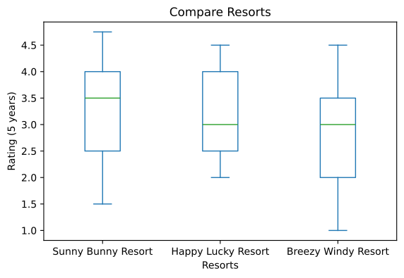
Drawn by us to help you understand the concept clearly, and verified to make sure it's accurate. For exams, practice from your textbook's own diagram.
Drawn from three resorts' five-year customer ratings, this boxplot demonstrates the chart type's main use: comparing distributions to support a decision — here, which resort deserves the award. Each blue box shows where the middle half of a resort's ratings lies, the green median line marks its typical rating, and the whiskers mark the best and worst. Because Sunny Bunny's median (~3.5) sits above the other two while all three boxes span broadly similar ranges, the plot makes t …
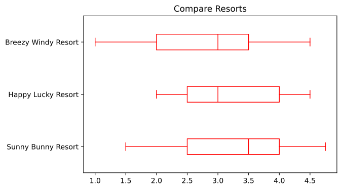
Drawn by us to help you understand the concept clearly, and verified to make sure it's accurate. For exams, practice from your textbook's own diagram.
The final boxplot variation teaches two more customisation options. Passing vert=False rotates the whole plot: the resort names move to the y-axis and the rating scale runs horizontally, so each box now stretches sideways with its median as a vertical line inside it. color='red' recolours the boxes. Because the spreads match those of Figure 4.18 exactly, the pairing shows that orientation and colour are pure presentation choic …
Customising Box plot
The real book's own 'Customising Box plot' content is Program 4-15 above — df.plot(kind='box', title='Compare Resorts', color='red', vert=False). (No patch_artist/showmeans/notch param …