Informatics Practices · Ch 4 — Plotting Data using Matplotlib
Plotting Bar Chart
Plotting Bar Chart
Bar charts are the go-to choice when you want to compare values across different categories. A line plot is great for showing trends over time, but it struggles to make clear comparisons between separate groups. For example, in the weekly sales data, a line plot shows that sales rise on weekends, but it is hard to tell at a glance how Week 1 compares to Week 2 on a given day. A bar chart solves this by using separate bars for each category, making side-by-side comparison immediate.
Unlike line plots, bar charts can directly plot non-numeric labels — like day names — on the x-axis. To create a bar chart in pandas, you set kind='bar' inside the plot() method. You can also specify which DataFrame column goes on the x-axis and which on the y-axis.
The textbook uses a file called MelaSales.csv. After adding a column called "Day" with the names of the days (Monday through Sunday), the data looks like this:
| Week 1 | Week 2 | Week 3 | Day |
|---|---|---|---|
| 5000 | 4000 | 4000 | Monday |
| 5900 | 3000 | 5800 | Tuesday |
| 6500 | 5000 | 3500 | Wednesday |
| 3500 | 5500 | 2500 | Thursday |
| 4000 | 3000 | 3000 | Friday |
| 5300 | 4300 | 5300 | Saturday |
| 7900 | 5900 | 6000 | Sunday |
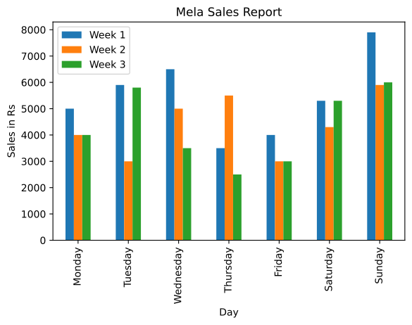
Program 4-6 shows the basic bar chart. The code reads the CSV, then calls df.plot(kind='bar', x='Day', title='Mela Sales Report'). This tells pandas to use the "Day" column for the x-axis and plot all other numeric columns (Week 1, Week 2, Week 3) as separate bars for each day. The y-axis is labelled "Sales in Rs" using plt.ylabel(). The result is Figure 4.7 — a bar chart where each day has three bars side by side, one for each week.
If you do not specify the x parameter, pandas will use the DataFrame's index (the row numbers starting from 0) as the x-axis labels. That would produce a bar chart with numeric labels instead of day names.
Customising the bar chart — Program 4-7 adds several visual tweaks to make the chart clearer or more attractive. The same plot() call now includes extra arguments:
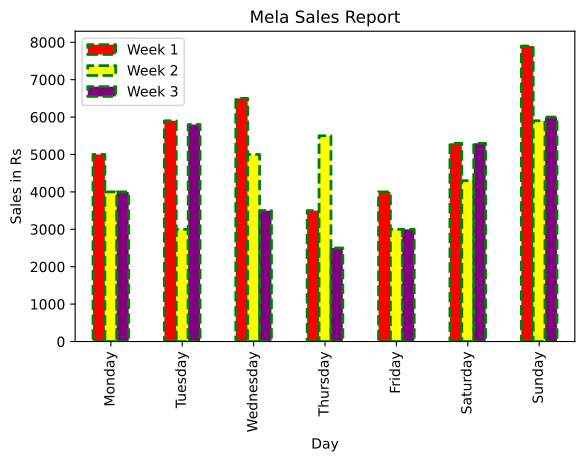
color=['red', 'yellow', 'purple']— sets the colour of each bar group (Week 1 bars become red, Week 2 yellow, Week 3 purple).edgecolor='Green'— gives each bar a green outline.linewidth=2— makes the outline thicker.linestyle='--'— draws the outline as a dashed line instead of a solid one. …
| Week 1 | Week 2 | Week 3 | Day |
|---|---|---|---|
| 5000 | 4000 | 4000 | Monday |
| 5900 | 3000 | 5800 | Tuesday |
| 6500 | 5000 | 3500 | Wednesday |
| 3500 | 5500 | 2500 | Thursday |
| 4000 | 3000 | 3000 | Friday |
Display a bar plot for the MelaSales.csv file with the Day column on the x-axis (Table 4.7) -- the first bar chart, showing how kind='bar' lets a categorical column drive the x-axis instead …
Drawn by us to help you understand the concept clearly, and verified to make sure it's accurate. For exams, practice from your textbook's own diagram.
The same Mela Sales data redrawn as a bar chart simply by passing kind='bar' to df.plot(), with x='Day' putting the day names on the x-axis. Each day gets a cluster of three bars, one per week, coloured automatically and keyed by the legend. The figure's teaching point is about choosing the right chart type: where the line plots showed each week's trend over time, the grouped bars make the day-by-day comparison between weeks …
Drawn by us to help you understand the concept clearly, and verified to make sure it's accurate. For exams, practice from your textbook's own diagram.
This figure demonstrates that bar charts have their own set of styling parameters. Program 4-7 passes color to pick the fill colour of each weekly series (red, yellow, purple), edgecolor to draw every bar's outline in green, and linewidth with the '--' linestyle to make that outline a thick dashed border. The data and layout are identical to Figure 4.7, so the comparison isolates exactly what each argument changes — reinforcing the chapter's pattern …
Customising Bar Chart
The real book's own 'Customising Bar Chart' content is Program 4-7 above — the same MelaSales.csv grouped bar chart styled with color=['red','yellow','purple'], edgecolor='Green', linewidth=2, linestyle='--'. (No separate monthly …
Display the same bar plot with each week's bars coloured red, yellow and purple, a green dashed edgecolor and linewidth 2 -- demonstrating color, edgecolor, linewidth and linestyle customis …