Economics · Ch 9 — Production and Costs
Short Run Costs
Short Run Costs
3.7.1 Short Run Costs
The Meaning of Fixed and Variable Costs
In the short run, a firm cannot change all its inputs. Some inputs — like factory buildings, heavy machinery, or a permanent licence — are fixed. The cost of employing these fixed inputs is called total fixed cost (TFC). No matter how much output the firm produces, TFC stays the same. Even if the firm produces nothing, it must still pay this cost.
The inputs the firm can adjust in the short run — raw materials, casual labour, electricity — are variable inputs. The cost of employing them is total variable cost (TVC). When output is zero, TVC is zero. As the firm produces more, it must use more variable inputs, so TVC rises.
Adding the two gives total cost (TC):
This is the fundamental identity of short-run cost. Every other cost concept is built from it.
The Cost Table: A Numerical Example
Table 3.3 in the textbook shows a typical firm's cost structure. The numbers are not arbitrary — they illustrate the patterns that economists observe in real firms.
| Output (q) | TFC (Rs) | TVC (Rs) | TC (Rs) | AFC (Rs) | AVC (Rs) | SAC (Rs) | SMC (Rs) |
|---|---|---|---|---|---|---|---|
| 0 | 20 | 0 | 20 | – | – | – | – |
| 1 | 20 | 10 | 30 | 20 | 10 | 30 | 10 |
| 2 | 20 | 18 | 38 | 10 | 9 | 19 | 8 |
| 3 | 20 | 24 | 44 | 6.67 | 8 | 14.67 | 6 |
| 4 | 20 | 29 | 49 | 5 | 7.25 | 12.25 | 5 |
| 5 | 20 | 33 | 53 | 4 | 6.6 | 10.6 | 4 |
| 6 | 20 | 39 | 59 | 3.33 | 6.5 | 9.83 | 6 |
| 7 | 20 | 47 | 67 | 2.86 | 6.7 | 9.57 | 8 |
| 8 | 20 | 60 | 80 | 2.5 | 7.5 | 10 | 13 |
| 9 | 20 | 75 | 95 | 2.22 | 8.33 | 10.55 | 15 |
| 10 | 20 | 95 | 115 | 2 | 9.5 | 11.5 | 20 |
Notice: TFC is always Rs 20. At q = 0, TC = TFC = Rs 20. TVC starts at zero and grows as output increases. TC is simply the vertical sum of TFC and TVC.
Average Costs
Three average cost concepts are defined from the totals.
Average fixed cost (AFC) is total fixed cost per unit of output:
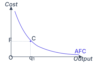
Since TFC is constant, AFC falls continuously as output rises. When output is very small, AFC is huge; when output is very large, AFC approaches zero. The AFC curve is a rectangular hyperbola — if you multiply any output level by its AFC, you always get the same number, TFC.
Average variable cost (AVC) is total variable cost per unit:
Short run average cost (SAC) — often just called average total cost — is total cost per unit:
Because TC = TFC + TVC, it follows that:
At q = 0, all three averages are undefined (division by zero). In the table, for the first unit, AFC = Rs 20, AVC = Rs 10, so SAC = Rs 30.
Short Run Marginal Cost (SMC)
Marginal cost is the extra cost of producing one more unit of output:
where means "change in". Since TFC does not change with output, any change in TC comes entirely from a change in TVC. So in the short run:
SMC is also . The fixed cost plays no role in marginal cost.
In the table, SMC is calculated by taking the difference in TC between successive output levels. For example, at q = 5:
- Change in TC = TC at q=5 minus TC at q=4 = 53 − 49 = Rs 4
- Change in q = 1
- SMC = 4/1 = Rs 4
SMC is undefined at q = 0. For the first unit, SMC equals AVC (both Rs 10). This is not a coincidence — it happens because the first unit's marginal cost is the entire variable cost of that unit, and the average of just that one unit is the same number.
The sum of all SMC values up to a given output level equals the TVC at that level. For instance, from the table: SMC for units 1 through 5 are 10, 8, 6, 5, 4. Their sum is 10 + 8 + 6 + 5 + 4 = 33, which is exactly the TVC at q = 5. Consequently, AVC at any output is the average of all SMC values up to that output.
Shapes of the Short Run Cost Curves
Total Cost Curves
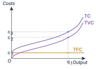
Figure 3.3 in the textbook shows the three total cost curves. Output is on the x-axis, cost in rupees on the y-axis.
- TFC curve: A horizontal straight line. It cuts the cost axis at the value of TFC (c₁ in the diagram). It never slopes — fixed cost does not change.
- TVC curve: Starts at the origin (zero output, zero variable cost). It rises as output increases, first at a decreasing rate, then at an increasing rate. This shape reflects the law of variable proportions: initially, extra units of output require smaller additions to variable cost; later, they require larger additions.
- TC curve: Has the same shape as the TVC curve but is shifted vertically upward by exactly the amount of TFC. At any output q₁, the vertical distance between TC and TVC equals TFC.
Drawn by us to help you understand the concept clearly, and verified to make sure it's accurate. For exams, practice from your NCERT textbook's own diagram.
Figure 3.3 is a two-axis diagram. The horizontal axis is labelled Output (often denoted as ), and the vertical axis is labelled Costs (in rupees). Three curves are drawn, each representing a different cost concept.
The first is TFC (Total Fixed Cost). It is a perfectly horizontal straight line. It cuts the vertical cost axis at a height labelled c1. This line does not change as output increases — it stays at c1 for every level of output, because fixed costs (like rent or salaries of permanent staff) do not vary with production in the short run.
The second curve is TVC (Total Variable Cost). It starts from the origin (0,0) — at zero output, variable cost is zero. As output increases, TVC rises. Its shape is S-shaped (sigmoid): it first increases at a decreasing rate (bending gently upward), then at an increasing rate (bending more steeply upward). This shape reflects the law of variable proportions: initially, adding variable inputs gives increasing marginal returns (cost rises slowly), then diminishing marginal returns set in (cost rises faster).
The third curve is TC (Total Cost). It is drawn parallel above the TVC curve — meaning it has exactly the same shape as TVC, but shifted vertically upward. TC starts at the point c1 on the vertical axis (at zero output, TC = TFC = c1). This is because TC = TVC + TFC, so the vertical distance between the TC curve and the TVC curve is always equal to TFC (c1), at every output level.
A dashed vertical line is drawn at a particular output level labelled q1. This line meets:
- the TFC curve at height c1,
- the TVC curve at height c2,
- the TC curve at height c3.
The vertical distances illustrate the relationship: at output q1, the gap between c3 and c2 is exactly c1 (TFC), and the gap between c2 and the origin is TVC. The total cost c3 is the vertical sum of c1 (TFC) and c2 (TVC). …
Average Fixed Cost Curve
The AFC curve (Figure 3.4) slopes downward throughout. It is a rectangular hyperbola: the area of any rectangle drawn from the origin to a point on the curve equals TFC. For example, at output q₁, AFC = OF, and the rectangle OF × Oq₁ has area equal to TFC.
Drawn by us to help you understand the concept clearly, and verified to make sure it's accurate. For exams, practice from your NCERT textbook's own diagram.
The figure shows a single downward-sloping curve labelled AFC (Average Fixed Cost) on a standard graph. The vertical axis is labelled Cost and the horizontal axis is labelled Output. The curve itself is a rectangular hyperbola — it starts very high near the vertical axis, drops steeply as output increases from zero, and then flattens out as it approaches the horizontal axis from above, never touching either axis.
A specific point C is marked on the AFC curve at output level q₁ (on the horizontal axis). From point C, a dashed horizontal line extends leftward to meet the cost axis at point F. A dashed vertical line drops from point C down to the output axis at q₁. These two dashed lines, together with the axes, form a rectangle whose corners are O (the origin), F (on the cost axis), C (on the curve), and q₁ (on the output axis). The rectangle is labelled OFCq₁. …
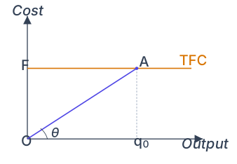
AFC can also be read from the TFC curve (Figure 3.5). At output q₀, draw a line from the origin to point A on the TFC curve. The slope of this line — tan θ, where θ is the angle ∠AOq₀ — equals AFC at q₀. This works because the slope of the ray from the origin to a point on the TFC curve is TFC/q.
Drawn by us to help you understand the concept clearly, and verified to make sure it's accurate. For exams, practice from your NCERT textbook's own diagram.
Figure 3.5 is a simple two-axis diagram that shows how to read average fixed cost (AFC) directly from the total fixed cost (TFC) curve. The horizontal axis is labelled "Output" and the vertical axis is labelled "Cost". The TFC curve is a horizontal straight line that cuts the cost axis at point F — this line stays flat because total fixed cost does not change when output changes.
On the TFC line, a point A is marked directly above a particular output level q₀ on the horizontal axis. A dashed vertical line drops straight down from A to q₀, and a solid ray (a straight line) is drawn from the origin O up to point A. This ray makes an angle θ (theta) with the horizontal axis. The vertical distance from the horizontal axis up to A is the total fixed cost at q₀, which equals OF (the height of the TFC line).
The key teaching of this figure is that the slope of the ray OA gives the average fixed cost at output q₀. Why? Because AFC is defined as TFC divided by q. At q₀, TFC = Aq₀ (the vertical leg of the right triangle OAq₀) and output = Oq₀ (the horizontal leg). The slope of the ray OA is the ratio of the vertical leg to the horizontal leg: Aq₀ / Oq₀. That ratio is exactly TFC / q₀, which is AFC. And since the slope of a line is tan θ, the caption says "the slope of the angle ∠AOq₀ gives us the average fixed cost at q₀" — meaning tan θ = AFC at that output. …
Marginal Cost Curve
The SMC curve is U-shaped. Why? Because of the law of variable proportions. Initially, as more variable input is employed, the marginal product of each additional unit rises. This means each extra unit of output requires less additional input, so marginal cost falls. After a point, diminishing returns set in — marginal product falls, so each extra unit of output requires more additional input, and marginal cost rises.
At q = 0, SMC is undefined. The SMC curve starts at the same point as the AVC curve (since for the first unit, SMC = AVC). It falls, reaches a minimum, then rises.
Average Variable Cost Curve
The AVC curve is also U-shaped. For the first unit, AVC = SMC. As output increases and SMC falls, AVC falls too — but less steeply, because AVC averages all marginal costs so far. When SMC starts rising, AVC continues to fall as long as SMC is below the current AVC. Once SMC rises above AVC, AVC begins to rise.
A common mistake is to think AVC reaches its minimum at the same output as SMC. It does not. AVC continues falling after SMC has started rising, until SMC catches up to it from below. The SMC curve cuts the AVC curve at the AVC's minimum point.
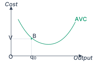
In Figure 3.6, at output q₀, AVC = OV. The total variable cost at q₀ is the area of the rectangle OV × Oq₀.
Drawn by us to help you understand the concept clearly, and verified to make sure it's accurate. For exams, practice from your NCERT textbook's own diagram.
The figure shows a single U-shaped curve labelled AVC (Average Variable Cost), plotted with Cost on the vertical axis and Output on the horizontal axis. The curve falls initially, reaches a minimum, and then rises — the characteristic U-shape of the short-run average variable cost curve.
On the falling (left) portion of the AVC curve, a point is marked B. From B, a dashed horizontal line extends leftward to meet the cost axis at point V. A dashed vertical line drops from B down to the output axis at point q₀. Together, these two dashed lines and the axes form a rectangle with vertices O (the origin), V (on the cost axis), B (on the curve), and q₀ (on the output axis). The rectangle is labelled OVBq₀.
The key teaching of this figure is that the area of rectangle OVBq₀ equals the total variable cost (TVC) at output level q₀. Why? Because average variable cost at q₀ is the height OV (the value of AVC at that output), and the quantity produced is the base Oq₀. Since TVC = AVC × quantity, the product of these two lengths gives the area of the rectangle. This geometric interpretation reinforces the algebraic definition: at any output, the total variable cost is the average variable cost multiplied by the number of units produced. …
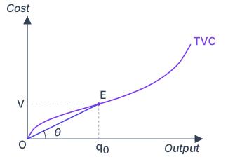
AVC can also be read from the TVC curve (Figure 3.7). At output q₀, draw a ray from the origin to point E on the TVC curve. The slope of this ray — tan θ — equals AVC at q₀. …
Drawn by us to help you understand the concept clearly, and verified to make sure it's accurate. For exams, practice from your NCERT textbook's own diagram.
Figure 3.7 is a simple two-axis diagram. Output () is measured along the horizontal axis, and total variable cost (TVC) is measured along the vertical axis. A single, S-shaped curve labelled TVC starts from the origin (0,0) and rises smoothly as output increases. The curve is drawn so that its slope first decreases (the curve becomes flatter) and then increases (the curve becomes steeper), giving it the characteristic S-shape that reflects the law of variable proportions.
On this curve, a specific point is marked E, corresponding to output level on the horizontal axis. From the origin O, a straight ray (a line) is drawn to point E. This ray makes an angle with the horizontal axis. Dashed lines are used to connect E to the vertical axis (meeting it at point V) and to the horizontal axis (meeting it at ). The dashed vertical line from E down to shows the total variable cost at that output: the height of point E above the horizontal axis is the TVC at , which is also the distance OV on the cost axis.
The key teaching of this figure is about average variable cost (AVC). The textbook caption states: "The slope of the angle EOq₀ gives us the average variable cost at q₀." Here is why. At output , the total variable cost is the vertical distance (which equals OV). The average variable cost is defined as . So at :
But in the right triangle formed by O, E, and the point directly below E on the horizontal axis, the ratio is exactly , where is the angle between the ray OE and the horizontal axis. Therefore, the slope of the ray from the origin to a point on the TVC curve equals the AVC at that output level. …
Drawn by us to help you understand the concept clearly, and verified to make sure it's accurate. For exams, practice from your NCERT textbook's own diagram.
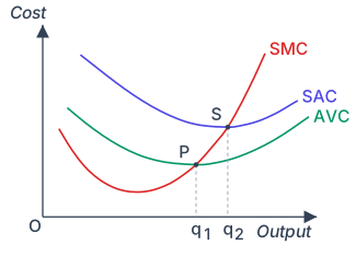
Figure 3.8 plots three short-run cost curves on a single graph: output on the horizontal axis, cost (in rupees) on the vertical axis. The three curves are the short-run marginal cost (SMC, red), the average variable cost (AVC, green), and the short-run average cost (SAC, blue). All three are U-shaped, but they differ in position and steepness.
The AVC curve is the lowest of the three. It falls initially, reaches a minimum at output level , and then rises. The SAC curve lies above the AVC curve at every output level — the vertical gap between them is the average fixed cost (AFC), which shrinks as output increases. SAC also falls, reaches its minimum at a larger output , and then rises. Notice that is to the right of : the minimum of SAC occurs at a higher output than the minimum of AVC. The SMC curve is steeper than the other two. It falls sharply, reaches a minimum, and then rises steeply.
The key relationship shown is how SMC intersects the other two curves. The SMC curve cuts the AVC curve from below at point P, which is exactly the minimum point of the AVC curve (at output ). A dashed vertical line drops from P to the horizontal axis, marking . Similarly, the SMC curve cuts the SAC curve from below at point S, the minimum point of the SAC curve (at output ). Another dashed vertical line drops from S to the axis, marking . …