Informatics Practices · Ch 4 — Plotting Data using Matplotlib
Plotting Histogram
Plotting Histogram
What is a Histogram?
A histogram is a type of column chart where each column represents a range of values, not a single value. The height of each column shows how many data points fall into that particular range. This makes histograms ideal for understanding the distribution or frequency of numerical data.
To build a histogram, the data is first sorted into intervals called bins. The number of data points in each bin is counted, and the height of the column is proportional to that count.
Bins: The Intervals of a Histogram
Bins are the intervals into which the entire dataset is divided. Each bin becomes one bar on the histogram. The df.plot(kind='hist') function automatically selects the size and number of bins based on the spread of values in the data. However, you can also control the bins manually by passing a value to the bins parameter.
Examples of specifying bins:
df.plot(kind='hist', bins=20)— divides the data into 20 equal-width bins.df.plot(kind='hist', bins=[18,19,20,21,22])— uses the exact boundaries given in the list.df.plot(kind='hist', bins=range(18,25))— creates bins from 18 to 24 (sincerange(18,25)gives 18,19,20,21,22,23,24).
Default Behaviour: Plotting All Numeric Columns
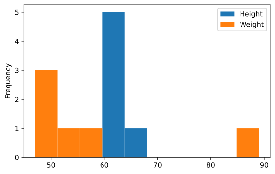
When you call df.plot(kind='hist') on a DataFrame without specifying a column, Matplotlib automatically plots a histogram for every numeric column in the DataFrame. For example, if your DataFrame has 'Height' and 'Weight' columns, both will appear as separate histograms on the same plot, each with its own colour. The plot() function calculates the bin values based on the data provided.
Customising a Histogram
You can change the appearance of a histogram using several parameters inside the plot() function.
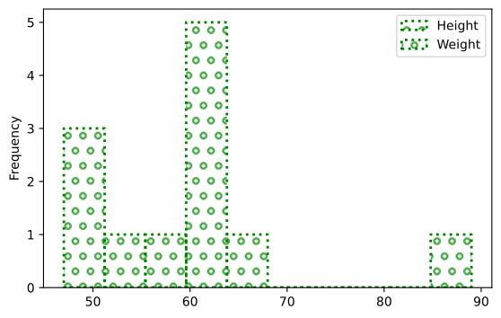
edgecolor— sets the colour of the border around each bar. For example,edgecolor='Green'.linestyle— changes the line style of the border. Common values include":"(dotted),"-"(solid),"--"(dashed).linewidth— controls the thickness of the border line. For example,linewidth=2.fill— takes a boolean value.True(the default) fills each bar with colour;Falseleaves the bars empty (transparent inside).hatch— fills each bar with a pattern instead of a solid colour. Available patterns include'-','+','x','\\','*','o','O','.'. For example,hatch='o'fills the bars with a pattern of small circles.
Working with Open Data
Many websites provide data freely for anyone to download and analyse, especially for educational purposes. This is called Open Data. The "Open Government Data (OGD) Platform India" (data.gov.in) is one such platform that supports the Open Data initiative of the Government of India. Large datasets on various projects and parameters are available there.
Example: Plotting Temperature Data
Consider a dataset called "Seasonal and Annual Min/Max Temp Series - India from 1901 to 2017". The goal is to plot the minimum and maximum temperature and observe how many times (frequency) a particular temperature has occurred.
Steps:
- Read the CSV file using
pd.read_csv(), using theusecolsparameter to extract only the required columns:'ANNUAL - MIN'and'ANNUAL - MAX'. - Create a DataFrame from the data.
- Plot a histogram for
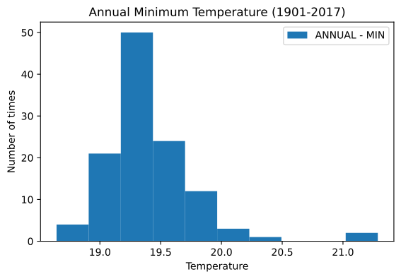
'ANNUAL - MIN'alone, setting a title and labelling the axes. - Plot a second histogram showing both
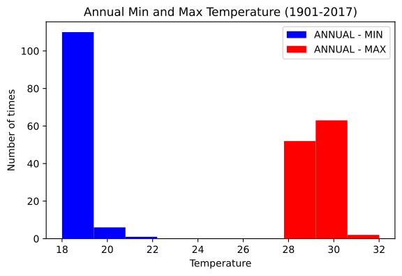
'ANNUAL - MIN'and'ANNUAL - MAX'together, using different colours (e.g., blue and red).
The y parameter inside df.plot(kind='hist', y='ANNUAL - MIN') specifies which column to plot when you want only one column from the DataFrame.
Frequency Polygon Over a Histogram …
Plot a default histogram for a small DataFrame's Height and Weight columns using df.plot(kind='hist') -- introduces how Pandas automatically chooses bin sizes from the sp …
Drawn by us to help you understand the concept clearly, and verified to make sure it's accurate. For exams, practice from your NCERT textbook's own diagram.
The chapter's first histogram, made with df.plot(kind='hist'): matplotlib takes each numeric column of the students DataFrame — Height and Weight — splits its range into automatically chosen bins and counts how many values fall in each, plotting the counts as bars. The figure teaches how to read a frequency distribution: five of the six heights crowd into the 60–63 band (the tallest bar), most weights cluster near 47–58, and the lone bar near 89 stands apart as an outlying value. Un …
Drawn by us to help you understand the concept clearly, and verified to make sure it's accurate. For exams, practice from your NCERT textbook's own diagram.
A restyled version of the previous histogram, used to introduce histogram-specific customisation arguments. fill=False empties the bars so only outlines remain, the edges are drawn in green with a dotted ':' linestyle of linewidth 2, and the 'o' hatch pattern fills each column with small circles. Since the frequencies are unchanged from Figure 4.9, the figure isolates presentation from data — and shows how unfilled, patterned bars can dist …
Drawn by us to help you understand the concept clearly, and verified to make sure it's accurate. For exams, practice from your NCERT textbook's own diagram.
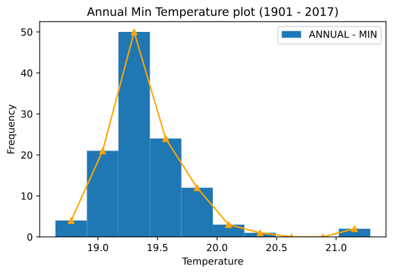
This figure scales the histogram up from a toy DataFrame to a real dataset: 117 years of IMD annual minimum temperatures. Binning that many observations reveals a genuine distribution — the years pile up sharply around 19.25 on the temperature axis, where the tallest bar counts 50 years, and taper off on either side — something no table of 117 numbers could show at a glance. One print caveat: the book swapped the printed captions of Figures 4.11 and 4.12, so this capt …
Drawn by us to help you understand the concept clearly, and verified to make sure it's accurate. For exams, practice from your NCERT textbook's own diagram.
Plotting both temperature columns in one histogram turns the chart into a comparison of two distributions. Program 4-10's color=['blue','red'] assigns a colour per column, and the legend keys blue to ANNUAL - MIN and red to ANNUAL - MAX. The teaching moment is the picture itself: the minima form one tall, narrow cluster around 19–22 while the maxima form a separate cluster around 28–31, and the wide empty gap between them shows how far apart the annual minima and maxima lie. Note that the bo …
Drawn by us to help you understand the concept clearly, and verified to make sure it's accurate. For exams, practice from your NCERT textbook's own diagram.
This figure introduces the frequency polygon — a line-based view of a histogram. Program 4-11 first draws the ANNUAL - MIN histogram, then computes the midpoint of each bin from its edges (mid = 0.5*(edges[1:] + edges[:-1])) and plots an orange line with triangle markers through the top of every bar. The polygon traces the same distribution as the bars — rising to the peak of 50 and tapering along the tail — and teaches that a histogram's bin edges …
Customising Histogram
The real book's own 'Customising Histogram' content is Program 4-9 above — the same Name/Height/Weight DataFrame styled with edgecolor='Green', linewidth=2, linestyle=':', fill=False, hatch='o'. (No separate Age-column example, and no rwidth/`hist …
Customise the same Height/Weight histogram: green edgecolor, dotted linestyle, linewidth 2, fill=False so each bar is unfilled, and an 'o' hatch pattern instead of solid colour (Figure 4.10) -- shows how a histogram's bars can be restyled wi …
Using Open Data
The real book's own 'Using Open Data' content is Program 4-10 above — the data.gov.in 'Seasonal and Annual Min/Max Temperature Series — India (1901-2017)' dataset (Min_Max_Seasonal_IMD_2017.csv), read with usecols=['ANNUAL - MIN','ANNUAL - MAX']. (No popu …
Load a real open dataset of India's 1901-2017 annual min/max temperatures and plot two histograms from it -- one for ANNUAL-MIN alone, one for ANNUAL-MIN and ANNUAL-MAX together -- the chapter's first example built on a downloaded CSV rat …
Plot a frequency polygon over the ANNUAL-MIN histogram by computing bin midpoints with NumPy and drawing a line through them with plt.plot(mid, y, '-^') -- shows a histogram and a line plot co …