Economics · Ch 10 — The Theory of the Firm under Perfect Competition
Market Supply Curve
Market Supply Curve
4.6 Market Supply Curve
The market supply curve tells us the total quantity that all firms in a market are willing to produce at each possible market price. On a standard graph, the market price is on the vertical axis (y-axis) and the aggregate output level is on the horizontal axis (x-axis). The curve itself shows how the combined output of all firms responds as price changes.
Deriving the Market Supply Curve
Consider a market with firms — firm 1, firm 2, firm 3, and so on. When the market price is fixed at some value , each firm decides how much to produce based on its own cost structure. The total output supplied by all firms together is simply the sum of what each individual firm supplies at that price:
where is the supply of firm at price .
This is the core idea: market supply is the horizontal summation of individual firm supply curves. We add quantities, not prices — for a given price, we add up the quantities each firm produces.
Geometric Construction with Two Firms
To see how this works visually, take a market with just two firms: firm 1 and firm 2. They have different cost structures, so their supply behaviour differs.
Let be the minimum price at which firm 1 is willing to produce anything — below , firm 1 supplies zero. Let be the corresponding threshold for firm 2. Assume — firm 2 needs a higher price to start producing.
Why different thresholds? Each firm has its own cost structure. Firm 1 might have lower average costs, so it can profitably produce at a lower price. Firm 2, with higher costs, needs a higher price to cover its expenses.
Now examine the three price ranges:
Price below . Both firms produce nothing. Market supply is zero.
Price between and . Firm 1 produces a positive amount; firm 2 still produces nothing. So the market supply curve in this range is exactly the same as firm 1's supply curve.
Price at or above . Both firms produce positive amounts. The market supply is the sum of their individual supplies.
Take a concrete price that is greater than . At this price, firm 1 supplies units and firm 2 supplies units. The market supply at is:
What the Three Panels of Figure 4.13 Show
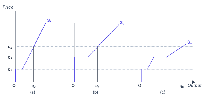
Panel (a) shows the supply curve of firm 1, labelled . It begins at price on the vertical axis and slopes upward.
Panel (b) shows the supply curve of firm 2, labelled . It begins at the higher price and also slopes upward.
Panel (c) shows the market supply curve, labelled . For prices below , it lies on the horizontal axis (zero output). Between and , it follows exactly. At and above , it lies to the right of both individual curves — at each price, the horizontal distance from the vertical axis to equals the sum of the distances to and .
This is why we say the market supply curve is obtained by horizontal summation of the individual supply curves.
Drawn by us to help you understand the concept clearly, and verified to make sure it's accurate. For exams, practice from your textbook's own diagram.
The figure is built around three panels arranged side by side. Each panel has price on the vertical axis and quantity on the horizontal axis. Panel (a) shows the supply curve of firm 1, panel (b) shows the supply curve of firm 2, and panel (c) shows the market supply curve. The key idea is that the market supply curve is not drawn from thin air — it is the horizontal sum of the individual firms’ supply curves.
In each firm’s panel, the supply curve is the portion of its marginal cost curve that lies above the minimum of its average variable cost. For a perfectly competitive firm, this is the rule: produce where price equals marginal cost, but only if price covers average variable cost; otherwise shut down. So the firm’s supply curve is upward-sloping from that minimum point onward. In the figure, firm 1’s supply curve starts at a certain minimum price, and firm 2’s starts at a possibly different minimum price (because firms can have different cost structures).
The horizontal summation works like this: at any given price, you read off the quantity supplied by firm 1 from panel (a) and the quantity supplied by firm 2 from panel (b). Then you add those two quantities together to get the total quantity supplied in the market at that price. That sum is plotted in panel (c). For example, if at price ₹10 firm 1 supplies 5 units and firm 2 supplies 3 units, the market supplies 8 units at ₹10. You repeat this for every price, and the resulting curve in panel (c) is the market supply curve.
Horizontal summation means adding quantities, not prices. At a given price, you add the horizontal distances from the vertical axis to each firm’s supply curve. This is why it’s called horizontal — you move horizontally from the price axis to each curve, sum those distances, and plot the total.
The textbook uses this figure to develop the formula for market supply. If is the supply function of firm 1 (quantity supplied as a function of price) and is the supply function of firm 2, then the market supply function is:
Here, is the market price (same for all firms in perfect competition), is the quantity firm 1 supplies at price , is the quantity firm 2 supplies at price , and is the total quantity supplied in the market at that price. This generalises to firms: . …
Horizontal vs vertical summation. In supply, we add quantities at a given price — that is horizontal summation (add along the x-axis). Do not confuse this with vertical summation, where you would add prices at a given quantity (used in some other contexts like adding demand curves for public goods).
Shifts in the Market Supply Curve
The derivation above assumes a fixed number of firms. If the number of firms changes, the entire market supply curve shifts:
- Increase in the number of firms — the market supply curve shifts to the right. At every price, more output is available.
- Decrease in the number of firms — the market supply curve shifts to the left. At every price, less output is available.
This makes intuitive sense: if more producers enter the market, total supply rises; if firms exit, total supply falls.
Numerical Example
The textbook works through a concrete numerical example with two firms. Let the supply curve of firm 1 be:
This means: if the market price is below ₹10, firm 1 produces nothing. If the price is ₹10 or above, firm 1 produces units.
Let the supply curve of firm 2 be:
Firm 2 needs a price of at least ₹15 to start producing; above that, it supplies units.
The market supply curve is the sum:
Working this out piece by piece:
-
When : Both firms supply zero. So .
-
When : Firm 1 supplies , firm 2 supplies zero. So . …