Economics · Ch 4 — Presentation of Data
Component Bar Diagram
Component Bar Diagram
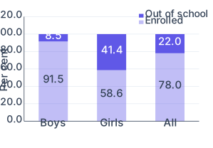
A component bar diagram (also called a sub-diagram) shows each bar divided into parts, so that the reader sees both the total and the sizes of the components that make it up, and can study the relationship among those parts. The components are usually shaded or coloured differently.
To construct one, a bar is drawn on the x-axis with its height equal to the total value. For percentage data the total bar is made units tall; otherwise the total value fixes the height and the component heights are worked out by the unitary method in proportion to their values. The smaller components are placed first when dividing the bar. …
Drawn by us to help you understand the concept clearly, and verified to make sure it's accurate. For exams, practice from your textbook's own diagram.
A component (stacked) bar diagram with three bars — Boys, Girls and All — each a full 100 per cent split into two segments: 'Enrolled' (lower, light) and 'Out of school' (upper, dark). Read each bar top-to-bottom to see how the whole divides: of boys are enrolled but only of girls, leaving of girls out of school versus of boys. The tall dark segment on the …
| Gender | Enrolled (per cent) | Out of school (per cent) |
|---|---|---|
| Boy | 91.5 | 8.5 |
| Girl | 58.6 | 41.4 |
| All | 78.0 | 22.0 |