Economics · Ch 4 — Presentation of Data
Multiple Bar Diagram
Multiple Bar Diagram
A multiple bar diagram is used to compare two or more sets of data side by side. For each category, a group of adjacent bars is drawn, one bar for each data set, and the groups are separated from one another.
Typical uses are comparing income and expenditure, or imports and exports, across several years, or marks obtained in different subjects across classes. For example, placing the female literacy bars for 2001 and 2011 next to each other for every major state lets the reader see at once that female literacy rose across the country, and even pick out the states (such as Bihar, Jharkhand and Uttar Pradesh) where the rise was sharpest.
Activities
- How many major states had a higher female literacy rate than the national average in 2011? …
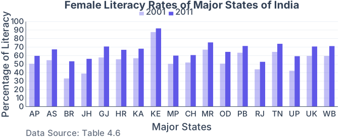
Drawn by us to help you understand the concept clearly, and verified to make sure it's accurate. For exams, practice from your textbook's own diagram.
A multiple (grouped) bar diagram: each state has two side-by-side bars, a lighter one for 2001 and a darker one for 2011 female literacy, so you can compare the same measure across two census years. The y-axis is percentage literacy (0–100). In every state the darker 2011 bar stands taller than the lighter 2001 bar — e.g. Bihar rises from to $53.3% …