Applied Mathematics · Ch 10 — Descriptive Statistics
Histograms
Histograms
A histogram is the natural next step after a frequency distribution — it turns a table of numbers into a picture. Instead of listing how many data points fall into each class interval, you draw a bar for each interval whose area is proportional to the frequency. This visual shape instantly reveals where most of the data clusters, how spread out it is, and whether the distribution is symmetric or skewed. For continuous data grouped into equal or unequal class widths, the h …
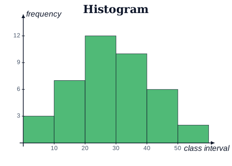
Drawn by us to help you understand the concept clearly, and verified to make sure it's accurate. For exams, practice from your NCERT textbook's own diagram.
A histogram shows a grouped frequency distribution; the bars are contiguous because the classe …