Economics · Ch 4 — Presentation of Data
Pie Diagram
Pie Diagram
A pie diagram (or pie chart) is a component diagram in the shape of a circle whose area is divided among the components in proportion to their sizes. Straight lines drawn from the centre to the circumference cut the circle into as many sectors as there are components.
Pie charts are drawn from percentages, not absolute values: each category's value is first written as a percentage of the total. The whole circle is treated as equal parts, so each one per cent corresponds to
The angle a component makes at the centre is found by multiplying its percentage by . For example, for the working status of India's population in 2011 (Table 4.8 below):
| Status | Population (crore) | Per cent | Angular Component |
|---|---|---|---|
| Marginal Worker | 12 | 9.9 | |
| Main Worker | 36 | 29.8 |
Data that a component bar diagram can show can equally be shown by a pie chart, once the absolute values are turned into percentages. The radius makes no difference to the meaning — only the proportions of the sectors matter.
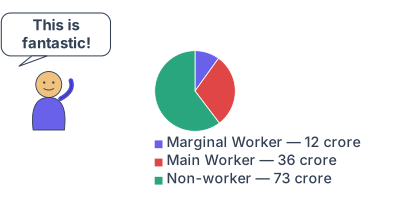
Drawn by us to help you understand the concept clearly, and verified to make sure it's accurate. For exams, practice from your textbook's own diagram.
Our own line-art cartoon (not traced from NCERT), drawn with the correct 12/36/73 crore split from Table 4.8 (the numbered Fig 4.4 just above had a printing misprint on this exact figure, corrected separately — this cartoon was never affected). A pie chart turns the same working-status data Figure …
Activities …
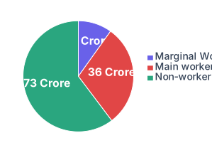
Drawn by us to help you understand the concept clearly, and verified to make sure it's accurate. For exams, practice from your textbook's own diagram.
A pie diagram: the full circle () is India's 2011 population by working status, each sector's angle proportional to its share. Non-workers form the largest slice (, ~), main workers next (, ~) and marginal workers the smallest (, ~). Read the sector sizes to compare shares of a whole. (One printed slice label rea …