Economics · Ch 4 — The Theory of the Firm under Perfect Competition
The Profit Maximisation Problem: Graphical Representation
The Profit Maximisation Problem: Graphical Representation
The Profit Maximisation Problem: Graphical Representation
The textbook uses two distinct diagrams to show how a perfectly competitive firm chooses its profit-maximising output. One diagram deals with the long run, the other with the short run. Both rely on the same core logic: the firm produces where market price equals marginal cost, provided price is at least as high as average variable cost (in the short run) or average cost (in the long run).
Long Run: When the Firm Shuts Down
In the long run, a firm can exit the industry entirely. The key condition for producing any output is that the market price must be at least as high as the minimum of the long run average cost (LRAC). If price falls below that minimum, the firm cannot cover its costs no matter what output it chooses.
Consider a market price that is less than the minimum point of the LRAC curve. The firm's long run marginal cost (LRMC) curve intersects the price line at some output level . But at , the firm's total cost exceeds its total revenue. The loss is shown graphically as the area of rectangle in the textbook's Figure 4.5.
Do not confuse the rectangle with a profit. When price is below LRAC, the rectangle represents a loss — the vertical distance between LRAC and price, multiplied by the quantity produced.
The rectangle is constructed as follows:
- The vertical side is the difference between the LRAC at and the price .
- The horizontal side is the quantity (from the origin to ).
- The area gives the total loss.
Because the firm cannot recover this loss in the long run (all costs are variable), the profit-maximising decision is to produce zero output. The firm exits the market.
In the long run, a profit-maximising firm produces zero output if the market price is less than the minimum of its long run average cost (LRAC). The firm will only produce if .
Short Run: The Profit-Maximising Output
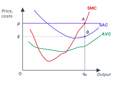
The short run case is more nuanced because some costs are fixed. The firm may produce even if it makes a loss, as long as it can cover its variable costs. The textbook's Figure 4.6 illustrates this.
Drawn by us to help you understand the concept clearly, and verified to make sure it's accurate. For exams, practice from your textbook's own diagram.
The figure plots the short-run position of a single firm in a perfectly competitive market. The horizontal axis measures the firm’s output, , and the vertical axis measures revenue and cost in rupees. The figure shows the horizontal price line at the given market price together with three curves: the short-run marginal cost curve , the short-run average cost curve and the average variable cost curve (drawn below ). The curve is U-shaped, and the curve is also U-shaped; crosses at the minimum of .
The central idea is that a profit-maximising firm chooses output where marginal revenue equals marginal cost. In perfect competition, marginal revenue is simply the market price , because each additional unit sells at the same price. So the firm’s optimal output is found where the horizontal price line intersects the rising portion of the curve. At this intersection, labelled point in the figure, the condition holds. A solid vertical line joins down through to on the output axis.
The rectangle that represents the firm’s total profit is constructed as follows. At output , the average cost per unit is read from the curve: drop a vertical line from up to the curve, hitting point . The height of the curve at is the average cost . The price is the average revenue. The vertical distance between the price line and the curve at is therefore , the profit per unit. The total profit is this per-unit profit multiplied by the number of units . Geometrically, that product is the area of a rectangle with base (or simply ) and height . The textbook labels this rectangle : marks the price on the vertical axis, lies on the vertical axis at the height of (joined to by a dotted line), is the intersection of the price line and directly above , and is the point on the curve at . The area of rectangle equals total profit.
Here is the market price (given), is the profit-maximising output where , and is the short-run average cost at that output. The formula makes clear that profit is positive only if price exceeds average cost at the chosen output. If the curve lies above the price line at , the rectangle would have negative height and the firm would make a loss — but the figure as described shows a case of positive profit. …
The market price is given as , a horizontal line (the firm's demand curve). The firm's short run marginal cost (SMC) curve slopes upward. The firm equates price with marginal cost:
This equality determines the profit-maximising output level . At , three conditions must hold (as established in sections 3.1–3.3):
- Price equals marginal cost ().
- The SMC curve is rising (sloping upwards) at .
- Price exceeds average variable cost ().
When these conditions are satisfied, is indeed the profit-maximising output.
Revenue, Cost, and Profit at
At output :
- Total revenue (TR) is the product of price and quantity: . Graphically, this is the area of rectangle — the rectangle with height and width .
- Total cost (TC) is the product of short run average cost (SAC) and quantity: . Graphically, this is the area of rectangle — the rectangle with height (point on the SAC curve) and width .
The firm's profit is the difference between total revenue and total cost:
Graphically, this profit is the area of rectangle — the rectangle whose height is the vertical distance between price and SAC at (i.e., ), and whose width is .
The rectangle in the short run diagram is the same shape as the loss rectangle in the long run diagram, but the roles of price and cost are reversed. In the short run, price is above SAC, so the rectangle is profit. In the long run, price is below LRAC, so the rectangle is loss.