Economics · Ch 15 — Poverty
The Number of Poor in India
The Number of Poor in India
When the number of poor is estimated as the proportion of people below the poverty line, it is known as the 'Head Count Ratio'. Comparing the number of poor and their proportion in terms of ratios and percentages gives us an idea of different levels of poverty and their distribution between states and over time. The official data on poverty is made available by the Planning Commission and is estimated from consumption-expenditure data collected by the National Sample Survey Organisation (NSSO).
Trends over time (Chart 4.3)
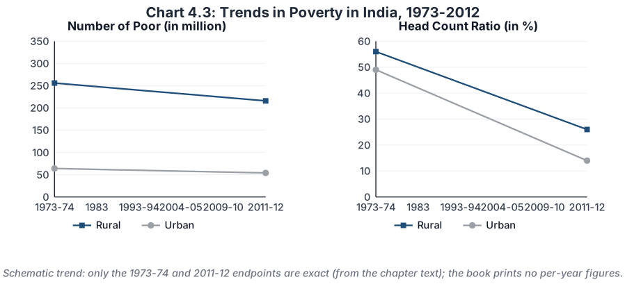
Chart 4.3 shows the number of poor and their proportion to the population for 1973–2012 (with separate Rural and Urban lines):
- In 1973-74, more than 320 million people were below the poverty line; by 2011-12 this had come down to about 270 million.
- In proportion, about 55 per cent of the total population was below the poverty line in 1973-74, falling to 22 per cent in 2011-12.
- In 1973-74, more than 80 per cent of the poor resided in rural areas, and this situation had not changed even in 2011-12 — more than three-fourths of India's poor still reside in villages.
- In the 1990s the absolute number of poor in rural areas declined while their urban counterparts increased marginally; the poverty ratio declined continuously for both.
Although both the number of poor and their proportion declined during 1973–2012, the nature of the decline is not encouraging: the ratio is declining much more slowly than the absolute number. The gap between the absolute number of rural and urban poor got reduced, whereas the gap in the ratio remained the same until 1999-2000 and then widened in 2011-12.
Drawn by us to help you understand the concept clearly, and verified to make sure it's accurate. For exams, practice from your textbook's own diagram.
Our recreation of the two poverty-trend panels. Both the number of poor (in million) and the head-count ratio (%) fall between 1973-74 and 2011-12 for rural and urban India alike, but the ratio falls faster than the absolute number. *Only the 1973-74 and 2011-12 endpoints are exact (from the chapter's own figures); the textbook prints no per …
State-level trends (Chart 4.4)
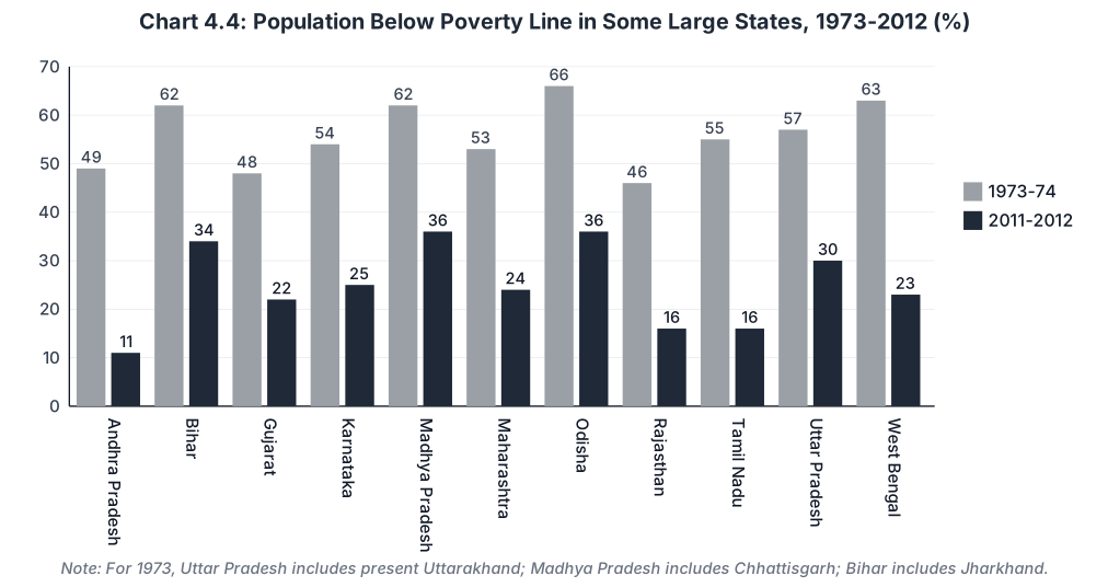
Chart 4.4 shows the percentage of population below the poverty line in some large states for 1973-74 and 2011-12. The exact printed figures are:
| State | 1973-74 (%) | 2011-2012 (%) |
|---|---|---|
| Andhra Pradesh | 49 | 11 |
| Bihar | 62 | 34 |
| Gujarat | 48 | 22 |
| Karnataka | 54 | 25 |
| Madhya Pradesh | 62 | 36 |
| Maharashtra | 53 | 24 |
| Odisha | 66 | 36 |
| Rajasthan | 46 | 16 |
| Tamil Nadu | 55 | 16 |
| Uttar Pradesh | 57 | 30 |
| West Bengal | 63 | 23 |
Note: For the year 1973, Uttar Pradesh includes the present Uttarakhand; Madhya Pradesh includes Chhattisgarh; and Bihar includes Jharkhand.
Drawn by us to help you understand the concept clearly, and verified to make sure it's accurate. For exams, practice from your textbook's own diagram.
Own recreation of the state-wise poverty bars. For each of eleven large states the taller grey bar is 1973-74 and the shorter dark bar is 2011-2012 — poverty fell everywhere, though Odisha, Madhya Pradesh, Bihar and Uttar Pradesh stayed above the national level while ** …
…