Economics · Ch 6 — Non-Competitive Markets
Market Demand Curve is the Average Revenue Curve
Market Demand Curve is the Average Revenue Curve
The market demand curve shows the quantities that consumers as a whole are willing to buy at different prices. At a high price consumers buy the small quantity ; at a lower price they buy the larger quantity . In short, the quantity demanded is a decreasing function of price.
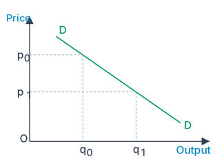
For the monopoly firm the same relationship reads in reverse. The firm can sell a larger quantity only at a lower price, and if it brings a smaller quantity to market it can sell at a higher price. Thus, for the monopolist, price depends on the quantity sold — price is a decreasing function of quantity. Since the firm is assumed to know the market demand curve perfectly, choosing the price is the same as choosing the quantity: to sell at it produces , and to sell it must accept the lower price . We express this by saying that the monopoly firm faces the market demand curve, which is downward sloping (this is Fig. 6.1 in the textbook).
Drawn by us to help you understand the concept clearly, and verified to make sure it's accurate. For exams, practice from your textbook's own diagram.
The market demand curve DD slopes downward: consumers buy the smaller quantity only at the higher price and the larger quantity at the lower price . So for the monopoly firm the price it can charg …
The contrast with perfect competition is sharp: there, the firm could sell as much as it liked at the same price. Because that is not true for a monopolist, we must look carefully at the revenue the firm receives. We do this through a schedule, a graph, and a simple straight-line demand equation.
A worked demand function
Let the demand function be
where is the quantity sold and is the price in rupees. Written with price on the left,
Substituting values of from 0 to 13 gives prices from 10 down to 3.5. The total revenue is , the average revenue is , and the marginal revenue (introduced fully in the next section) is the change in from selling one more unit. These are set out in Table 6.1.
Table 6.1: Prices and Revenue
| 0 | 10 | 0 | – | – |
| 1 | 9.5 | 9.5 | 9.5 | 9.5 |
| 2 | 9 | 18 | 9 | 8.5 |
| 3 | 8.5 | 25.5 | 8.5 | 7.5 |
| 4 | 8 | 32 | 8 | 6.5 |
| 5 | 7.5 | 37.5 | 7.5 | 5.5 |
| 6 | 7 | 42 | 7 | 4.5 |
| 7 | 6.5 | 45.5 | 6.5 | 3.5 |
| 8 | 6 | 48 | 6 | 2.5 |
| 9 | 5.5 | 49.5 | 5.5 | 1.5 |
| 10 | 5 | 50 | 5 | 0.5 |
| 11 | 4.5 | 49.5 | 4.5 | -0.5 |
| 12 | 4 | 48 | 4 | -1.5 |
| 13 | 3.5 | 45.5 | 3.5 | -2.5 |
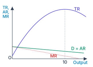
Plotting the values against gives the solid straight demand line . The total revenue is not a straight line; mathematically,
This is a quadratic in which the squared term has a negative coefficient, so its graph is an inverted vertical parabola (the TR curve of Fig. 6.2). As quantity rises, increases to a maximum of Rs 50 at 10 units and then declines.
Why average revenue equals price
The revenue received per unit sold is the average revenue, . In Table 6.1 the column is identical to the column — and this is exactly what we should expect, because
…
Drawn by us to help you understand the concept clearly, and verified to make sure it's accurate. For exams, practice from your textbook's own diagram.
Total revenue is an inverted parabola that rises to Rs 50 at 10 units and then falls. The straight line is the market demand curve, and the dotted marginal revenue (MR) line lies below it, r …
Drawn by us to help you understand the concept clearly, and verified to make sure it's accurate. For exams, practice from your textbook's own diagram.
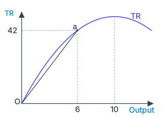
Average revenue at any output is the slope of the ray from the origin to the matching point on the total revenue curve. At 6 units the ray meets the TR curve at point a ( …