Geography · Ch 15 — Atmospheric Circulation and Weather Systems
Horizontal Distribution of Pressure
Horizontal Distribution of Pressure
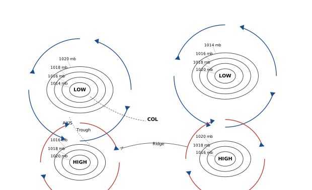
The diagram is a schematic weather map of the Northern Hemisphere, drawn as a flat plan view of sea-level pressure. It shows four distinct pressure centres arranged so that two LOWS and two HIGHS sit roughly in a checkerboard pattern. Each centre is marked with the letter L or H and is enclosed by concentric, roughly circular isobars. The isobars carry real millibar values — 1014 mb, 1016 mb, 1018 mb, and 1020 mb — with the lowest value at the core of a LOW and the highest at the core of a HIGH. This immediately teaches the defining rule of a pressure system: a low-pressure centre is the point of minimum pressure, surrounded by progressively higher isobars, while a high-pressure centre is the point of maximum pressure, surrounded by progressively lower isobars.
Between the pressure centres, the map marks two special elongated features. On the left side, running between a LOW and a neighbouring HIGH, a Trough extends outward from the low — an elongated arm of relatively low pressure — and its central line is labelled the AXIS. At the bottom, between the two HIGH centres, a Ridge extends outward from the high-pressure side — an elongated arm of relatively high pressure. The trough and ridge are drawn as curved lines that bend the isobars, showing how pressure systems are not always neat circles but often stretch into lobes.
At the centre of the diagram, where the trough and ridge cross, the map marks a COL. This is the saddle-shaped neutral point between the four pressure centres — a region where pressure is neither particularly high nor particularly low, and where the isobars take on a distinctive hourglass or saddle form. The col is the geometric meeting place of the two lows and two highs, and it represents a zone of weak, variable pressure gradients. …
The atmosphere presses down on everything with a force we call pressure, but that pressure is not the same everywhere. Even small differences in pressure matter enormously — they are what set the air in motion and give birth to wind. So before we talk about how air moves, we need a way to picture how pressure is spread out across the Earth's surface at any given moment.
That picture is drawn on weather maps. To make comparison possible, pressure readings taken at different altitudes are all reduced to what they would be at mean sea level. This standardisation lets us see the true horizontal pattern of pressure without the distortion caused by mountains and plateaus. The sea level pressure distribution is what weather maps actually show.
On these maps, pressure is represented by lines called isobars — lines joining places that have the same pressure. The pattern of isobars reveals the pressure systems that govern the weather. Figure 9.1 in the chapter shows exactly these patterns.
Two basic types of pressure systems emerge from the isobar pattern:
- Low-pressure system — a region enclosed by one or more isobars, with the lowest pressure at its centre. The isobars wrap around the centre, and pressure rises as you move outward.
- High-pressure system — also enclosed by one or more isobars, but with the highest pressure at its centre. Here pressure falls as you move away from the centre. …
Small differences in pressure are highly significant in terms of wind direction and velocity. Horizontal distribution of pressure is studied by drawing isobars at constant levels -- isobars are lines connecting places having equal pressure. In order to eliminate the effect of altitude on pressure, it is measured at any station after being reduced to sea level for purposes of comparison; the sea level pressure distribution is shown on weather maps. …