Geography · Ch 2 — The World Population: Distribution, Density and Growth
Demographic Transition
Demographic Transition
The demographic transition theory is a framework used to describe and predict how the population of any region changes over time. It explains the shift from a pattern of high birth rates and high death rates to one of low birth rates and low death rates. This shift happens as a society moves from being rural, agrarian, and illiterate to becoming urban, industrial, and literate. These changes occur in a series of stages, which together are called the demographic cycle.
The theory is typically explained using a three-stage model.
Stage One: High Fertility, High Mortality
In the first stage, both the birth rate (fertility) and the death rate (mortality) are high. People reproduce more to compensate for the many deaths caused by epidemics and an unreliable food supply. As a result, the overall population growth is slow. Most people are engaged in agriculture, where large families are seen as an asset for farm work. Life expectancy is low, the population is largely illiterate, and the level of technology is underdeveloped. Two hundred years ago, every country in the world was in this stage.
Stage Two: Fertility Remains High, Mortality Declines
At the beginning of the second stage, fertility remains high, but it gradually declines over time. The key change here is a sharp reduction in the mortality rate. This decline is driven by improvements in sanitation and health conditions. Because the birth rate stays high while the death rate falls, there is a large gap between them. This gap leads to a very high net addition to the population — in other words, rapid population growth.
Stage Three: Both Fertility and Mortality Decline Considerably …
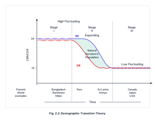
The diagram is a line graph that maps the Demographic Transition Theory across three stages. The vertical axis is labelled CBR/CDR (Crude Birth Rate / Crude Death Rate), with two marked values: 35 at the top and 15 near the bottom. The horizontal axis is labelled Time.
The plot area is divided by dotted vertical lines into three columns, each headed by a stage number: Stage I, Stage II, and Stage III. Above the columns, three phase labels run along the top: High Fluctuating over Stage I, Expanding over Stage II, and Low Fluctuating over Stage III.
Two curves are drawn across the graph. The upper curve is labelled BR (Birth Rate), and the lower curve is labelled DR (Death Rate).
- Stage I (High Fluctuating): Both BR and DR are high, near the 35 level. They run close together and are wavy or fluctuating. The gap between them is narrow, so natural increase is small.
- Stage II (Expanding): The DR curve falls steeply downward, while the BR curve stays high and only begins to decline late in this stage. The two curves diverge, creating a widening gap. This gap is filled with diagonal hatching (shading) and is labelled Natural Increase in Population.
- Stage III (Low Fluctuating): Both curves have come down to a low level, near the 15 mark. They run close together again and are gently wavy, indicating low fluctuation.
Below the horizontal axis, country or group examples are printed under each stage as Present World examples:
- Under Stage I: Bangladesh Rainforest tribes
- Under Stage II: Peru (first line), then Sri Lanka Kenya (second line)
- Under Stage III: Canada Japan USA …