Geography · Ch 2 — The World Population: Distribution, Density and Growth
Patterns of Population Distribution in the World
Patterns of Population Distribution in the World
The way people are spread across the earth is not uniform. Some regions are thickly crowded, while vast stretches are nearly empty. This uneven spread is what we call population distribution, and studying its patterns is the first step to understanding the demographic character of any area.
What is Population Distribution?
Population distribution simply refers to the way people are spaced over the earth’s surface. It is not about numbers alone — it is about where people live and why they live there.
The Big Picture: Two Striking Facts
The textbook gives two powerful numbers that capture the global pattern:
- 90 per cent of the world’s population lives on just 10 per cent of the land area. This means the remaining 90 per cent of the earth’s land is home to only 10 per cent of all people. The world is far emptier than it looks on a crowded map.
- The ten most populous countries together account for about 60 per cent of the world’s population. A handful of nations carry the bulk of humanity.
The Dominance of Asia
Of these ten most populous countries, six are located in Asia. This is a key point: Asia is not just the largest continent in area — it is overwhelmingly the most populous. The six Asian countries among the top ten are:
- China
- India
- Indonesia
- Pakistan
- Bangladesh
- Japan
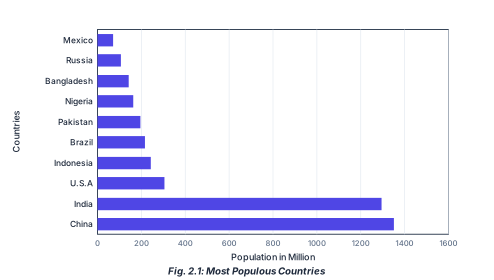
The textbook asks you to identify these six countries from a figure (Fig. 2.1). Memorising this list is important — it shows the concentration of population in South, East, and Southeast Asia.
Why This Pattern Matters …
Drawn by us to help you understand the concept clearly, and verified to make sure it's accurate. For exams, practice from your NCERT textbook's own diagram.
Figure 2.1 is a horizontal bar chart that ranks the ten most populous countries in the world. The vertical axis lists the country names from top to bottom: Mexico, Russia, Bangladesh, Nigeria, Pakistan, Brazil, Indonesia, U.S.A., India, and China. The horizontal axis measures population in millions, with gridlines at 0, 200, 400, 600, 800, 1000, 1200, 1400, and 1600. Each country is represented by a horizontal bar whose length corresponds to its population.
China’s bar is the longest, extending to roughly 1400 million, and India’s is second, reaching about 1300 million — both far past the 1200 gridline. The remaining eight bars are all much shorter, none reaching the 400 gridline. Among these, the U.S.A. has the longest bar (around 300 million), followed by Indonesia, Brazil, Pakistan, Nigeria, Bangladesh, Russia, and Mexico, each progressively shorter down to roughly 100–150 million. No exact numeric values are printed on the bars; only the gridlines are labelled.
The chart visually confirms the textbook statement that the ten most populous countries together contribute about 60% of the world’s population. The dramatic gap between the top two (China and India) and the rest highlights how concentrated global population is in just these two nations. …