Economics · Ch 10 — Presentation of Data
Bar Diagram
Bar Diagram
A bar diagram is a set of equispaced, equal-width rectangular bars, one bar for each class or category of data. The height (or length) of a bar reads the magnitude of the data, and every bar starts from the zero line, so its lower end touches the base line.
Because the bars all share the same width, they can be compared simply by their heights, which lets the data be taken in at a glance. Bar diagrams can show frequency-type data as well as non-frequency-type data (such as production, yield or population at different times or in different states), where each value keeps its own identity. The three varieties — …
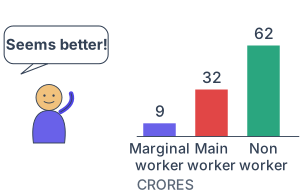
Drawn by us to help you understand the concept clearly, and verified to make sure it's accurate. For exams, practice from your textbook's own diagram.
Our own line-art cartoon (not traced from NCERT). It makes the bar diagram's core promise visible at a glance: the longer the bar, the larger the value — non-workers (the tallest bar here) clearly outnumber main and marginal …