Economics · Ch 10 — Presentation of Data
Histogram
Histogram
A histogram is a two-dimensional diagram made of rectangles: the base of each rectangle is a class interval (marked between class boundaries on the X-axis) and its area is proportional to the class frequency.
When all class intervals are of equal width, the areas — and hence the heights — are simply proportional to the frequencies, so the height of each rectangle can be taken as the frequency itself. When the widths are unequal, the heights must be adjusted so the areas stay comparable; the height then used is the frequency density:
…
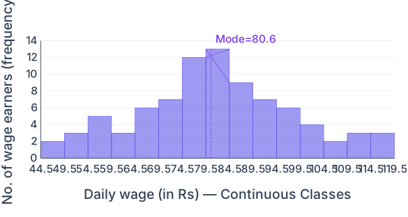
Drawn by us to help you understand the concept clearly, and verified to make sure it's accurate. For exams, practice from your textbook's own diagram.
A histogram of 85 daily-wage earners. The x-axis shows continuous wage classes (boundaries 44.5, 49.5 … 119.5, each 5 wide) and the y-axis the frequency. Bars are adjacent with no gaps because the data are continuous, and each bar's height is that class's number of earners. The distribution rises to a peak at the 80–84 class (frequency 13), the modal class; a dashed line drawn insid …