Business Mathematics and Basic Statistics · Ch 6 — Graphical Representation of Statistical Data
Histogram
Histogram
A histogram represents a continuous (grouped) frequency distribution using a set of adjacent rectangles — one per class interval — drawn with no gaps between them, since the classes themselves are continuous, running one into the next. Along the X-axis, the class boundaries are marked; along the Y-axis, the frequency of each class is marked; the height of each rectangle equals the class's frequency (when every class has the same width), and the rectangles are drawn touching each other because there is no genuine 'gap' between, say, marks 20–30 and marks 30–40.
Histogram — Equal Class Widths
When every class interval has the same width, the height of each rectangle is simply the class's frequency, and the rectangles are drawn directly against the class boundaries on the X-axis, touching their neighbours on both sides.
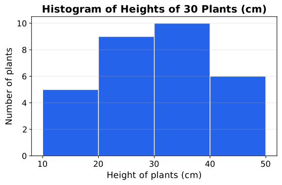
⚠️ A histogram is not a bar diagram, even though both use rectangles — a bar diagram represents discrete/categorical data with gaps between bars, while a histogram represents continuous grouped data with the bars touching, because the classes themselves are continuous. Mixing the two up (leaving gaps in a histogram, or joining bars in a bar diagram) is a common and easily-avoided drawing mistake. …
A graph of a continuous (grouped) frequency distribution using adjacent, touching rectangles — one per class interval — whose heights (for equal class widths) …
Frequency divided by class width; used as the rectangle height instead of raw frequency when class widths are unequal, so that a rectangle's area (not its height) st …