Business Mathematics and Basic Statistics · Ch 6 — Graphical Representation of Statistical Data
Pie Diagram
Pie Diagram
A pie diagram (or pie chart) represents how a total is split among its components using a single circle divided into sectors, where each sector's angle (and hence its area) is proportional to the share of the total that component represents. Pie diagrams are ideal when the message is about proportion of a whole — how a budget is allocated, how a market is shared among competitors — rather than about comparing raw magnitudes across categories, which a bar diagram does better.
Angle of a Pie-Diagram Sector
Since a full circle measures , the angle for a component whose value is out of a grand total is
The angles of all the sectors must always add up to exactly — a useful arithmetic check after computing each one.
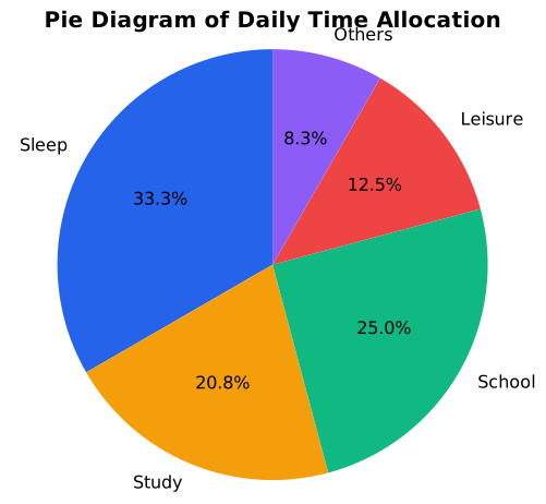
Percentages are often shown alongside (or instead of) angles, computed the same way but out of instead of : . Every sector is usually also labelled directly (category name plus its angle or percentage), since, unlike a bar diagram, a pie diagram has no axis with a scale to read values from. …
A circle divided into sectors whose angles (and areas) are proportional to the share of a total that each component of …
The angle of a pie-diagram sector for a component of value out of a grand total , given by (v/T) × 360°; the angles of all sec …