Business Mathematics and Basic Statistics · Ch 6 — Graphical Representation of Statistical Data
Line Graph
Line Graph
A line graph is one of the simplest and most widely used ways of presenting data that changes over time — daily temperatures, monthly sales, yearly exports, and so on. Time (or any other variable that naturally has an order, such as successive years or months) is marked along the horizontal axis (X-axis), and the value of the variable being studied is marked along the vertical axis (Y-axis). Each pair of values is plotted as a point, and consecutive points are joined by straight line segments, giving a continuous zig-zag line that lets a reader see, at a glance, whether the variable is rising, falling, or fluctuating.
Constructing a Line Graph
- Mark the time periods (days, months, years, …) at equal intervals along the X-axis.
- Choose a convenient scale for the Y-axis so that the smallest and largest values both fit comfortably on the graph.
- Plot a point for each pair of values.
- Join consecutive points with straight line segments (never a smooth curve, unless the data itself represents a genuinely continuous physical process) — the joined segments are what let a reader judge the trend.
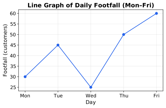
When two (or more) related series are plotted on the same axes — for example, this year's and last year's monthly sales — the result is a multiple line graph, drawn using differently styled or coloured lines with a legend, so the reader can compare the trends of both series directly rather than having to look at two separate graphs. This comparative use of a line graph is exactly the kind of graphical-comparison skill this chapter's later worked examples and Section 7 return to.
A well-drawn line graph is one of the six-mark graphical-representation techniques tested every semester in the WBCHSE Class 12 Business Mathematics and Basic Statistics examination, and the same time-series-plotting idea is used to present trend data in commerce and statistics courses everywhere.
A graph in which values of a variable, recorded at successive points in time (or any naturally ordered variable), are plotted and joined by straight line segments to show a trend.
A line graph on which two or more related data series are plotted on the same axes (using different line styles/colours and a legend) so their trends can be compared directly.