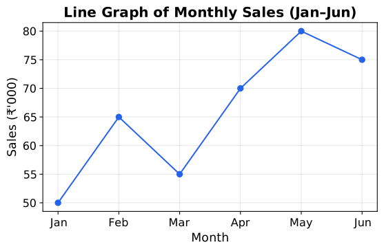
Line Graph – From Intuition to Precision
Imagine you are tracking the temperature outside your window every hour from 6 AM to 6 PM. At 6 AM it is 15°C, at 7 AM it is 17°C, at 8 AM it is 20°C, and so on. You have a list of numbers, but it is hard to see the pattern just by reading them. You want a picture that shows how the temperature changes over time.
That picture is a line graph.
The Intuition
A line graph is a way to show how one thing (say, temperature) depends on another thing (say, time). You draw two perpendicular lines — axes. The horizontal axis (x-axis) usually represents the thing you control or that changes naturally, like time. The vertical axis (y-axis) represents the thing you measure, like temperature.
For each moment in time, you mark a point at the correct height (temperature). Then you connect these points with straight line segments. The result is a rising and falling line that tells a story at a glance: "It was cool in the morning, got hot by noon, then cooled down again."
The key idea: the steepness of the line tells you how fast the change is happening. A steep upward slope means a rapid increase; a flat line means no change; a downward slope means a decrease.
The Precise Statement
A line graph is a graphical representation of a set of data points where each point is defined by an ordered pair (x,y). The points are plotted on a Cartesian plane and connected by straight line segments in the order of their x-coordinates.
Line Graph={(x1,y1),(x2,y2),…,(xn,yn)} plotted and connected in order of increasing x
The line segments between consecutive points are linear interpolations — they assume the change from one point to the next happens at a constant rate. This is why the graph looks like a series of straight pieces joined together.
What It Shows and What It Does Not
A line graph is excellent for showing trends over time or relationships between two continuous variables. It makes it easy to see:
- The overall direction (increasing, decreasing, or constant)
- Peaks and valleys (maximum and minimum values)
- The rate of change (slope of each segment)
But a line graph assumes the data between the plotted points follows a straight line. This is an approximation. If you only measure temperature every hour, the line graph suggests the temperature changed smoothly between measurements — which is usually reasonable, but not guaranteed.
Do not use a line graph for categories that have no natural order (like types of fruit or names of students). Connecting "Apple" to "Banana" with a line makes no sense because there is no "between" them. For such data, use a bar graph instead.
A Simple Example
Suppose a car's distance from home over time is:
| Time (hours) | Distance (km) |
|---|
| 0 | 0 |
| 1 | 60 |
| 2 | 120 |
| 3 | 120 |
| 4 | 180 |
Plot these points: (0,0), (1,60), (2,120), (3,120), (4,180). Connect them in order.
The line from (0,0) to (1,60) is steep upward — the car is moving fast. From (1,60) to (2,120) is equally steep — still moving at the same speed. From (2,120) to (3,120) is flat — the car stopped. From (3,120) to (4,180) is steep again — the car resumed.
In one glance, you see the car moved, stopped, then moved again. That is the power of a line graph.
The Bottom Line
A line graph is a story of change told with points and straight lines. It connects the dots to reveal patterns that numbers alone hide. Use it when your data has a natural order (like time) and you want to show how something varies along that order.