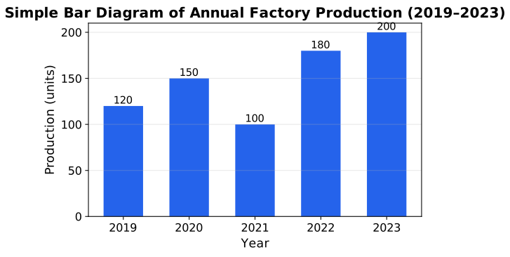
The annual production (in units) of a small factory over five years is given below. Draw a simple bar diagram to represent this data, and identify the year in which production increased the most compared to the previous year.
| Year | 2019 | 2020 | 2021 | 2022 | 2023 |
|---|---|---|---|---|---|
| Production (units) | 120 | 150 | 100 | 180 | 200 |
Step 1 — Draw the bar diagram. Mark the five years on the X-axis and production (units) on the Y-axis; draw five equal-width bars, one per year, each starting from a zero baseline.
Step 2 — Compute the year-on-year changes.
- 2020 vs 2019:
- 2021 vs 2020:
- 2022 vs 2021:
- 2023 vs 2022:
Step 3 — Identify the largest increase. Comparing , the largest positive change is , occurring in 2022.
Independent check. Re-computing directly from the bar heights (rather than the running differences): the biggest single jump between two adjacent bars is visibly between the 2021 bar (100) and the 2022 bar (180), a rise of 80 units — matching the arithmetic.
Production increased the most in 2022, rising by 80 units (from 100 to 180) compared to 2021.
Unlock everything free for 14 days
- Full step-by-step solutions
- Concept-first explanations
- Methods, shortcuts & mistakes
- PYQ mapping + timed mock tests
Full access for 14 days. No credit card required.