The sales (in ₹ lakh) of two branches of a company over four years are given below. Draw a multiple bar diagram to compare the two branches, and state which branch had higher total sales over the four years.
| Year | 2020 | 2021 | 2022 | 2023 |
|---|---|---|---|---|
| Branch A | 40 | 45 | 60 | 50 |
| Branch B | 35 | 50 | 55 | 65 |
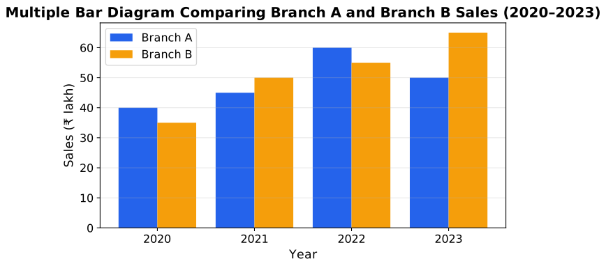
Step 1 — Draw the multiple bar diagram. For each year, draw two bars touching each other (one for Branch A, one for Branch B, distinguished by colour/shading), with a gap separating each year's pair from the next.
Step 2 — Total each branch's sales.
Branch A: . Adding: , , .
Branch B: . Adding: , , .
Step 3 — Compare the totals. , so Branch B's total is higher, by lakh.
Step 4 — Read the year-by-year pattern from the diagram. Branch A led in 2020 (40 vs 35) and 2022 (60 vs 55); Branch B led in 2021 (50 vs 45) and, more markedly, in 2023 (65 vs 50) — it is this strong final year that gives Branch B the higher overall total despite trailing in two of the four years.
Independent check. Re-adding Branch B's figures in a different order, — confirms the total.
Branch B had the higher total sales over the four years: ₹205 lakh against Branch A's ₹195 lakh, a difference of ₹10 lakh, driven mainly by Branch B's strong performance in 2023.
Unlock everything free for 14 days
- Full step-by-step solutions
- Concept-first explanations
- Methods, shortcuts & mistakes
- PYQ mapping + timed mock tests
Full access for 14 days. No credit card required.